Creating a Shared Story
Visit Røros og Østerdalen was formed when Visit Røros joined forces with Østerdalen after the pandemic, with shared ownership across municipalities and businesses. Nonspace developed the brand platform and a visual identity with a new logo, colours, typography and iconography, together with the region’s stakeholders.
Highlights


About the project
Visit Røros and Østerdalen invites travellers to explore one of Norway's most enchanting regions, where rich cultural heritage meets vast, unspoiled nature. From the UNESCO-listed mining town of Røros to the deep forests and rivers of Østerdalen, the region offers authentic experiences rooted in tradition, sustainability, and scenic beauty year-round.
From being known for the UNESCO region of Røros, the destination company expanded to include the communities of Østerdalen. The change also marked a shift from a membership organisation to shared ownership across municipalities and businesses in central and eastern Norway.
The branding process brought together different cultures, communities and organisations, from local municipalities to small independent businesses. The result was a new regional destination positioned nationally: a platform for experiences for independent travellers, from those exploring their own region to domestic and international visitors.
Rebranding the organisation meant combining the strong, established town and regional brand of Røros with the less well-known destination of Østerdalen. There was no blueprint for the destination to follow, which gave us the opportunity to create something entirely new. It called for a brand platform built through collaboration between communities and businesses across municipal borders.
Central to the branding process were the diverse visitor groups and their shifting preferences and priorities, shaped by the effects of the pandemic on lifestyles and the growing importance of sustainable travel. We drew on insights from international destinations such as Salla in Finland and Jeju-do in South Korea, as well as our own experience with the destination brands Visit Bergen and Visit Trondheim, and insight from the travel, tourism and cultural sectors.
A key task for the brand platform was putting into practice the National Tourism Strategy 2030 “Big impact, small footprint” and Innovation Norway’s scheme “Sustainable Destination”. Combining national statistics, transport infrastructure and travel patterns, hotel stays, cultural calendars and more, we mapped the sustainable position the brand platform needed to establish.
From the start and throughout the process, members and owners across the regions were invited to take part and contribute insight and vision. This included a survey across the community to capture key insights on businesses, community dynamics, culture and visitor experiences, as well as workshops with key stakeholders, from the municipalities to hoteliers, cultural festivals and business owners.
Through regular updates with the organisation’s marketing advisory board and board of directors, we applied the key insights and direction to the ongoing work of the organisation. The managing director also gave weekly updates to all owners across the regions, sharing progress and insights.
The first step in the solution was to create a shared story, uniting Røros and Østerdalen and the different businesses and communities of the regions. It became a cultural platform for ownership, cooperation and innovation for all members: a shared idea for both ambition and the collective pride in welcoming visitors, from locals to international guests.
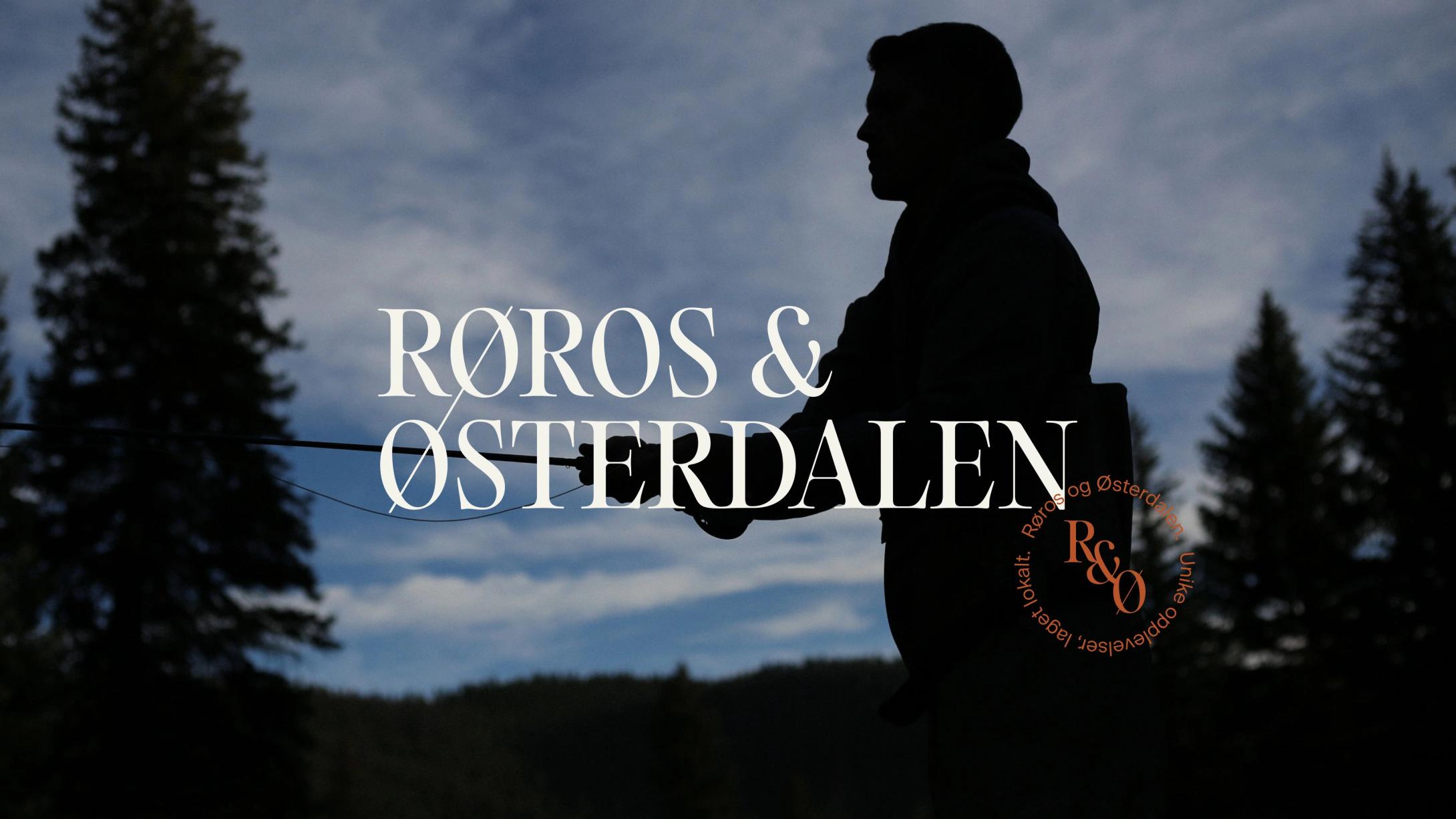
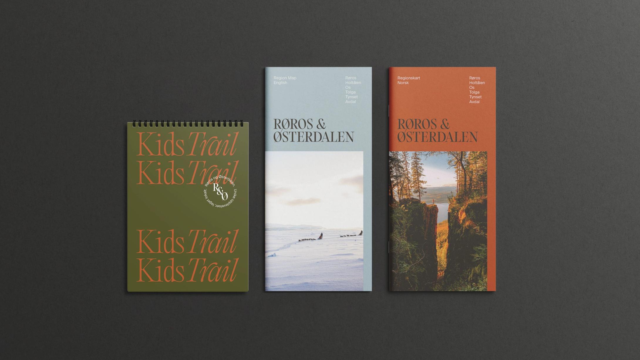
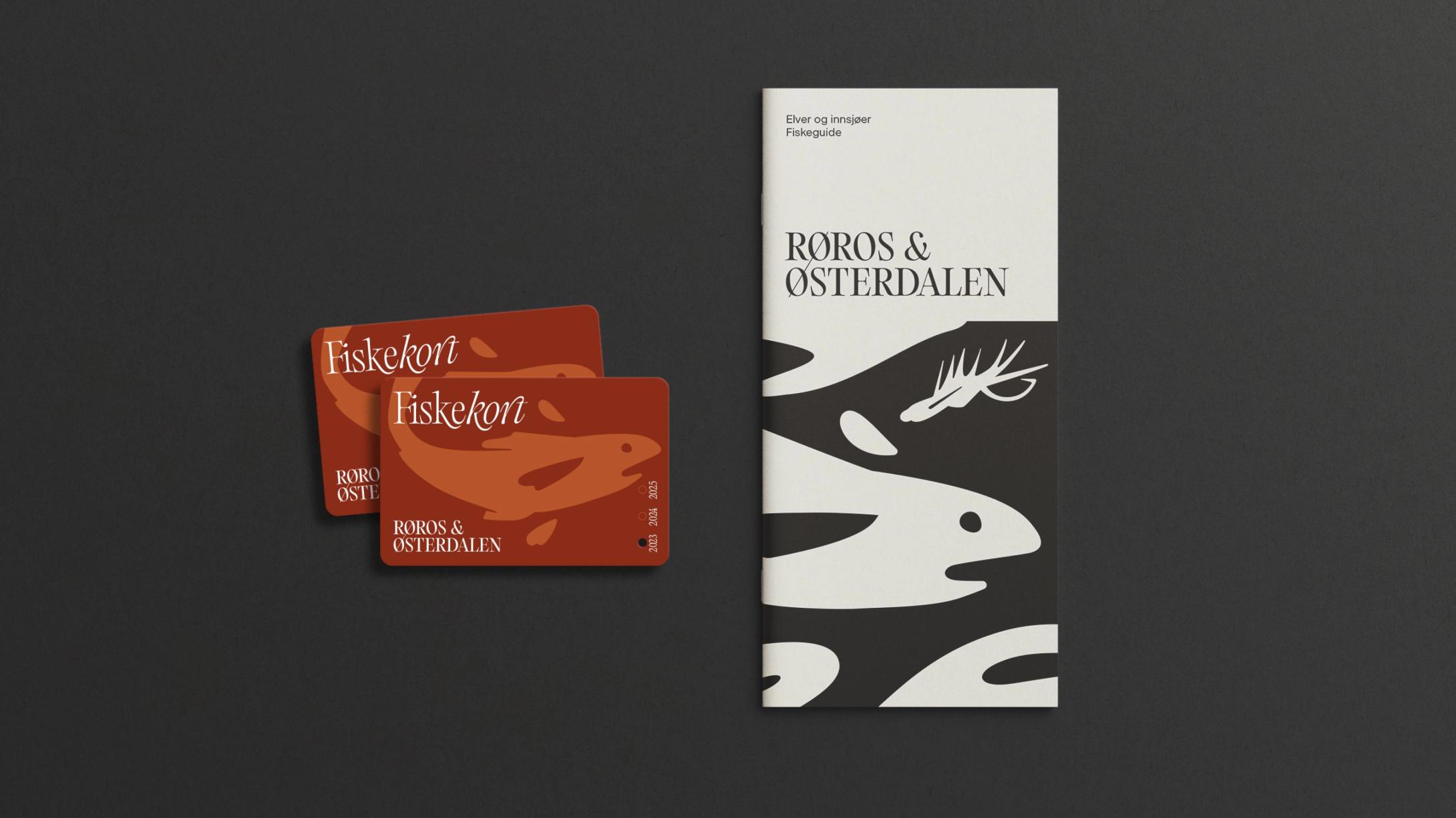
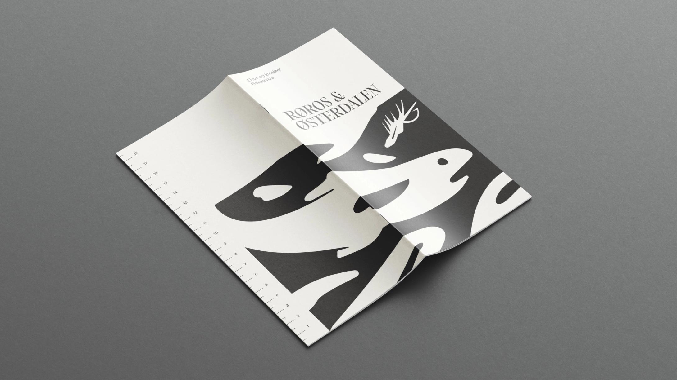
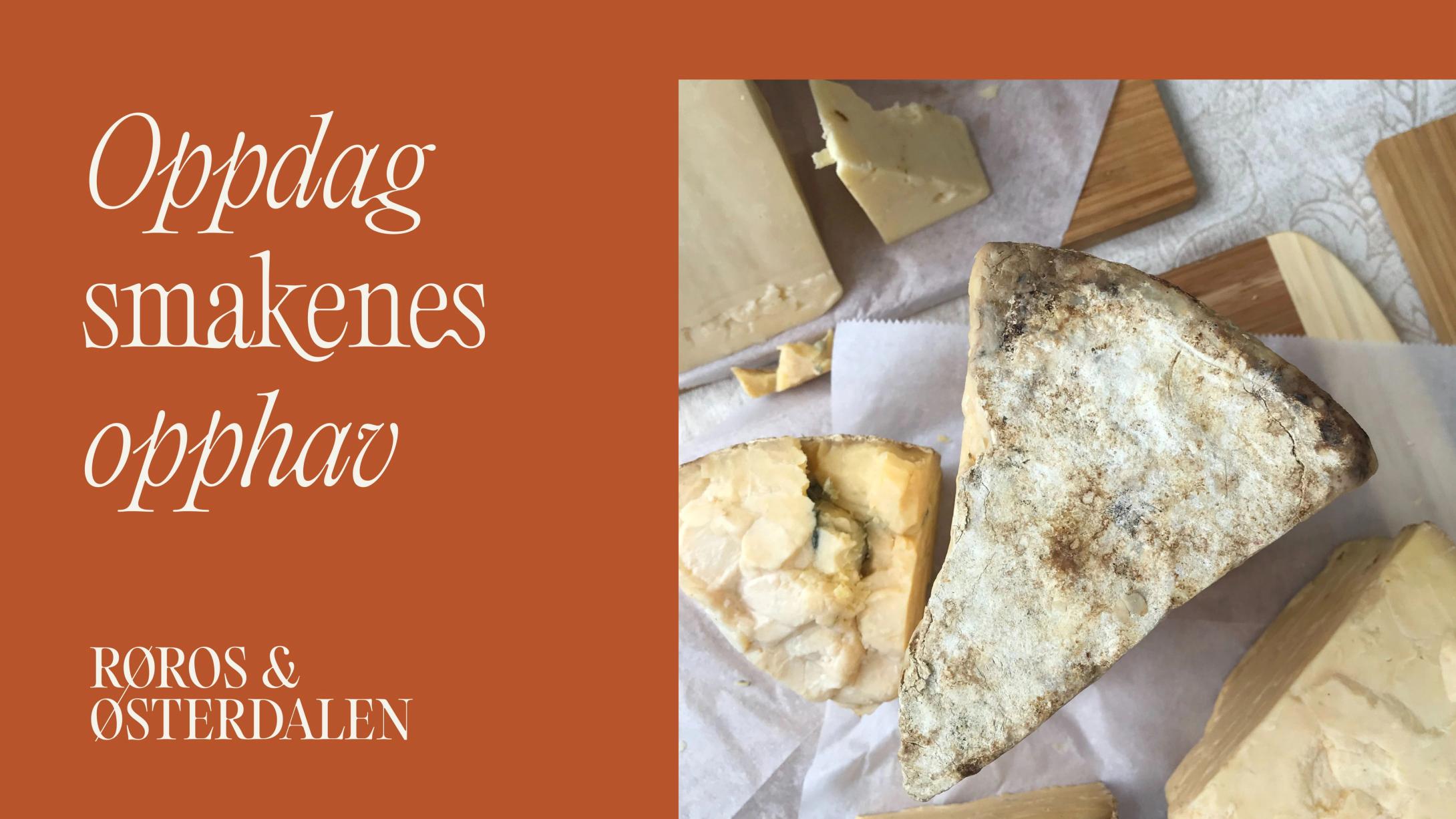
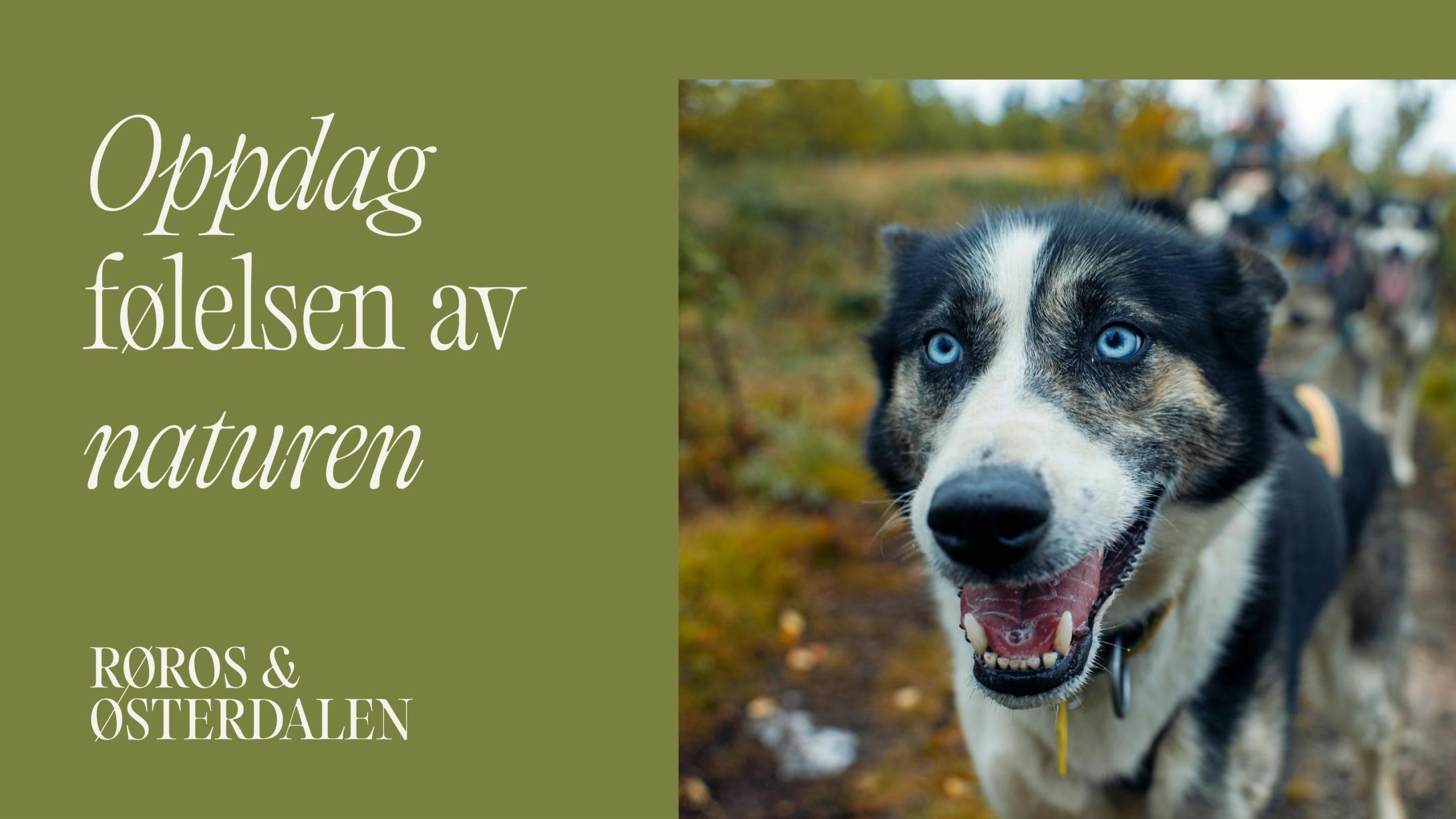
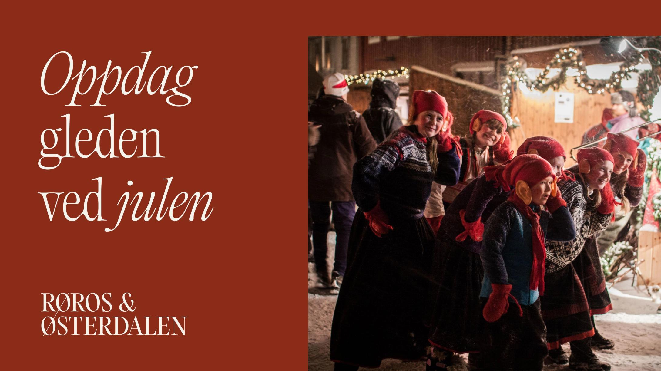
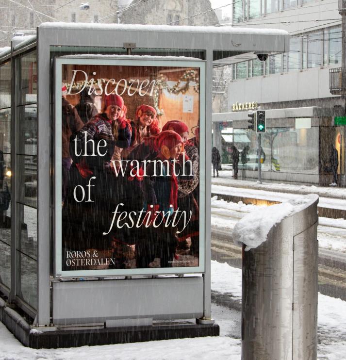
With this story in place, we developed the new visual culture of Røros and Østerdalen. The visual profile captures the traits of the region and the feeling of discovering an intriguing part of Norway. The rich cultural and mining history is balanced with the wide landscapes and organic qualities of nature that define the region as a whole.
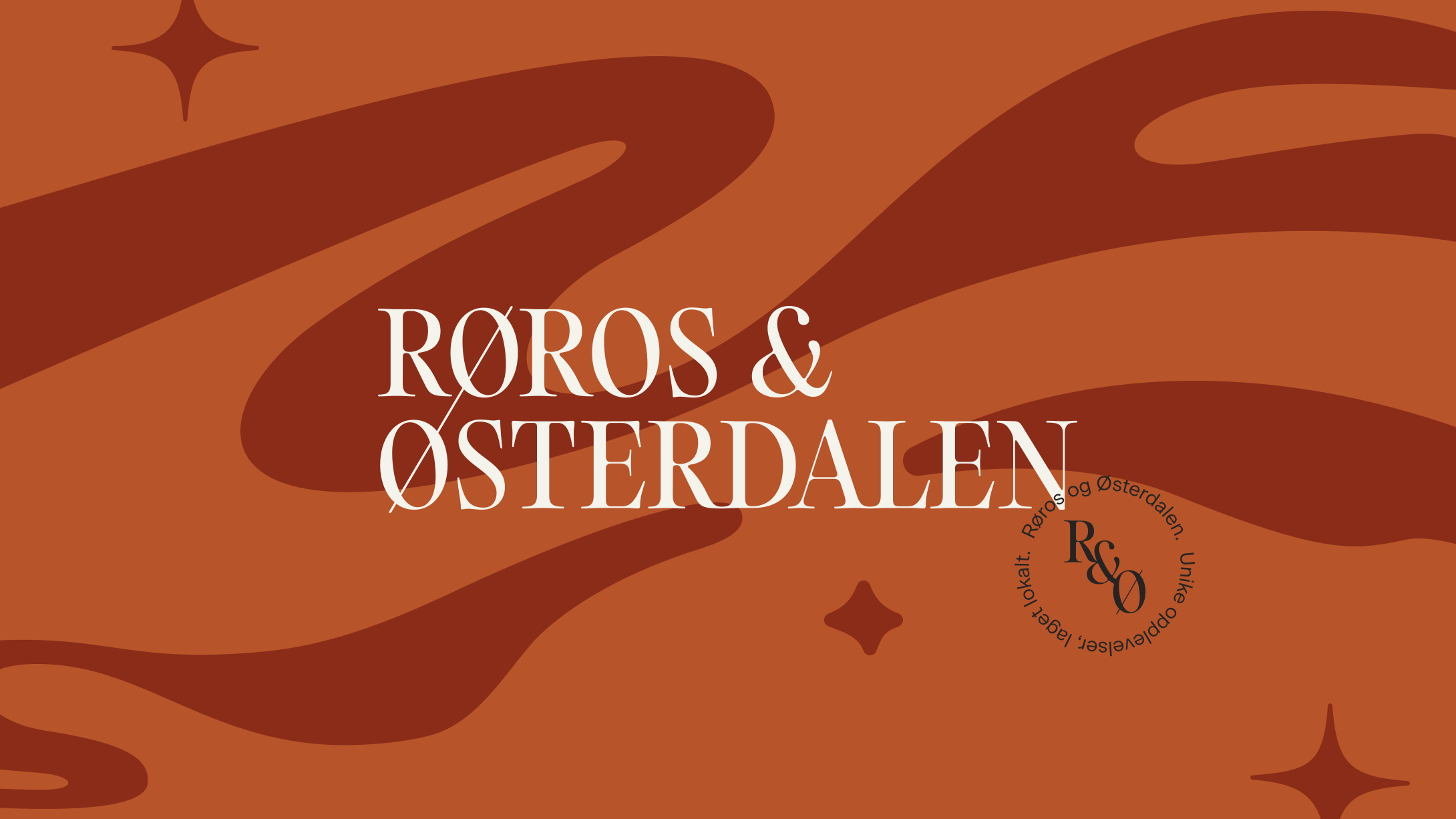
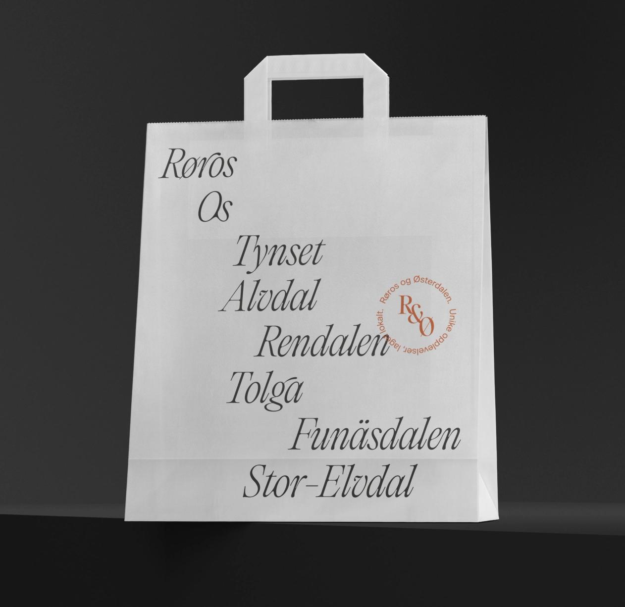
The wordmark logo brings together the town of Røros and the region of Østerdalen, hinting at a new touring route to explore and discover, while representing the shift in organisational structure and a future of greater collaboration.
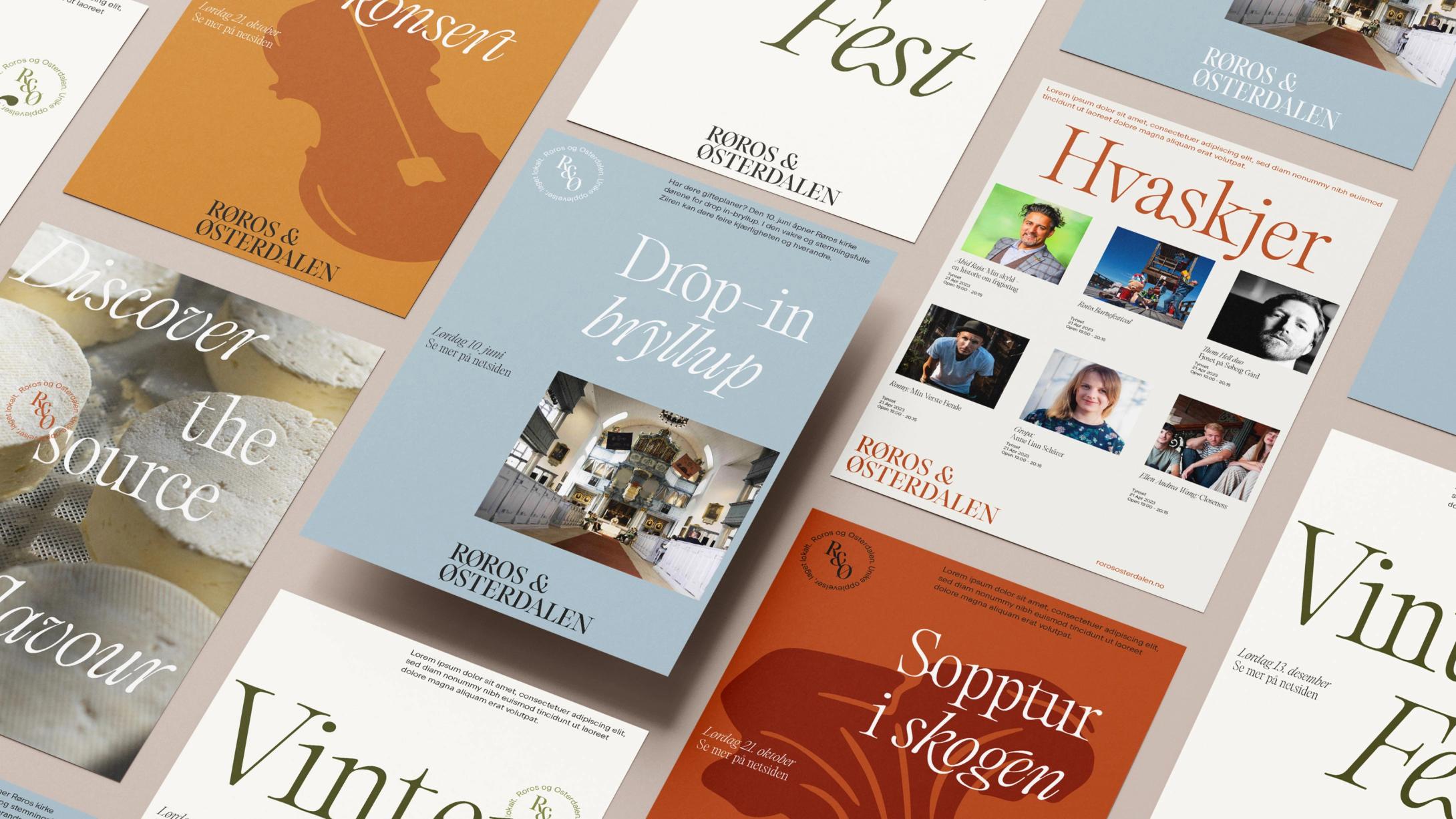
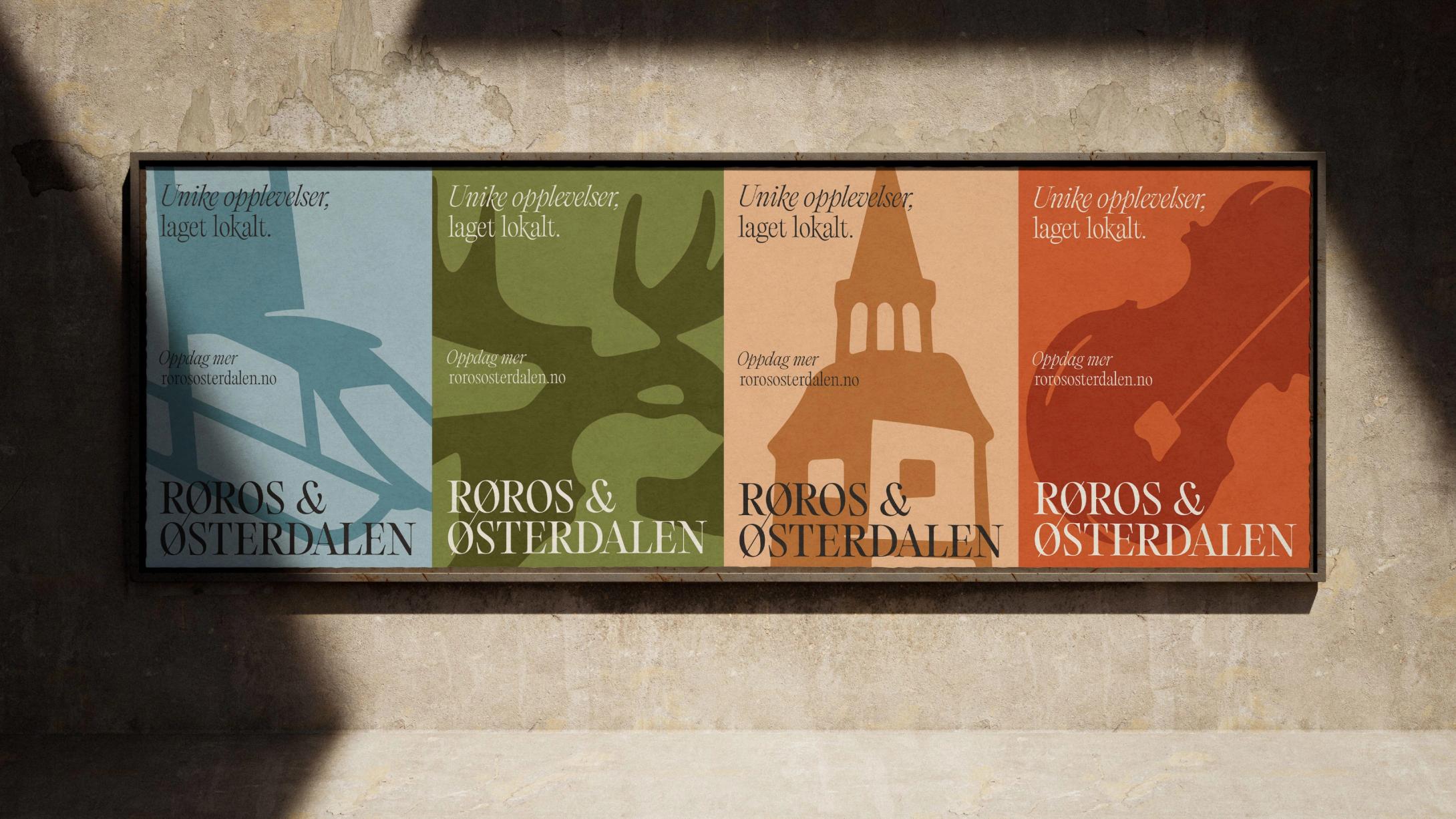
The visual world is built around several key ingredients that together capture the essence and energy of the region. A colour palette steeped in cultural, heritage and geographical references sets the tone for a region defined as much by what is found there as by what is not: small attractions and an immense sense of scale and wilderness. The colours bring an earthy, warm aesthetic to an area known for bitterly cold winters and warm hospitality.
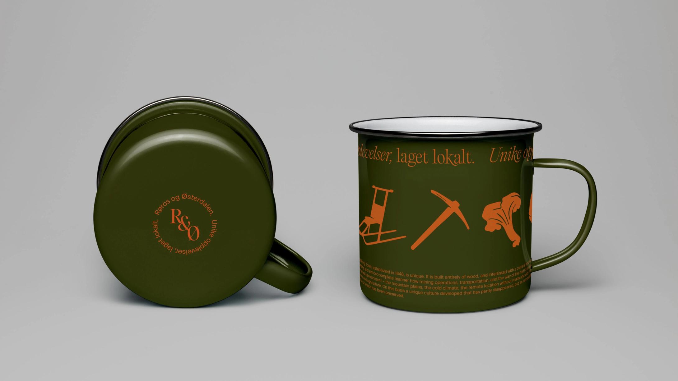
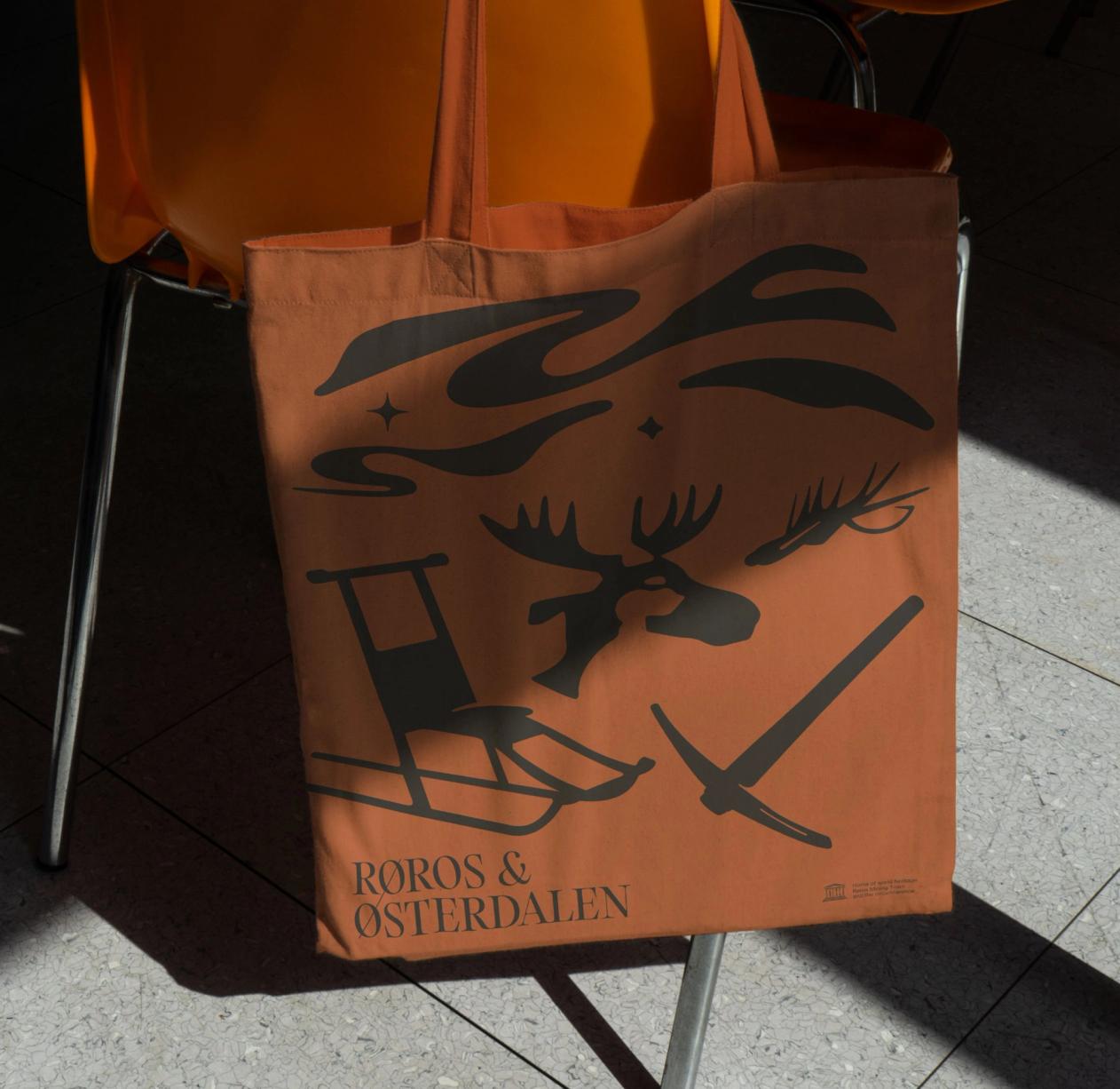
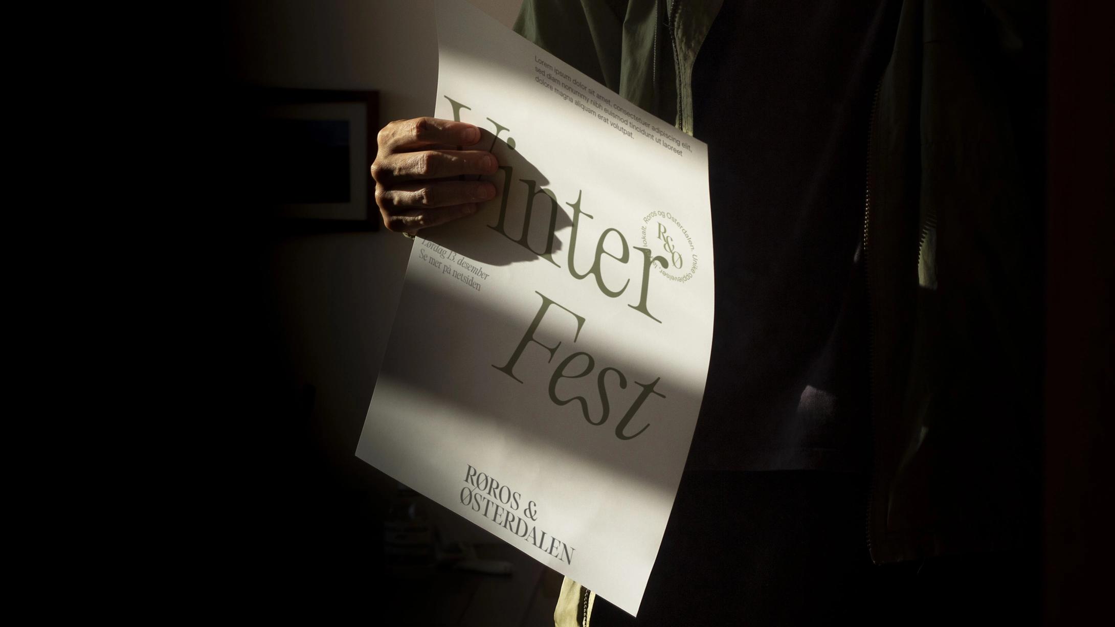
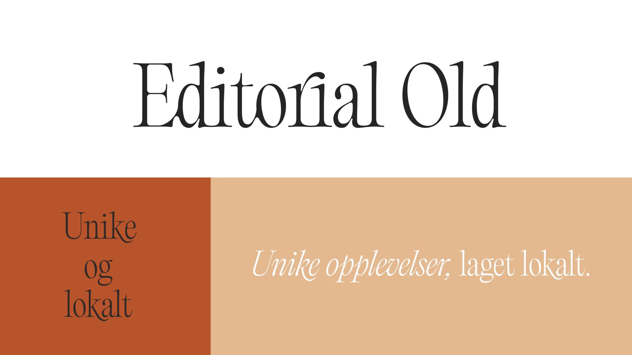
The typographic palette, built around a hero font in various styles, underlines the connection of the region through stylistic swashes and ligatures, balancing old-world charm with a modern vision. The rounded, imperfect and organic forms of the brand typeface are extended into a style of illustrated icons that show the symbols of the region, touching on nature, culture, history and adventure, and inviting visitors to discover it.
Would you like to know more about this?
Reach out to the team, we're happy to answer questions, receive feedback or discuss the topic.

Relevant cases
Scent Becomes Strategy
Digitising and Rebranding a Trusted Travel Operator
Life in Full Contrast