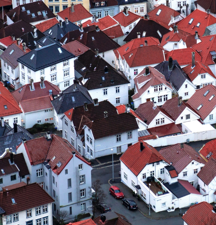
Such an iconic city and region naturally carries many clichés and tired symbols. The new profile challenges the familiar with the surprisingly unfamiliar, giving Bergen new energy and celebrating the breadth of experiences the region has to offer.
The focus was to move away from the position as “Gateway to the Fjords” and anchor the brand in the quality of life the region offers: no longer a gateway, but a destination.
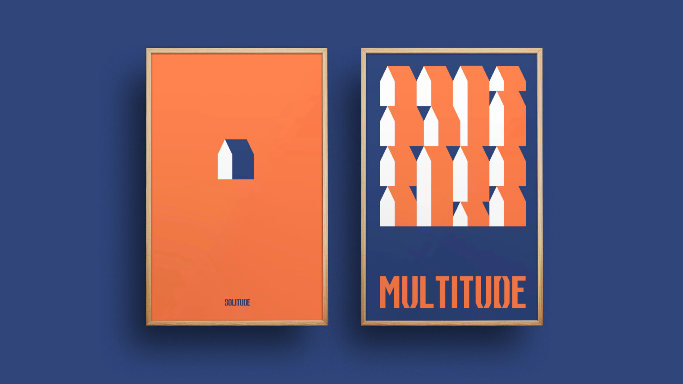
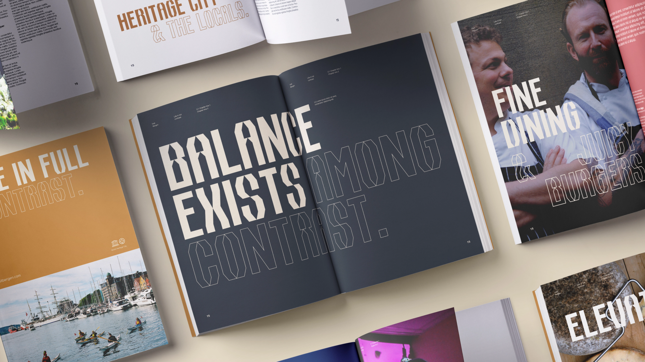
A destination with “Life in Full Contrast”. A celebration of cultural and natural diversity at its extremes, from urban street life to mountaintops, classical to contemporary, fast and slow. A personality that celebrates contrast in scale, size, volume and emotion.
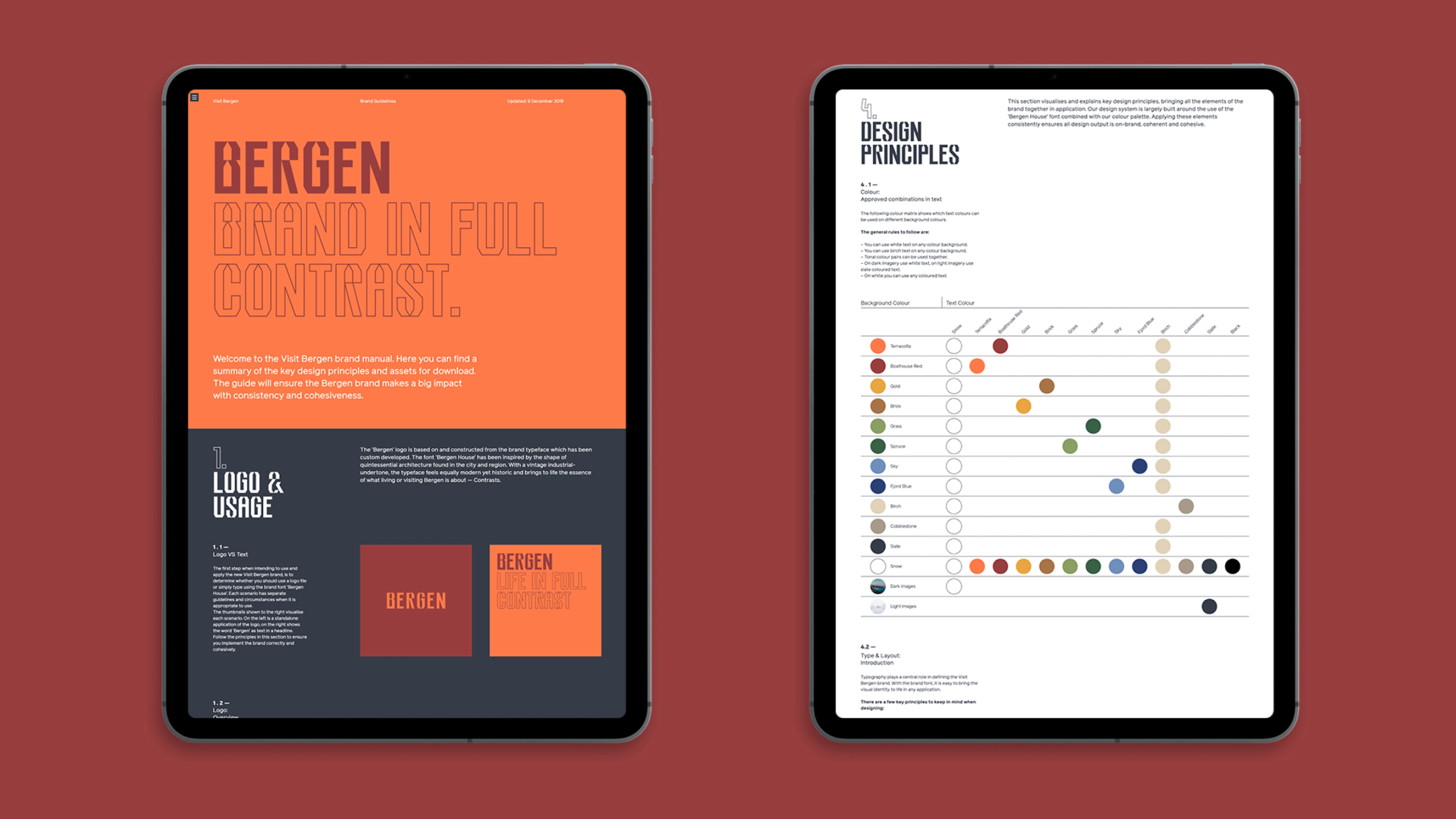
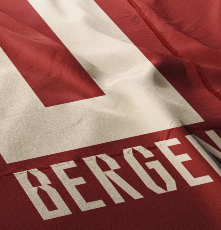
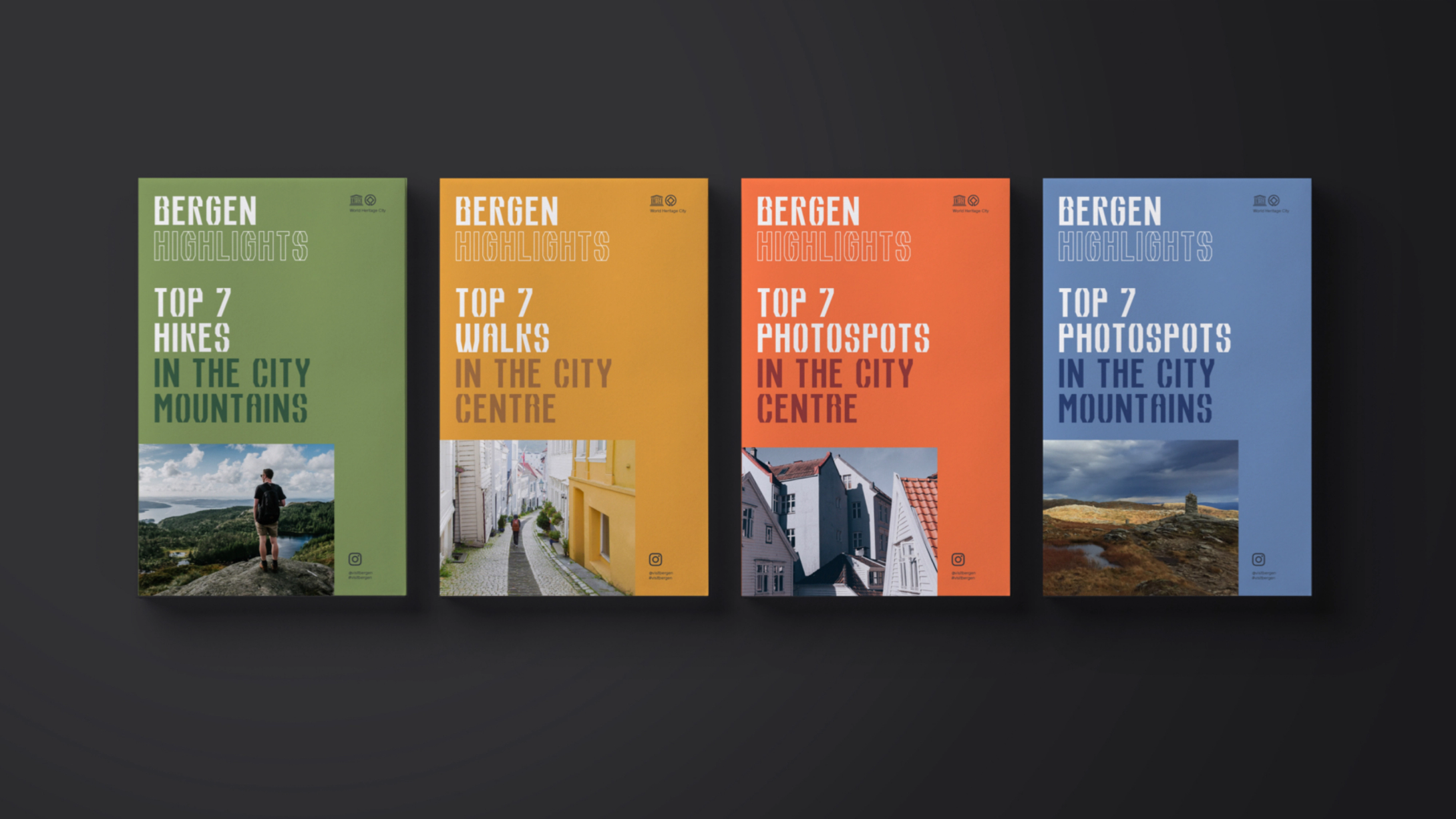
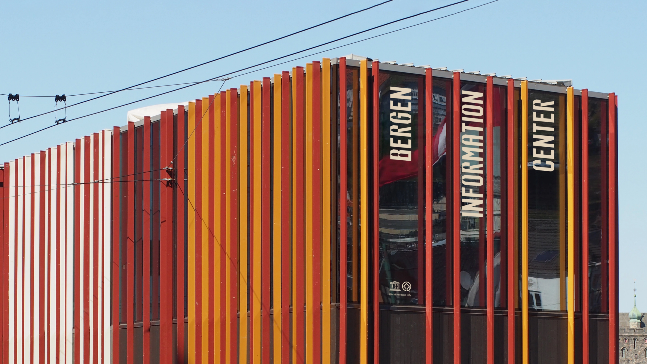
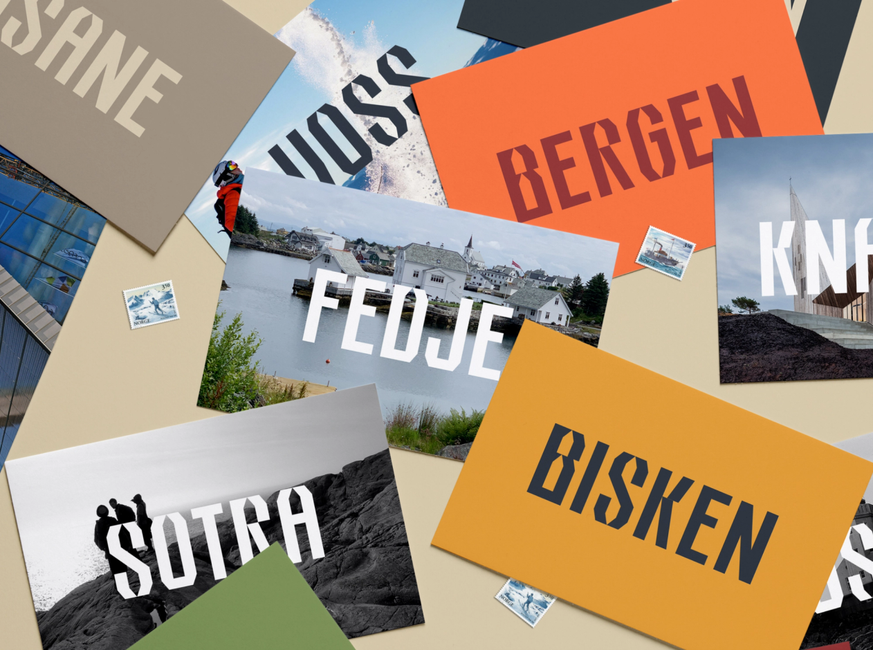
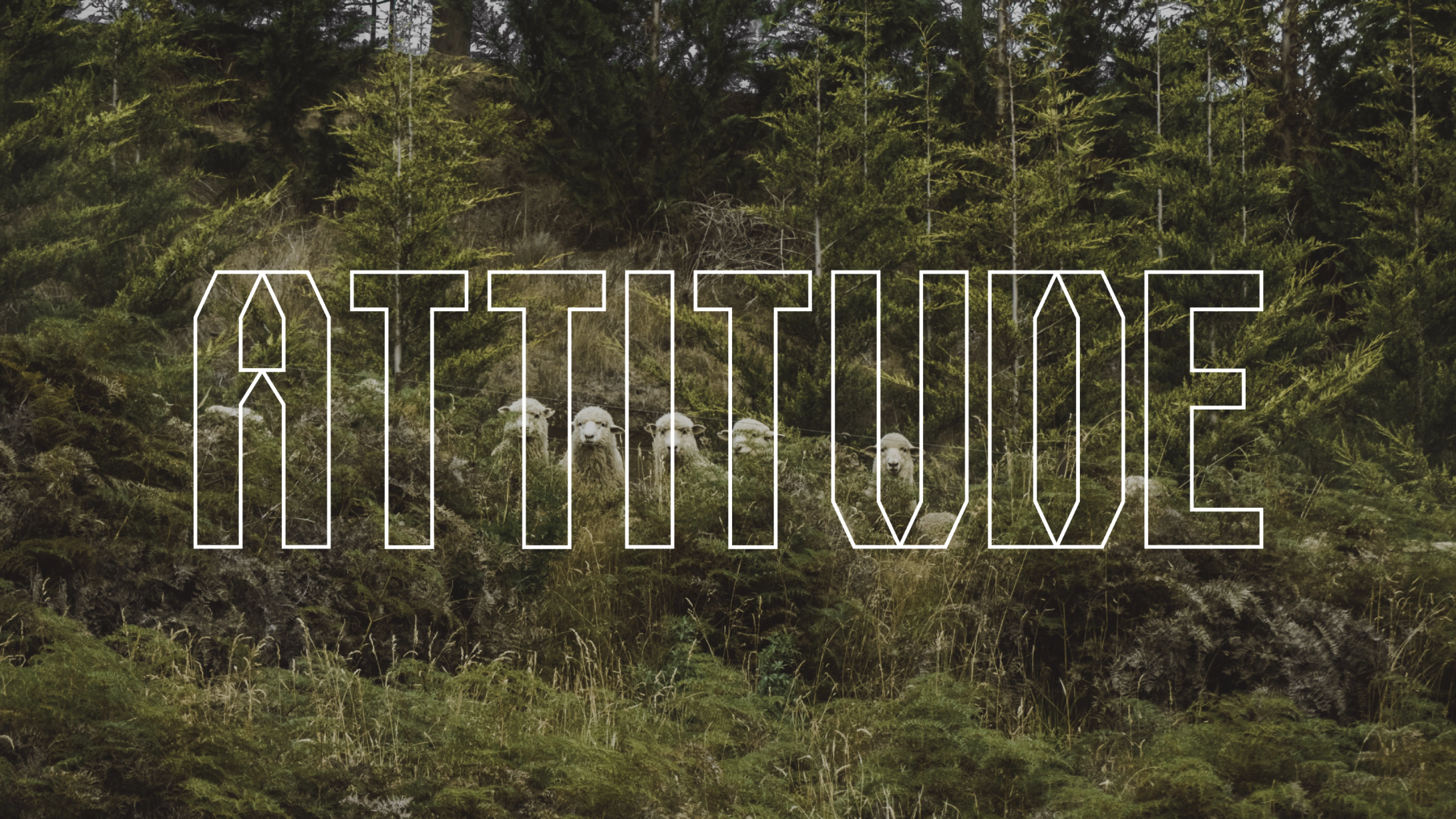
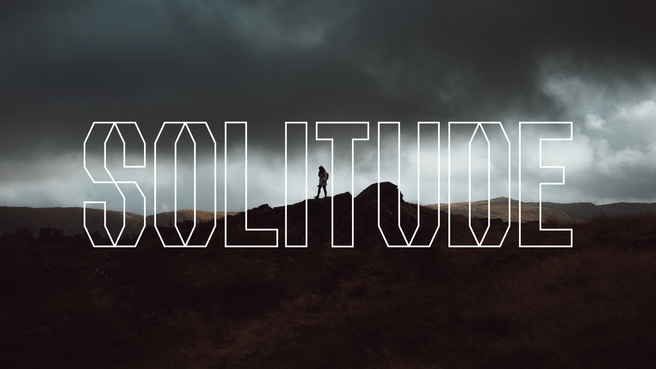
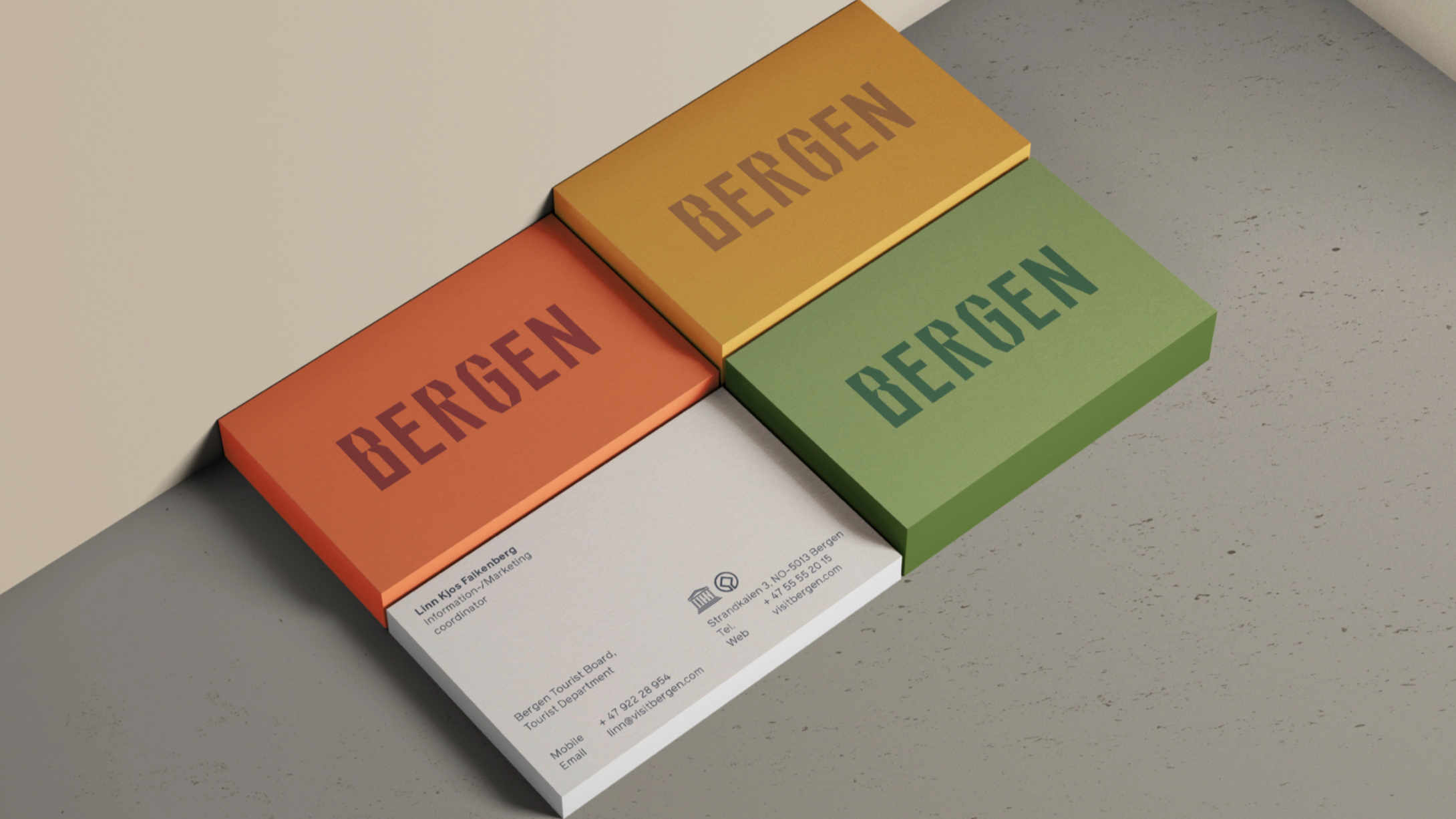
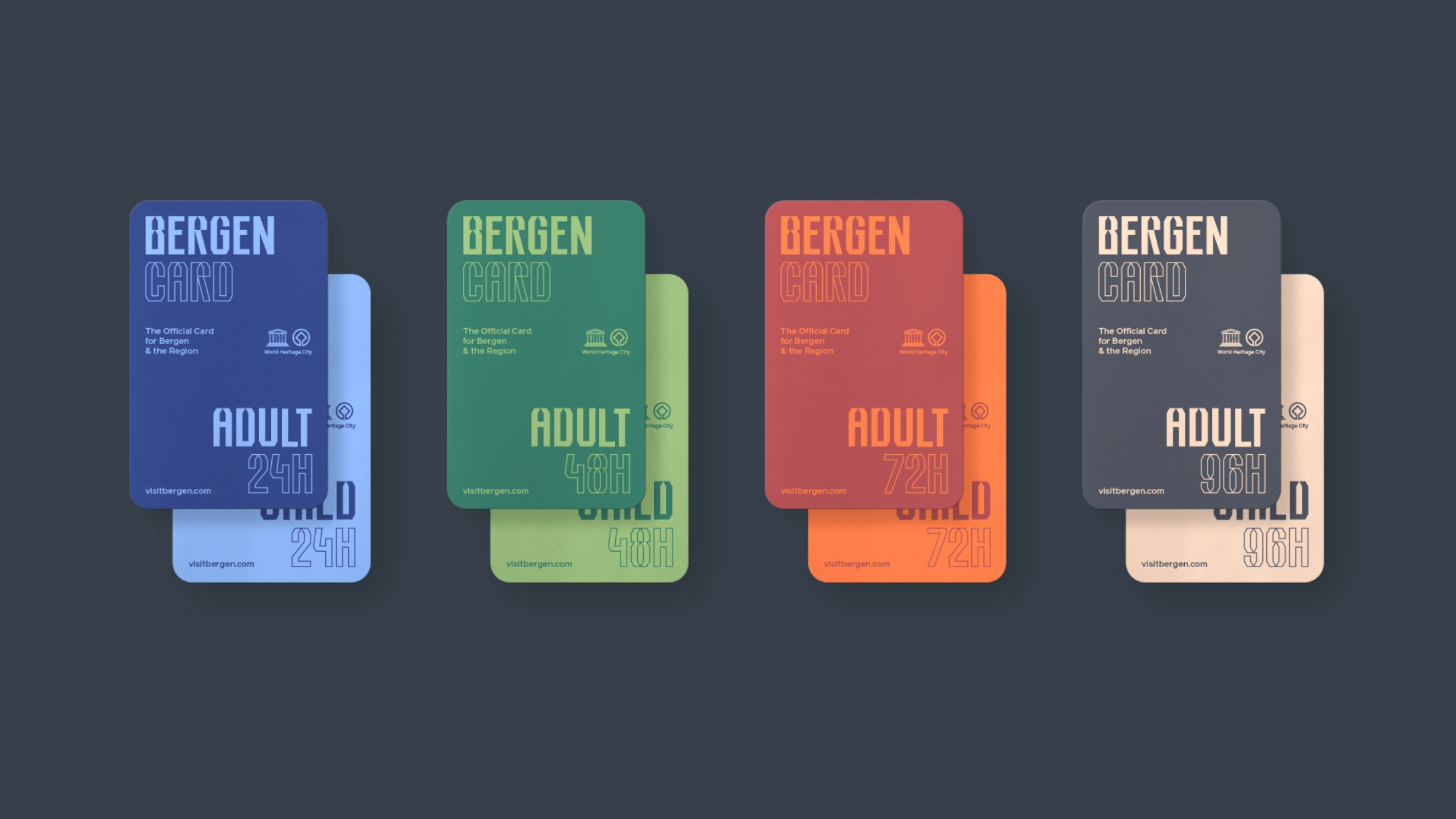
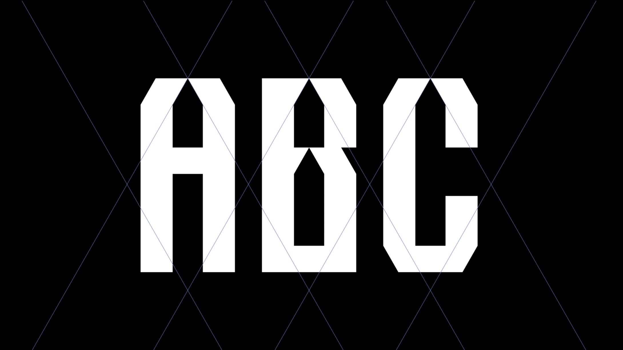
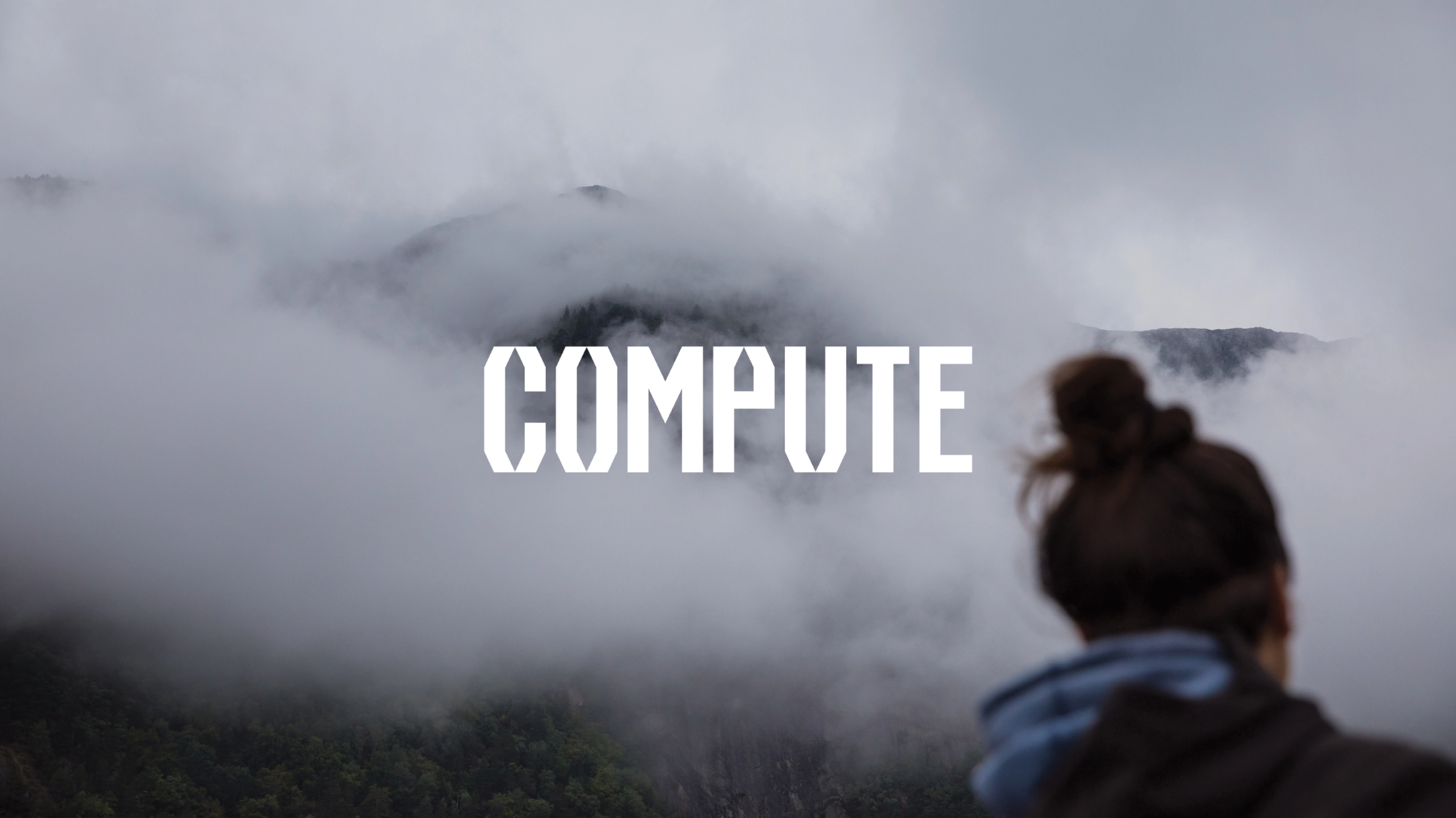
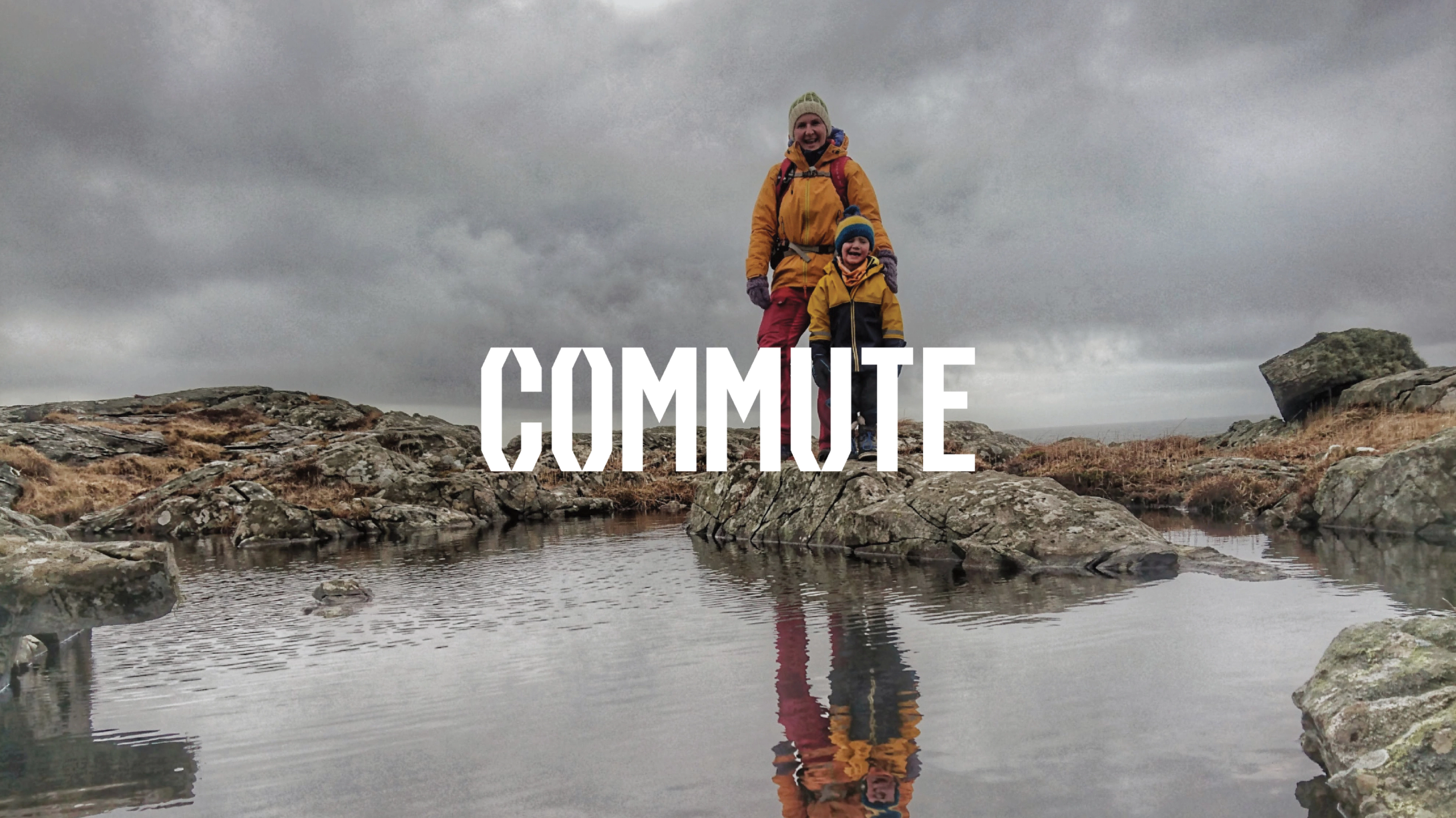
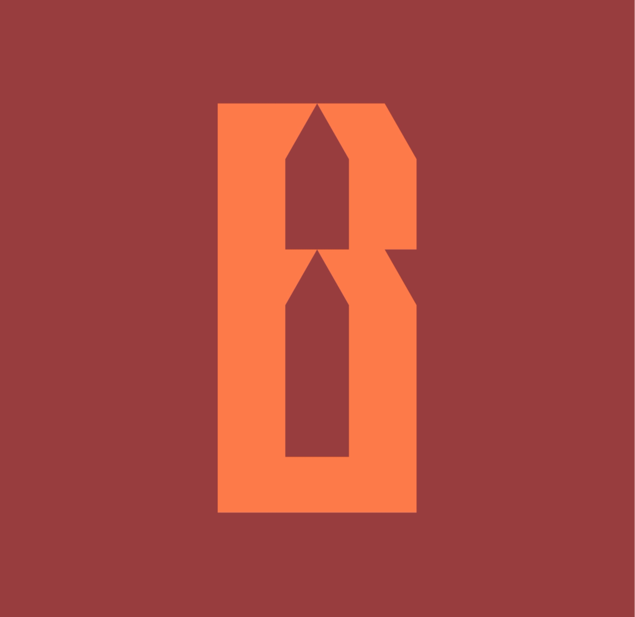
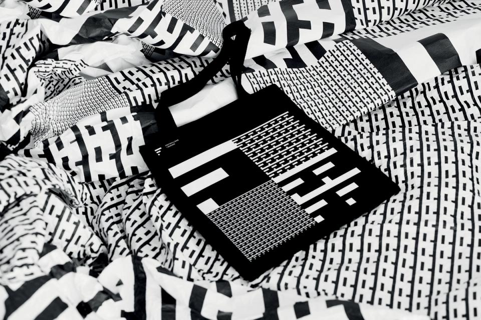
In practice, the identity works as a quality mark for member brands, as the organisational identity of Visit Bergen and as a campaign platform. There is no logo in the traditional sense, but a custom typeface made to tell the stories of the region. A voice shouting from the mountaintops, whispering in the wind and singing in the crowd.
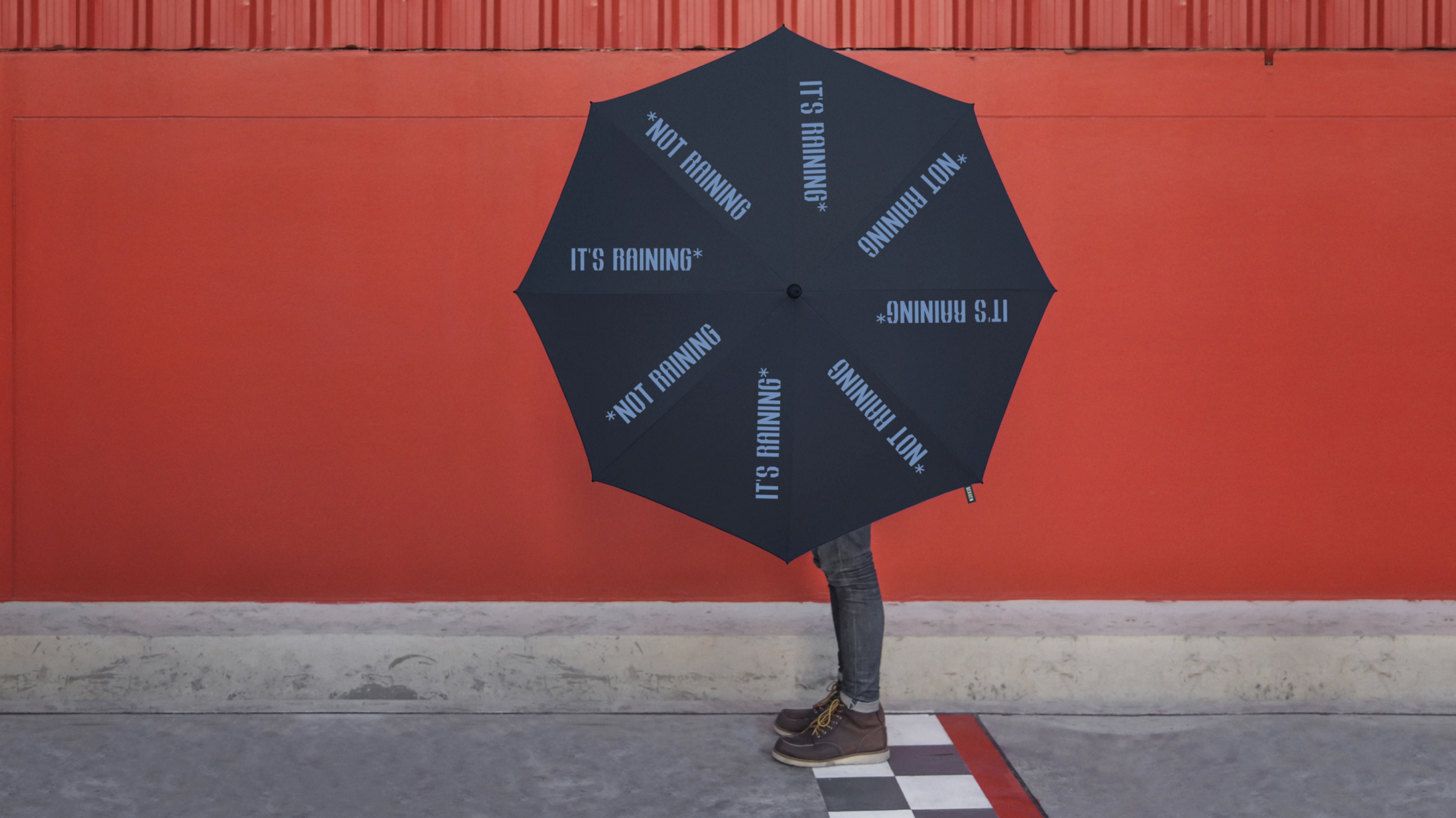
Tone of voice is a critical component of the brand. Clear and expressive, playful yet direct: a personality full of self-confidence, yet welcoming. A region that is open and full of energy, proud of its contrasts in an inviting way. Copy combined with imagery and film is the simple yet effective medium through which the brand grabs attention and carries its story.
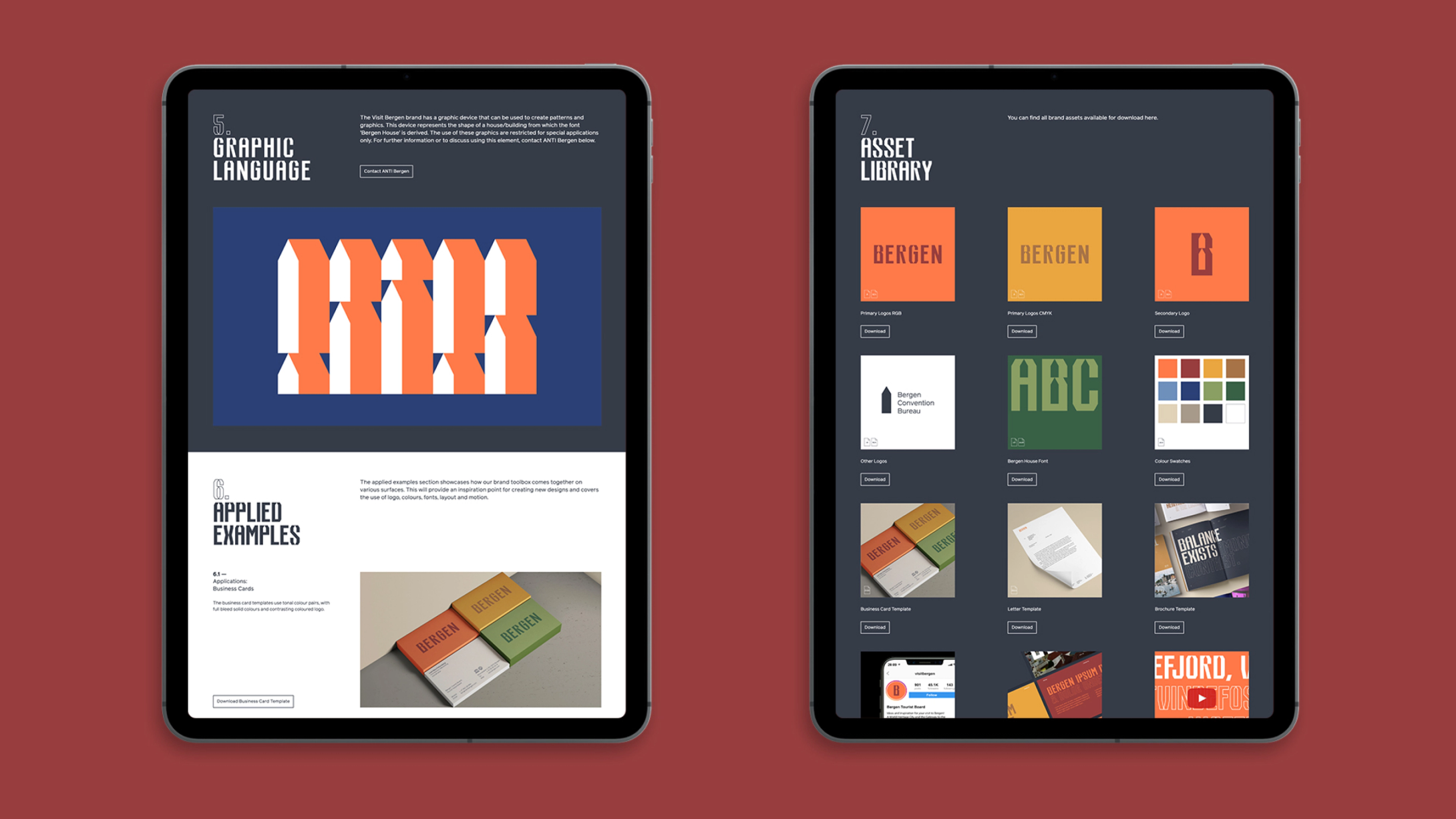
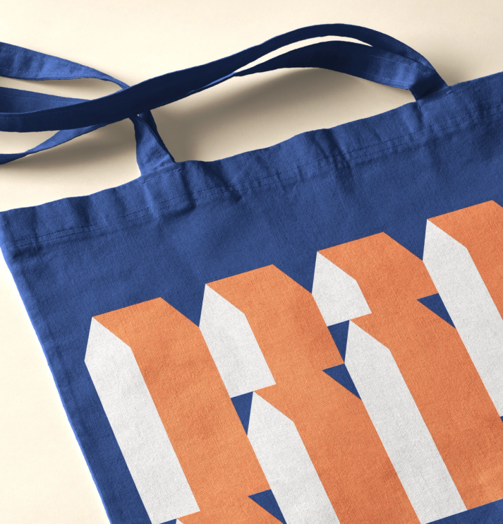
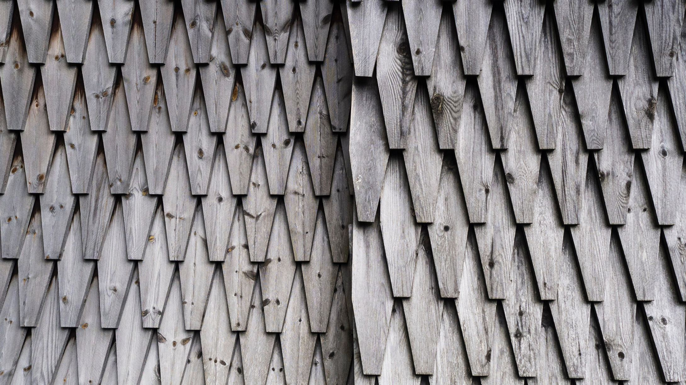
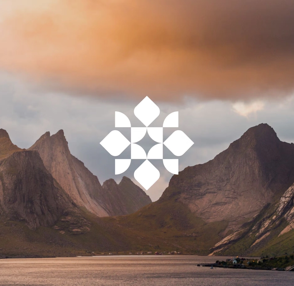
A symbol is found in the negative space of the bespoke typeface, a graphic accent in the design dialect of the region. The form can stand alone or be used as pattern and shape in different frequencies to express the contrasts of the region: urban and nature, calm and high energy.
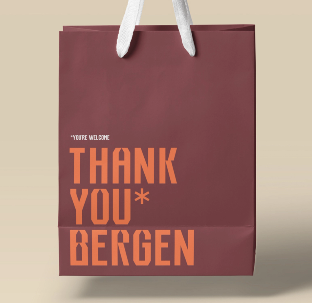
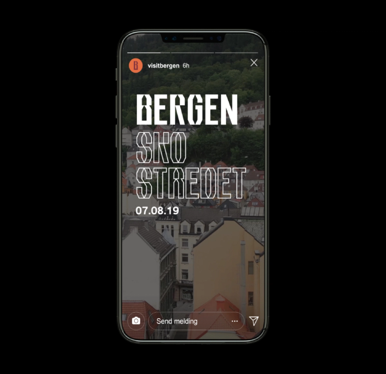
The new profile of the Bergen region enters the world in many forms: as an organisational brand, campaign, rap lyrics and music video, merchandise and live experiences.