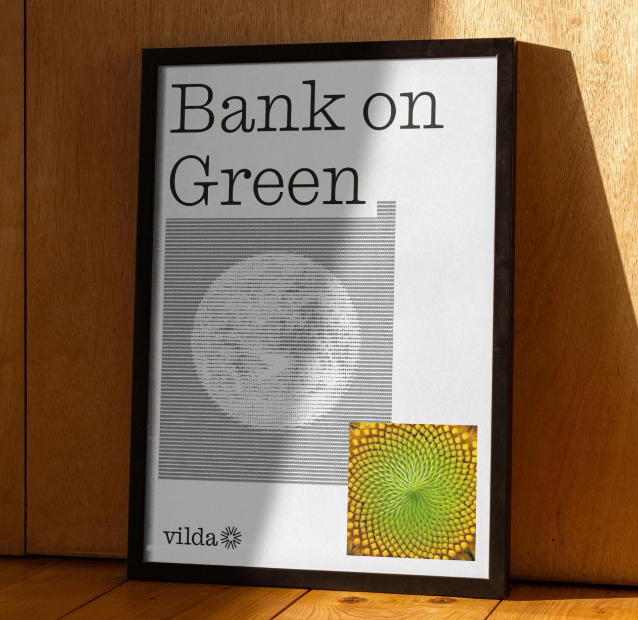
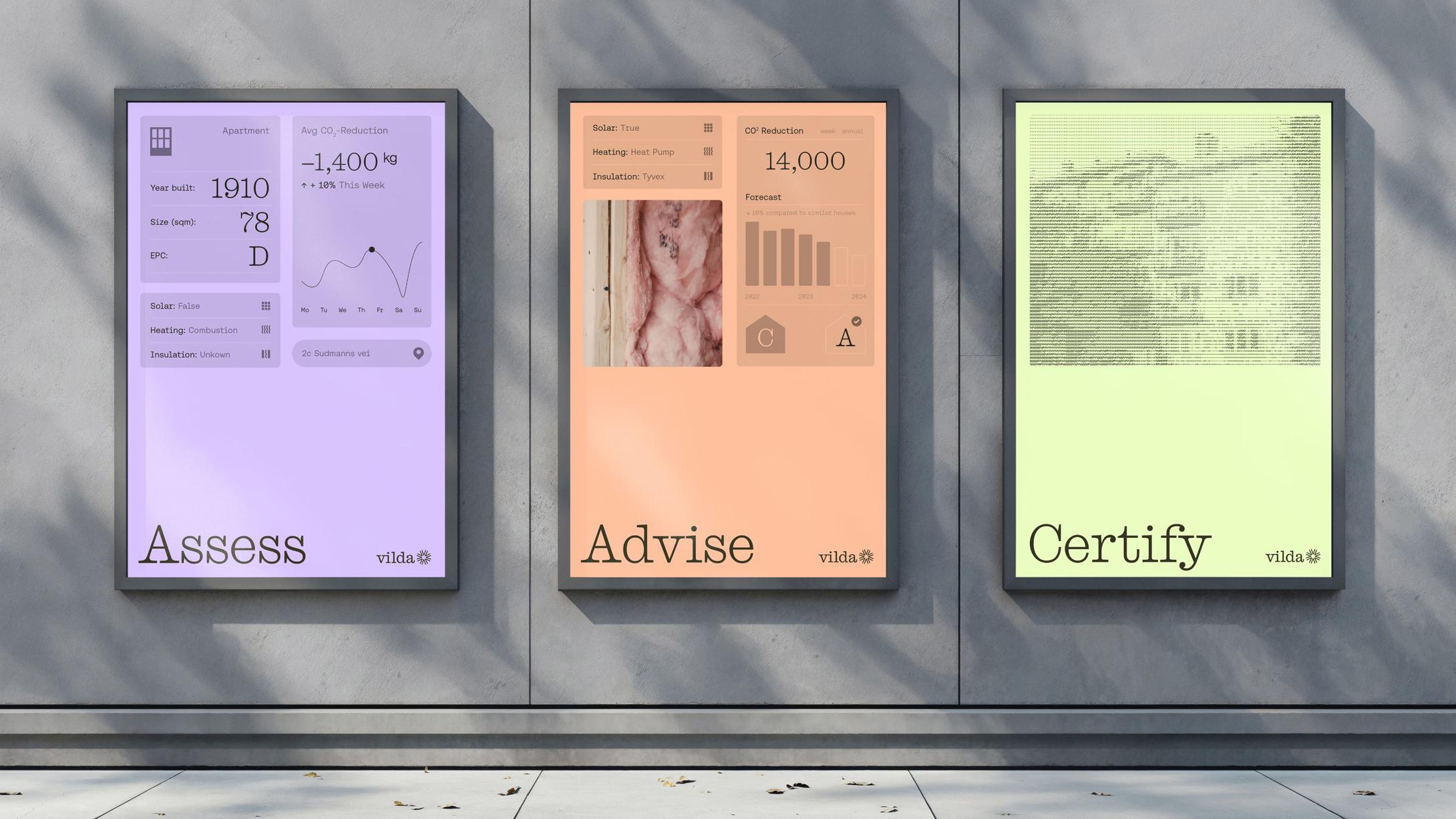
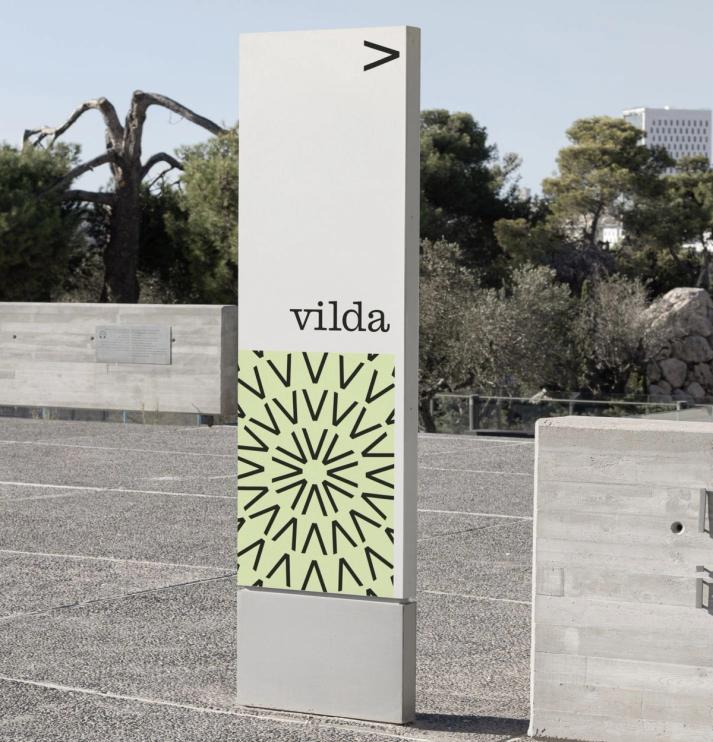
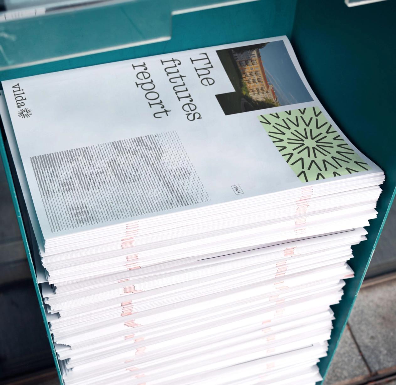
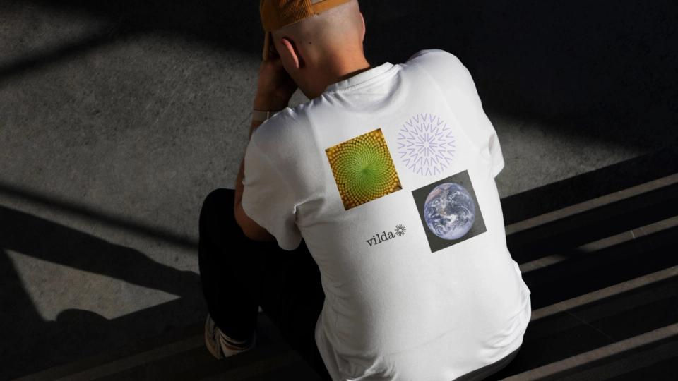
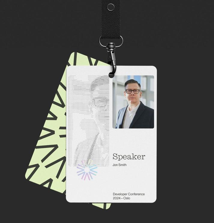
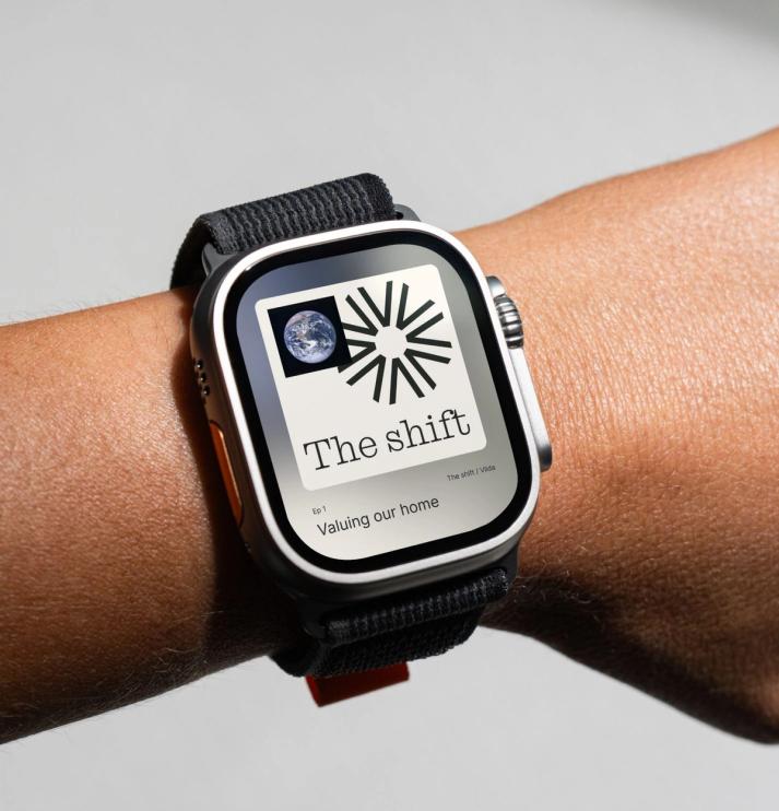
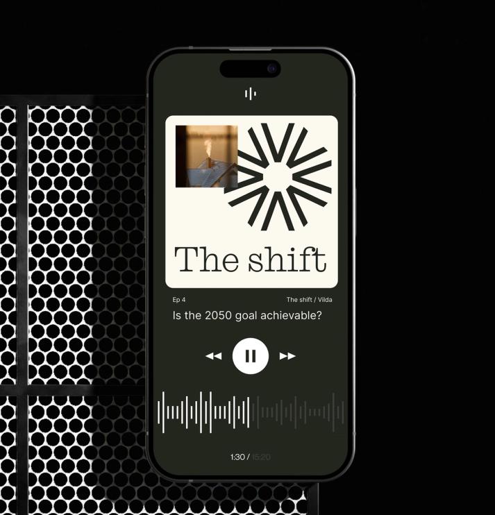
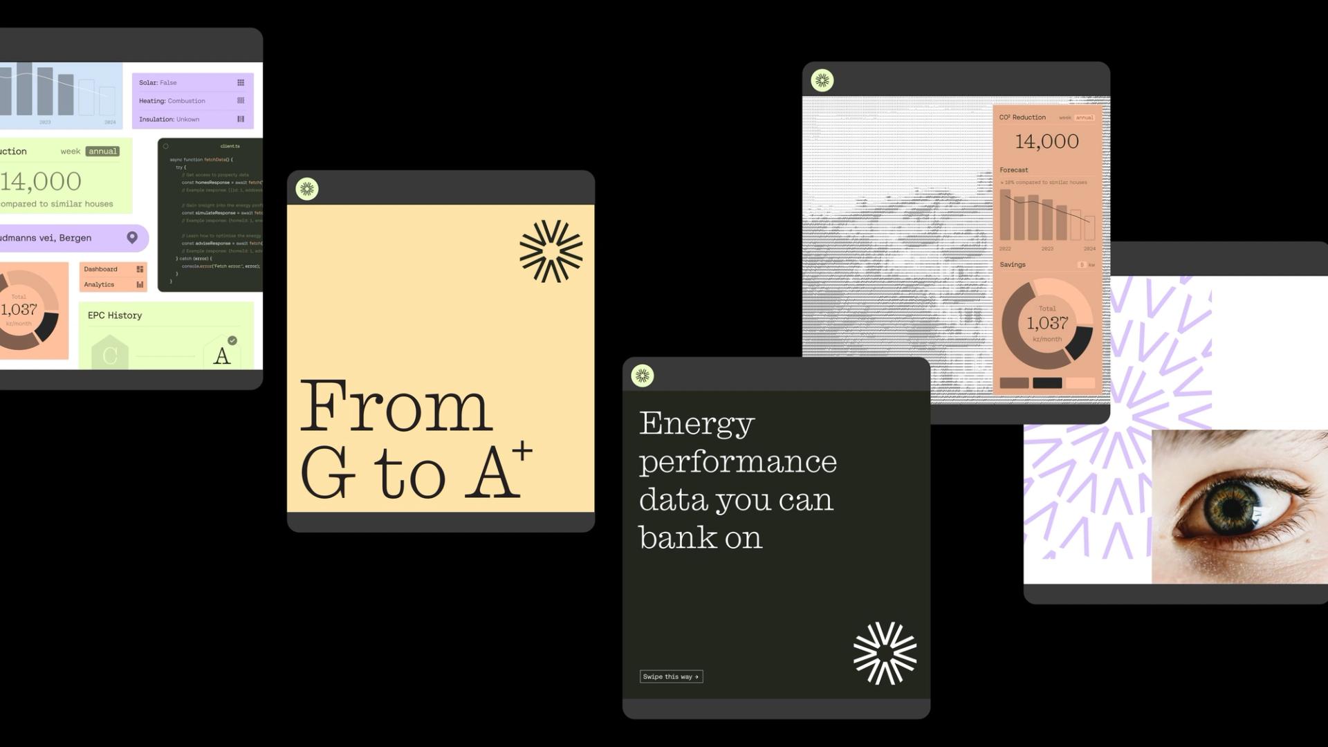
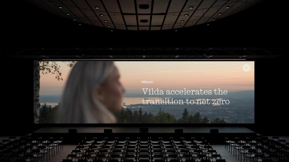
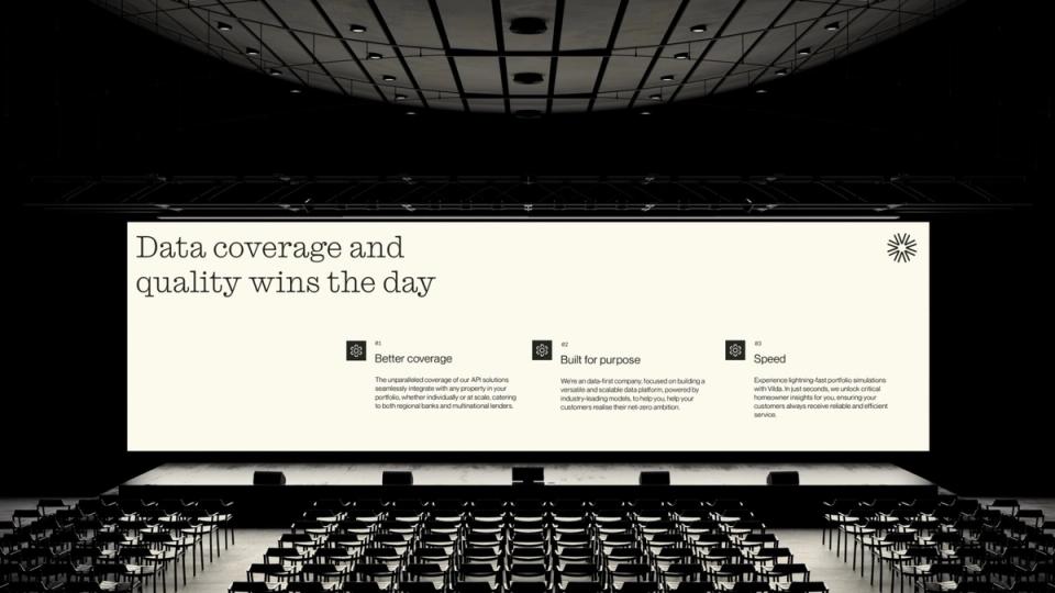
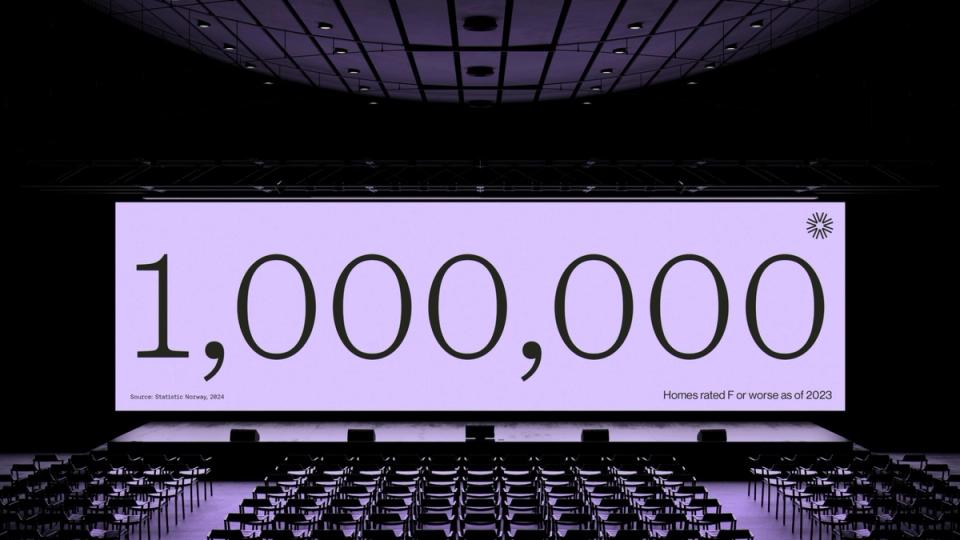
In a market full of green buzzwords and tech jargon, we chose the opposite: a brand that feels authoritative, yet warm and human. Optimistic, yet realistic. Tech-focused, yet inspired by nature.
The logo symbolises systems, rhythms and repetition, in both nature and data models. The circular form reflects Vilda's ambition to spread positive impact into new markets.
The typography combines academic confidence with editorial calm. The visual profile draws clear parallels between data-driven insight and the structures of nature, from cells to buildings.
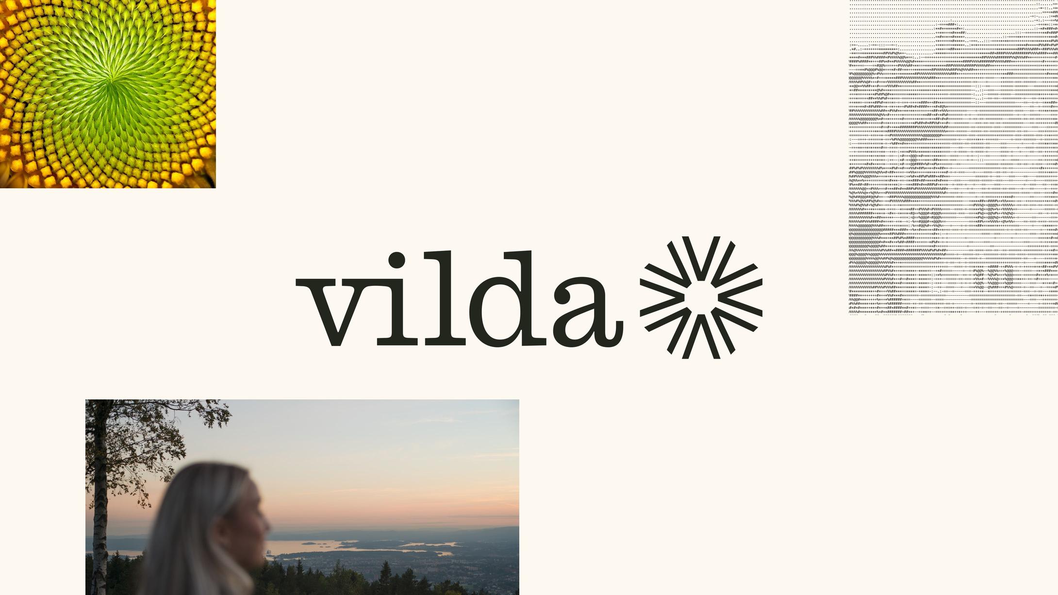
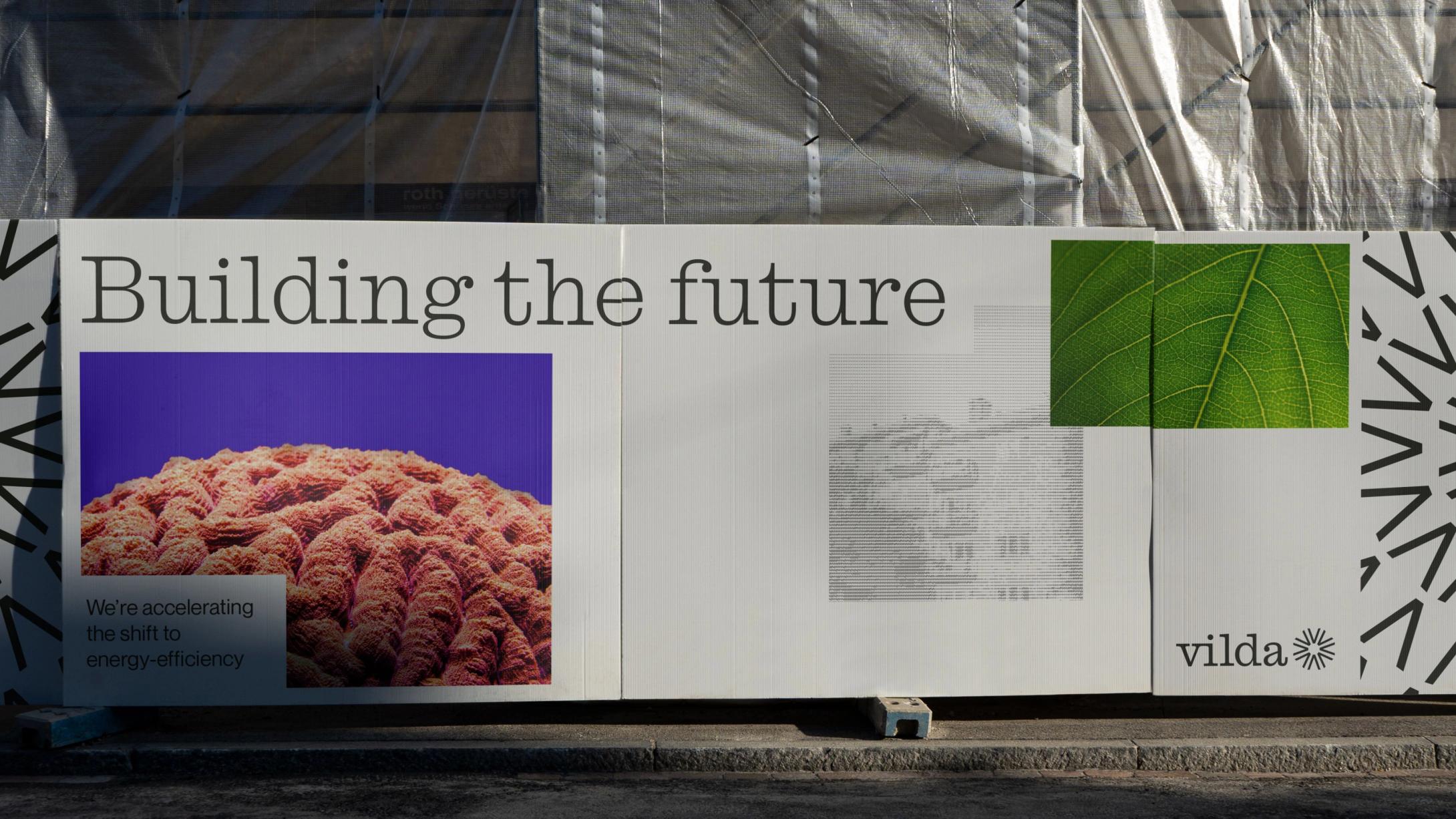
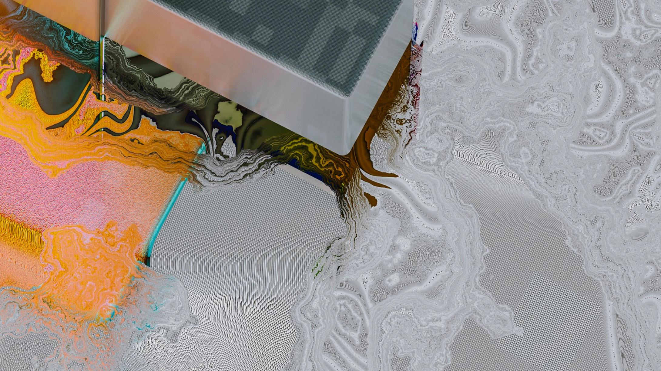
The imagery balances the micro and the macro, seeing both the details and the whole. A subtle image treatment uses elements of data structure and code, connecting the brand to the structures Vilda builds through its models.
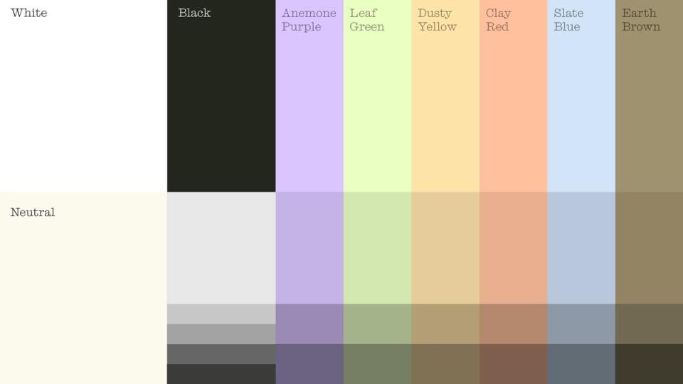
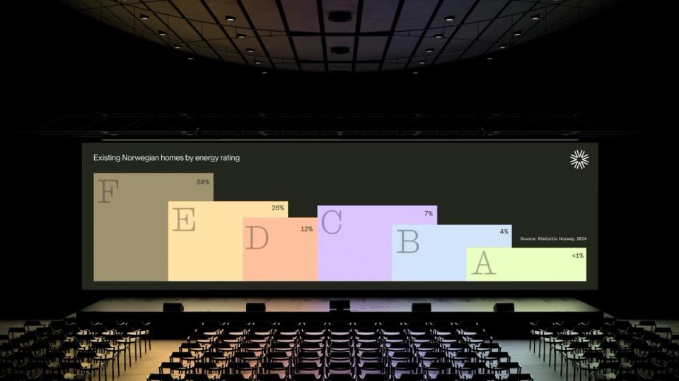
The colour palette breaks with green tech conventions, using muted, natural and tech-inspired tones. The illustration style, inspired by dashboards and user interfaces, makes it easier to explain how the platform works for financial players.
With a robust brand platform and visual identity, Vilda is well positioned for the future, in Norway and across Europe.
“To propel us forward into the next phase, the Nonspace team delivered outstanding work that truly captured the essence of Vilda as a brand. Their hands-on approach throughout meant they were able to deliver a brand platform and visual identity that both aligned with and humanised energy efficiency performance data/discipline.
“From the outset, their understanding of our challenges, constraints and needs, combined with an ego-free, open-minded and service-minded approach, made working together effortless; this, in turn, seamlessly translated into a captivating landing site and adaptable UI components for our platform.
“Working with Nonspace as a startup felt like having an extension of the team: attentive, flexible and with a high sense of ownership,” says Matthew Harrison-Raft, co-founder and former Design Lead at Vilda.