Where Life Plays
Nye Hjorten Teater is the privately owned people's theatre in Trondheim that opened its doors in January 2025. Nonspace developed the brand platform "Der livet leker" (Where life plays), visual identity, symbol, social media kit, website design and campaigns, including a recruitment campaign that drew more than 700 applications.
About the project
Nye Hjorten Teater is a newly opened folk theatre in the heart of Trondheim, offering high-quality entertainment under the playful motto “Saturday all week”. Combining bold architecture, modern stage technology, and a welcoming atmosphere, the theatre presents a wide-ranging program of musicals, comedy, drama, and family shows. Founded by Ole Robert Reitan in collaboration with Mads Bones, Kyrre Havdal, and Olve Løseth, it builds on the legacy of Trondheim’s original Hjorten Theatre while creating a vibrant new cultural hub for the city.
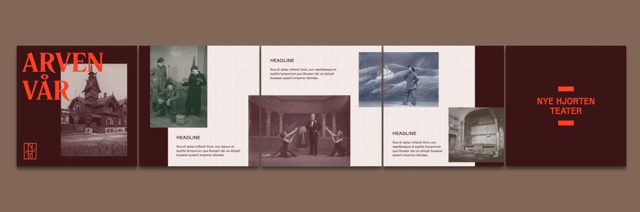
When the doors open at Nye Hjorten Teater in January 2025, the historic spirit of 19th-century variety theatre and the legacy of Olga Topp come back to life. The theatre aims to reach a broad audience with a varied programme that includes entertainment, musicals, comedies, farces, family shows and classic dramas. In other words: the full spectrum of emotions.
The privately owned people’s theatre, founded by Ole Robert Reitan, approached Nonspace to build a new brand. The goal was to develop a brand strategy, visual identity and communication strategy that would meet the expectations for the opening and ensure continuous renewal and growth.
With an entirely new team at Nye Hjorten Teater, it was crucial for everyone to take part in exploring and shaping the theatre’s future. Through a comprehensive brand workshop, we worked with the team to define the theatre’s vision and ambitions. These were brought together under the brand platform “Der livet leker” (Where life plays), with the aim of enriching Trondheim with new and exciting cultural experiences.
It is an art to create an identity that is flexible, consistent, and adaptable to various contexts without losing integrity. Nye Hjorten Teater faced the challenge of balancing creative expression with organisational structure. The identity needed to be a framework that embraced and highlighted the creativity and excitement that would unfold within the theatre's walls. This involved establishing a brand architecture that could scale, adapt, and resonate with a broad audience, from cultural connoisseurs to the culturally curious.
Nye Hjorten Teater aims to contribute to Trondheim’s cultural and economic development by creating attractive jobs and cultural offerings that appeal to residents and visitors. The discussion around the theatre’s role in society and declining audiences is a general issue for theatres across Norway. However, Nye Hjorten Teater has a clear ambition to put Trondheim on the map as a destination for theatregoers. The theatre must therefore stand out and create a space where a broad audience can feel at home. This means offering spectacular shows and a wide range of performances, from stand-up comedy to scientific lectures, creating a physical meeting place: a refuge from the hustle and bustle of digital life.
Nye Hjorten Teater is to be a house of entertainment, a fabulous fever dream that brings culture and emotions to the people through laughter, tears, fantastic theatre and entertainment. Through unique stage experiences, magical moments and unforgettable memories, Nye Hjorten aims to be a refuge where good memories and experiences are made. By developing Nye Hjorten’s brand story, we landed on the concept “Der livet leker” (Where life plays), which captures the theatre’s grand ambitions and down-to-earth tone.
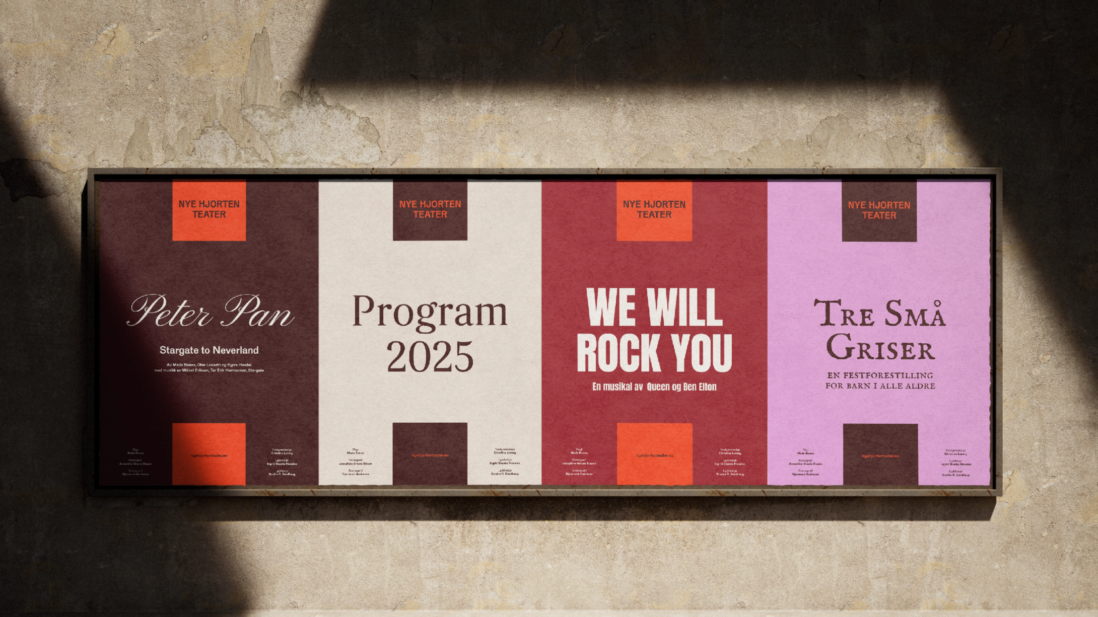
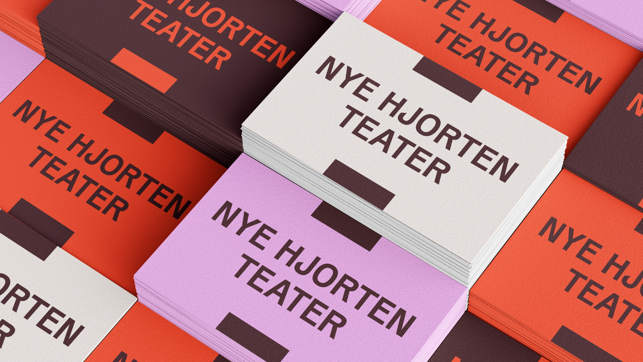
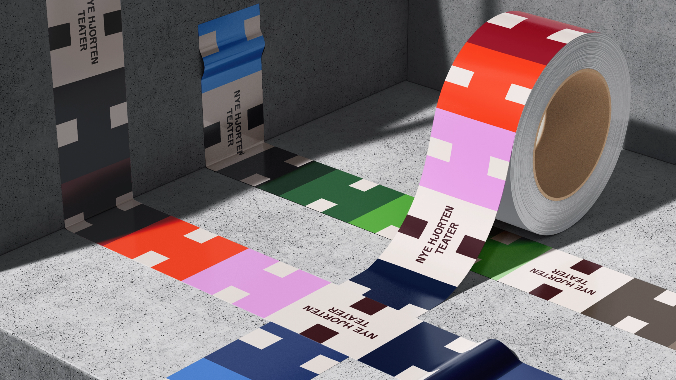
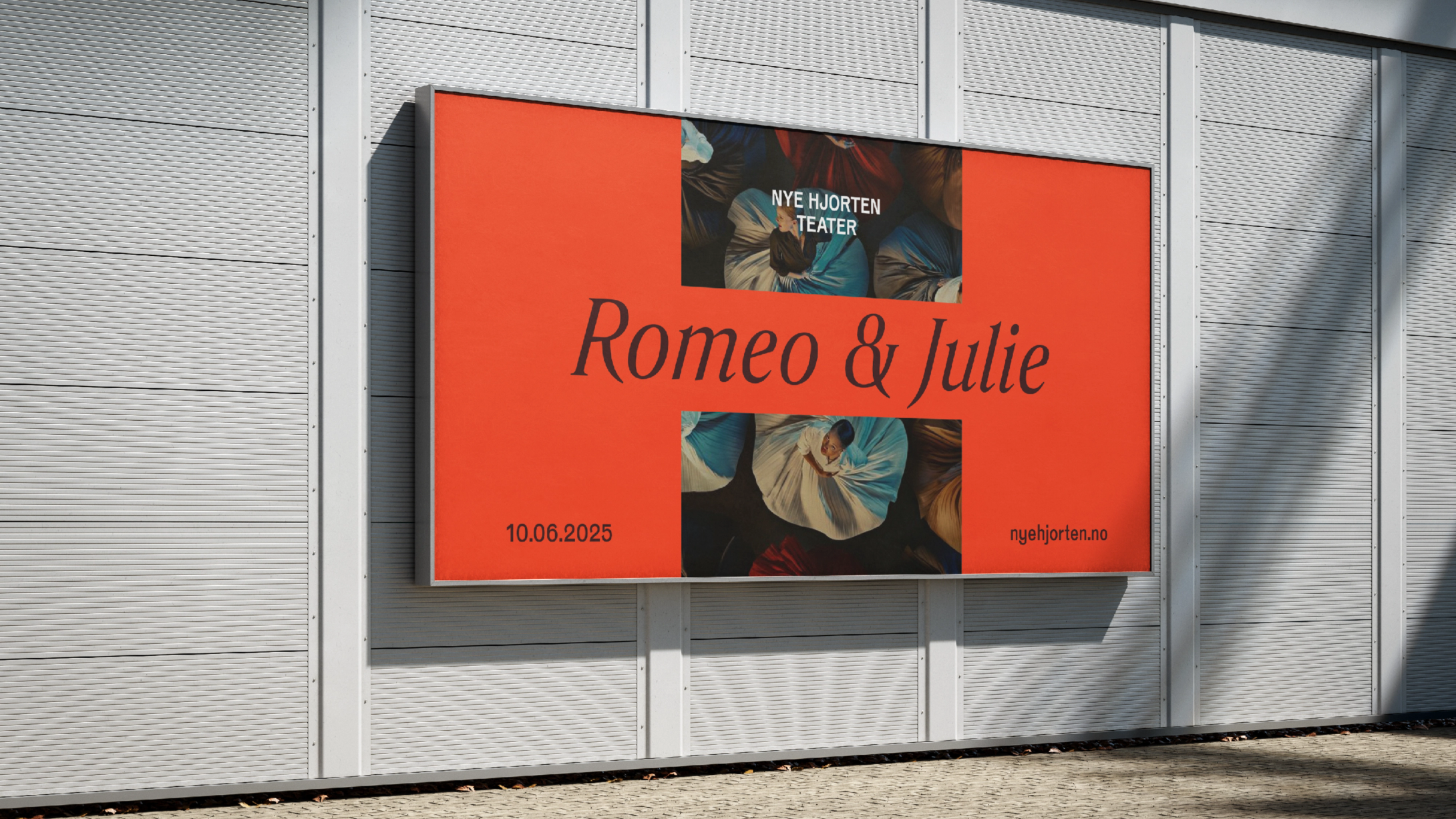
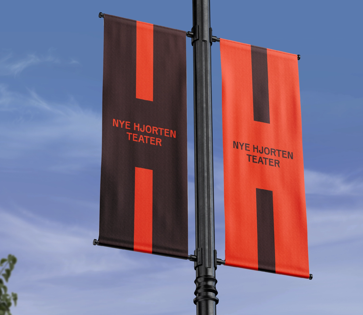
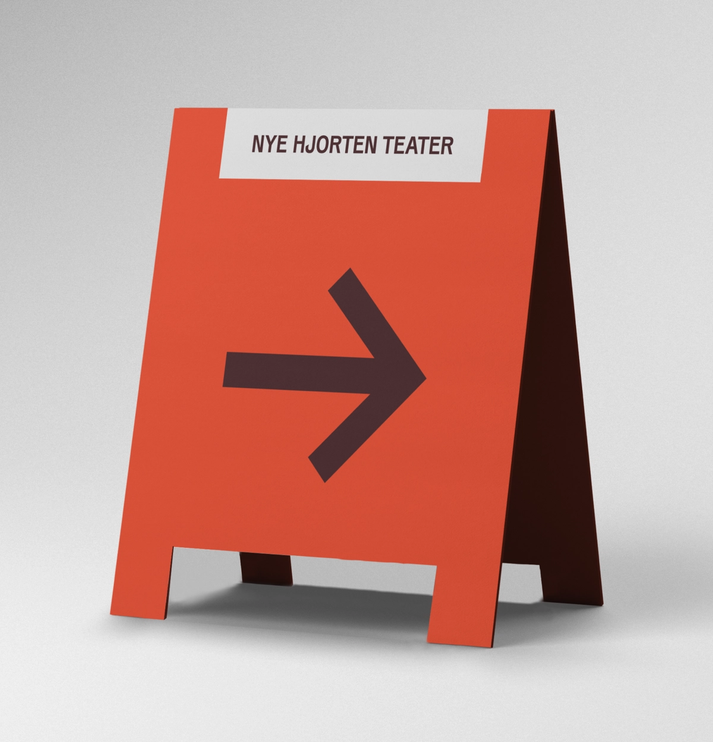
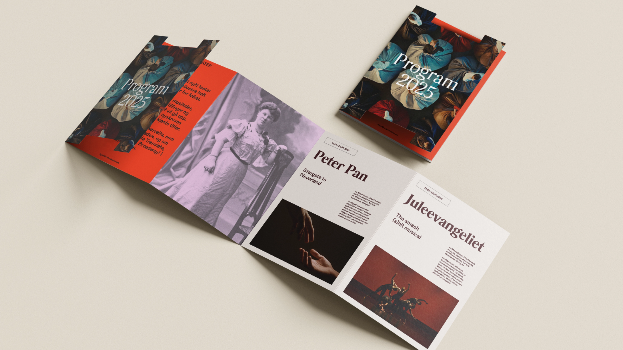
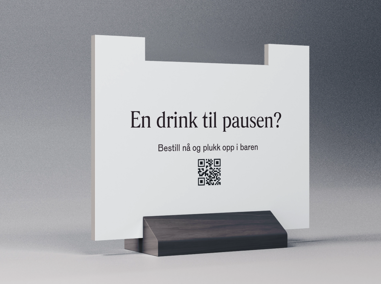
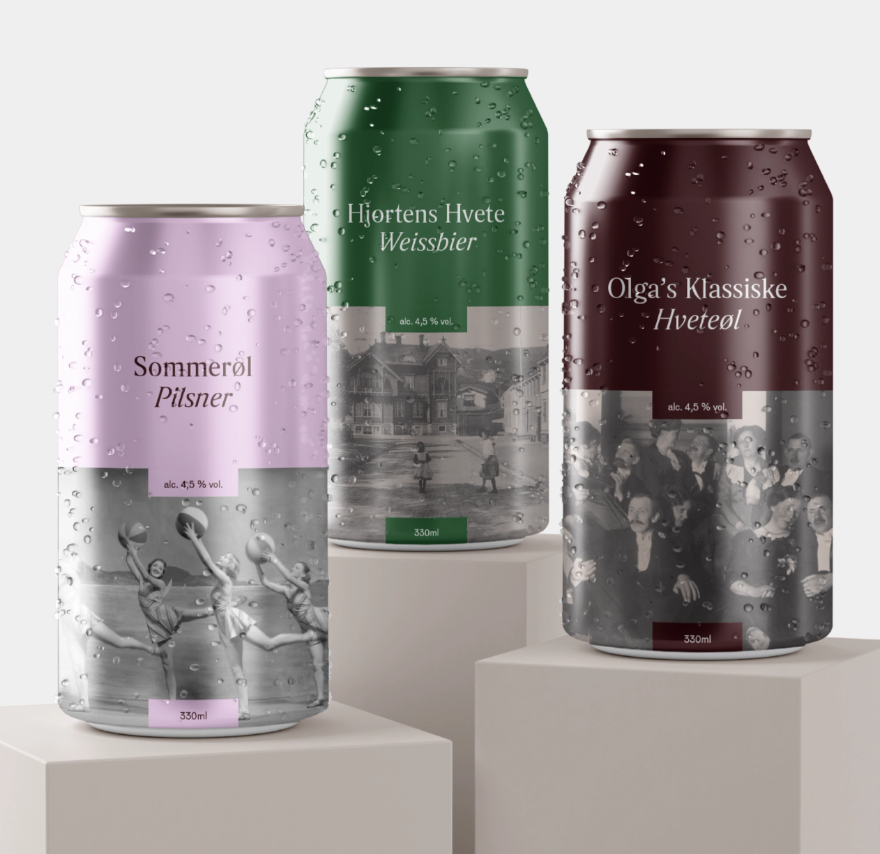
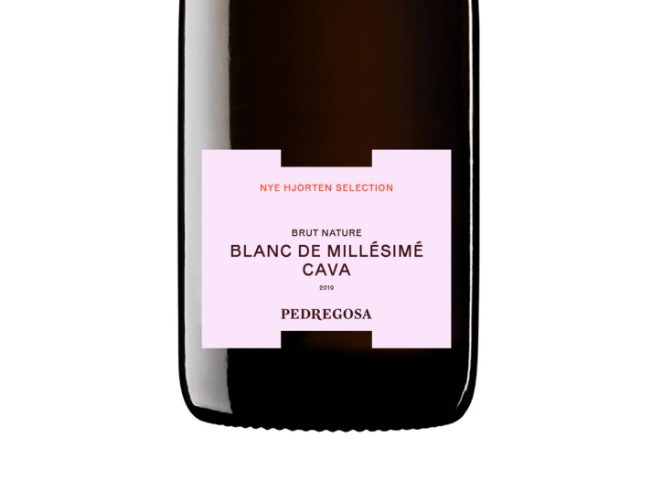
The goal of Nye Hjorten’s identity is to create a stage where different creative expressions can unfold, with the ability to adjust the level of visual intensity within the brand. The communication strategy lets the medium or format act as the “stage”, where the identity becomes a framework for any creative endeavour. We developed two identity boxes that together create the negative space of an “H”. We also made room for experimenting with different fonts for different performances, so each show can have its own mini-identity within Nye Hjorten’s visual framework.
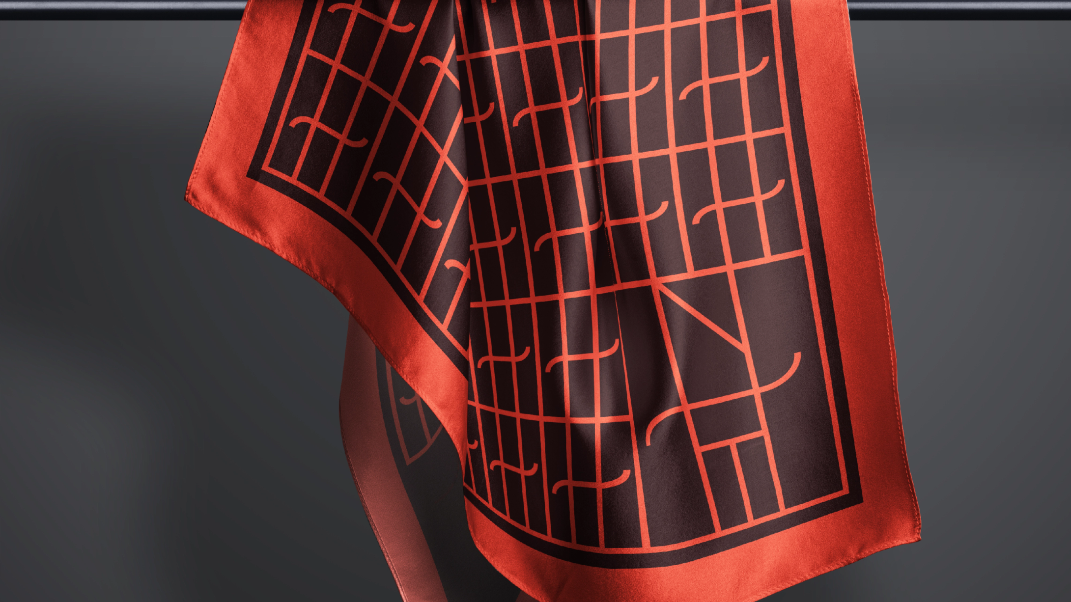
In addition to the logo lock-up, we developed a symbol for the theatre. This playful symbol incorporates Nye Hjorten Teater's letters, a reinterpretation of the classic tragedy and comedy masks often associated with theatre, and the Trøndersk moustache!
The primary colours position Nye Hjorten Teater as a player in entertainment and culture. The red colour represents the theatre as the city's beating heart, a pulse that throbs in the centre and reflects the theatre's exterior.
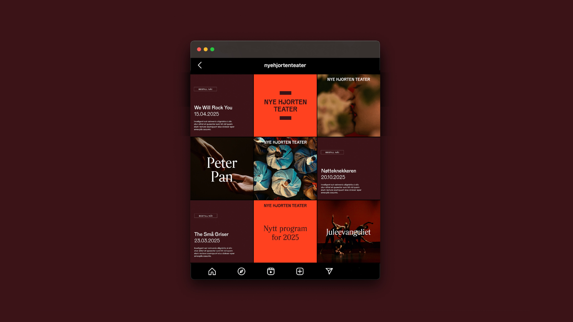
Alongside brand development, brand story, visual concept, and a new visual identity, we also created a social media kit, website design, a user-friendly communication strategy, and various creative campaigns to promote Nye Hjorten Teater externally.
We ran a recruitment campaign that resulted in more than 700 applications, and we developed the launch campaign for the opening show Peter Pan – Stargate to Neverland, from idea to creative communication. Through edgy and slightly “cheeky” art direction, we created an exciting visual video and photo universe with a narrative highlighting Trondheim as a cultural destination and Nye Hjorten Teater as the city’s new and exciting stage. We wanted to create a genuine sense that something magical was about to happen, spiced with nostalgic references to Peter Pan, the theme of the show.
Building visualisation: Skibnes Arkitekter AS
Film production and special effects: Helmet
Sound: Nye Hjorten Teater
Would you like to know more about this?
Reach out to the team, we're happy to answer questions, receive feedback or discuss the topic.

Relevant cases
A House of Influence since 1870
23 Roads to UEFA Women's Euro 2025
Framing the Extraordinary