Always Forward
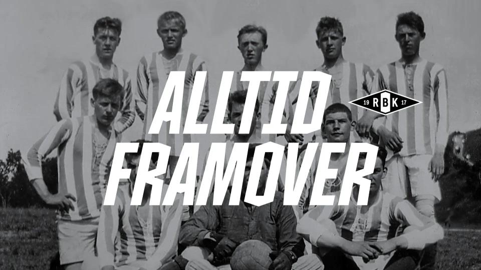
Rosenborg Ballklub, Norway's most successful football club, needed a clear direction for the future. Nonspace developed the club strategy "Always Forward", a new visual identity, design system and bespoke typeface, Rosenborg 1917, and has since followed up with communication, kit launches and a digital annual report.
Highlights






About the project
Rosenborg Ballklub is a Norwegian football club, based in Trondheim and founded in 1917. With a record number of league titles and a strong tradition in European competitions, Rosenborg has long been a central figure in Norwegian football. The club plays its home matches at Lerkendal Stadion and is known for its deep roots in the local community, strong supporter culture, and commitment to developing talent both on and off the pitch.
Honouring the club's rich past whilst ensuring the brand is ahead and relevant for the next generation, we've created a strong identity, an exciting visual world, a long-term graphic system and developed strategies and communications that will live both on and outside of the pitch.
For a brand with long traditions and a lot of pride in the past, it was important to shift the focus to the future. Rosenborg has a strong history, and is Norway's largest and most successful football team. That history needed to be honoured and preserved, but also challenged, to ensure the club did not rest on the laurels of the past. Many supporters remember the glory days, while the next generation of supporters do not have this relationship with the club. Rosenborg is also more than the merits of the men's team. As a brand, Rosenborg today represents several teams, a thriving women's team and greater diversity on the football field.
As a leading football club, you have to be proactive and challenging to stay relevant, and to innovate in a rapidly changing cultural and media landscape.
For a brand characterised by short-term design solutions, quick passes and organisational changes, it was important to identify the true DNA of Rosenborg, and create a strong brand, both strategically and visually to take Rosenborg into the future.
Rosenborg is more than just a football club; it is a movement that unites, engages, and inspires. With its significant role both on and off the field as a backdrop, the club, in collaboration with Nonspace, has developed a new brand strategy and visual identity. The new identity reflects Rosenborg's dedication to inclusion, diversity, and community engagement, while also preserving the club's proud heritage.
Football is culture, so we believe it is important for a football club to “play above the game”: to live beyond the pitch and have a presence both on and off matchday.
The new strategy focuses on moving forward together, as a community, as one club, to make a difference:
For everyone: We are a club for everyone and open doors for inclusion and diversity. We believe in the power of community and our role as a flag bearer for Trøndelag and Central Norway.
Engage: We get involved in society through a responsibility to make a difference. By taking our social responsibility seriously, we create a sense of community.
Excite: We excite and entertain through football, but also through collaboration and content that excites our supporters.
Move: Rosenborg is more than just a football club. We believe in moving forward together to make a difference as a community and a club. We are a movement that represents the people of Trondheim and Trøndelag.
Rosenborg's brand strategy is a fundamental building block for the brand. It is found in all parts of the organisation's work to ensure that people see, hear, support, and use the brand. Further, it is a management tool that can open up many opportunities to examine everything that Rosenborg does, and how they will work together to make a difference going forward, both internally and externally.
Strategically, it is about crossing the greatest stories with the most important touch points between Rosenborg and our community. This means being able to master many types of narratives, platforms, surfaces, and challenges. Their purpose is at the centre of everything: “Creating an unstoppable team, always moving forward.”
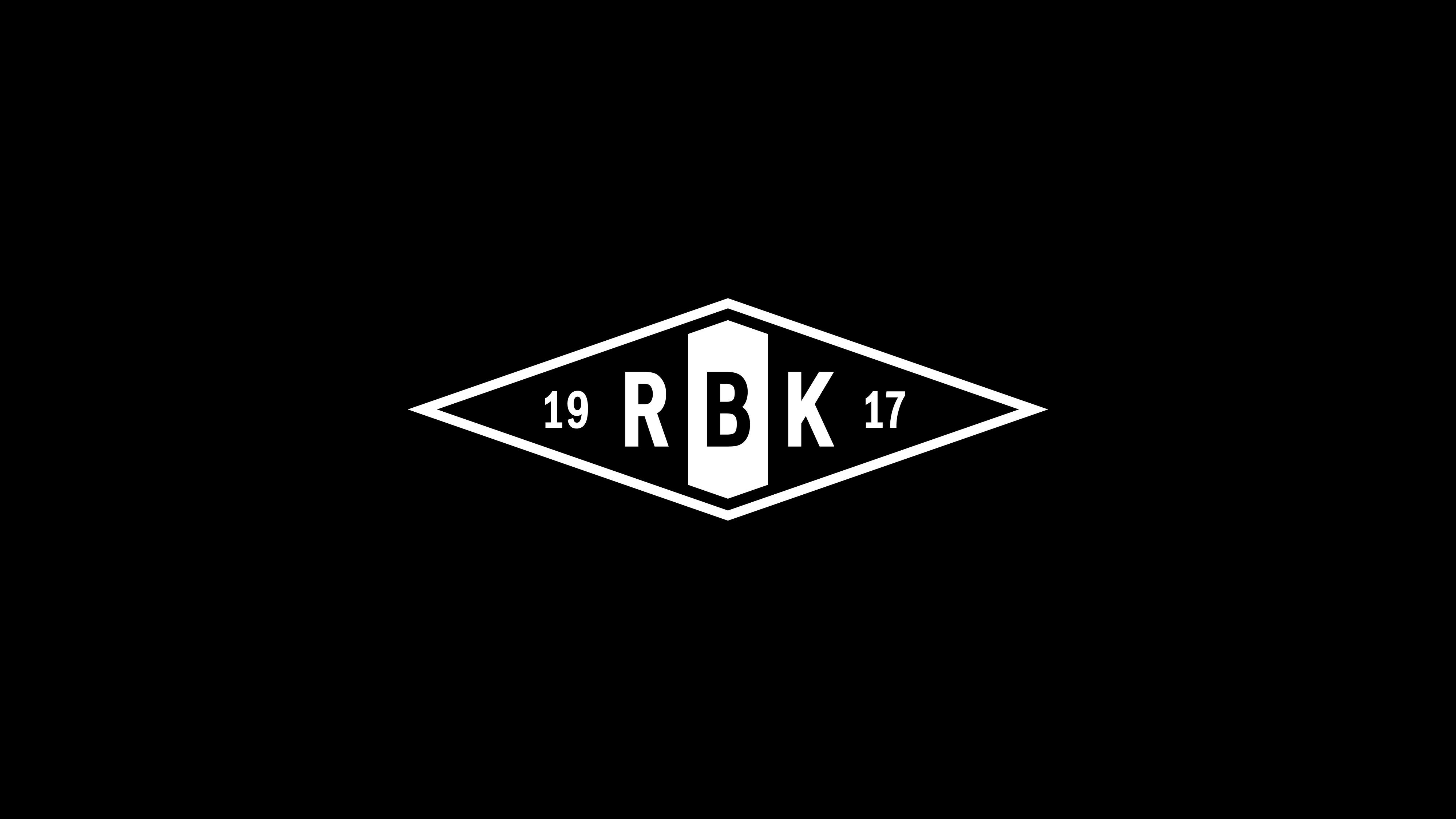
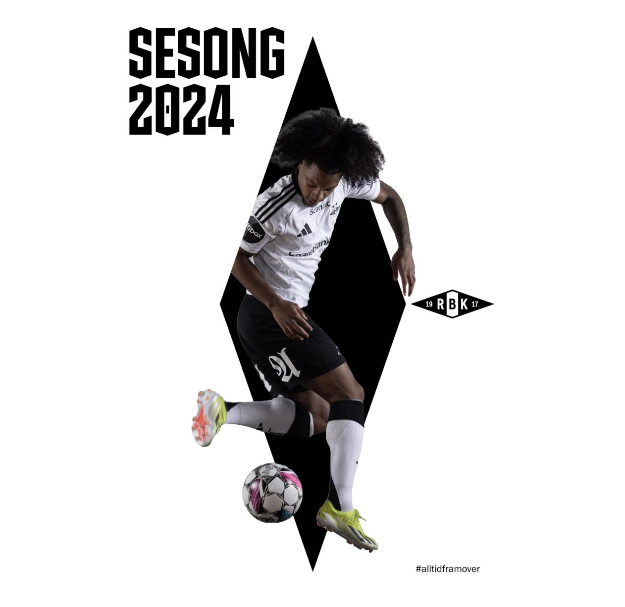
Rosenborg's newly designed logo is a redesign of the original, with minor corrections in details and angles. The outer diamond shape follows the concept of active angles of 19.17 degrees, a tribute to the year Rosenborg was founded.
We adjusted the inner numbers and letters for better scaling of the logo. The two outer lines in black and white that make up the diamond shape have the same thickness in the newly drawn logo, allowing it to be used effectively in black and white, as with the original logo.
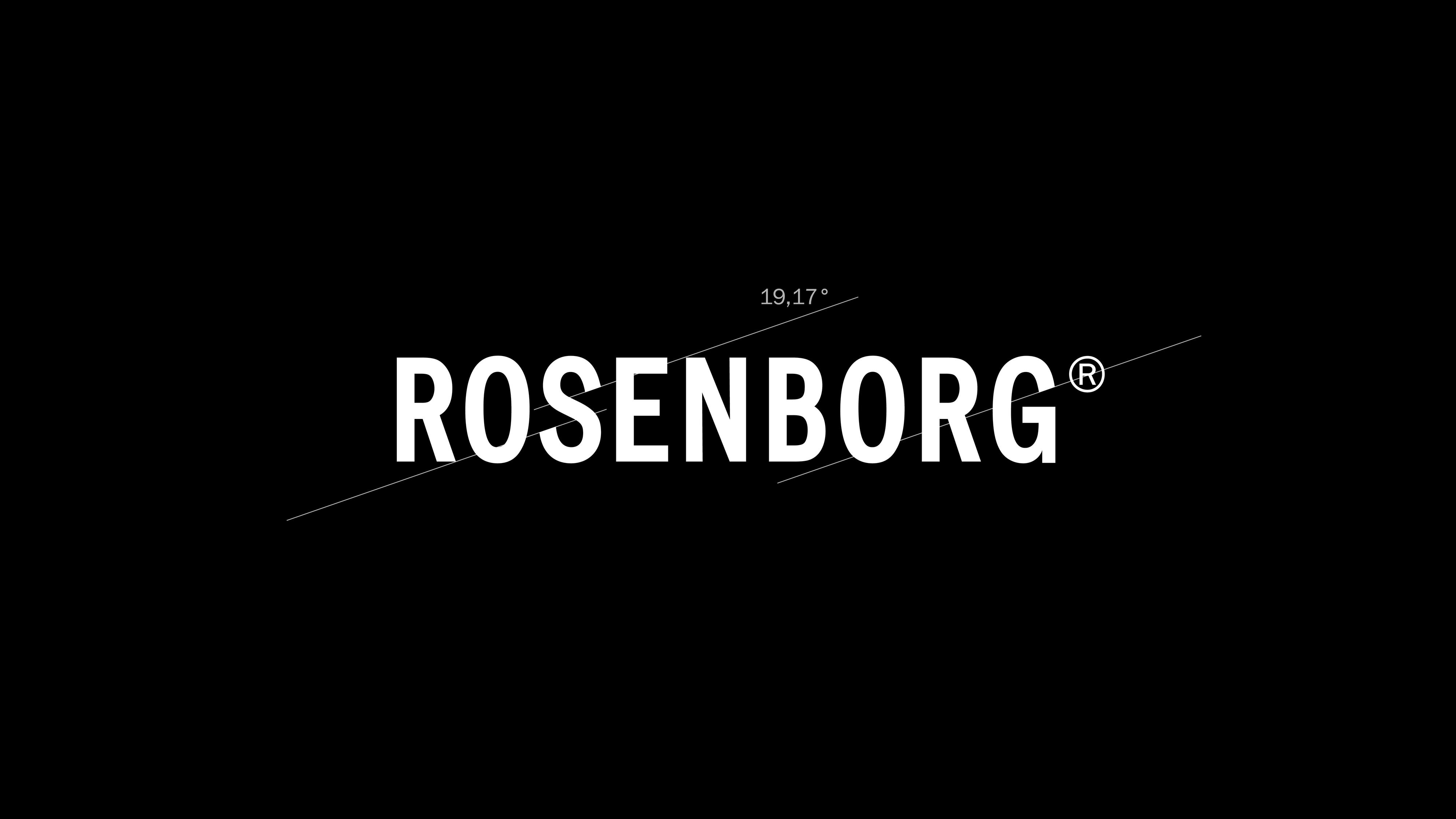
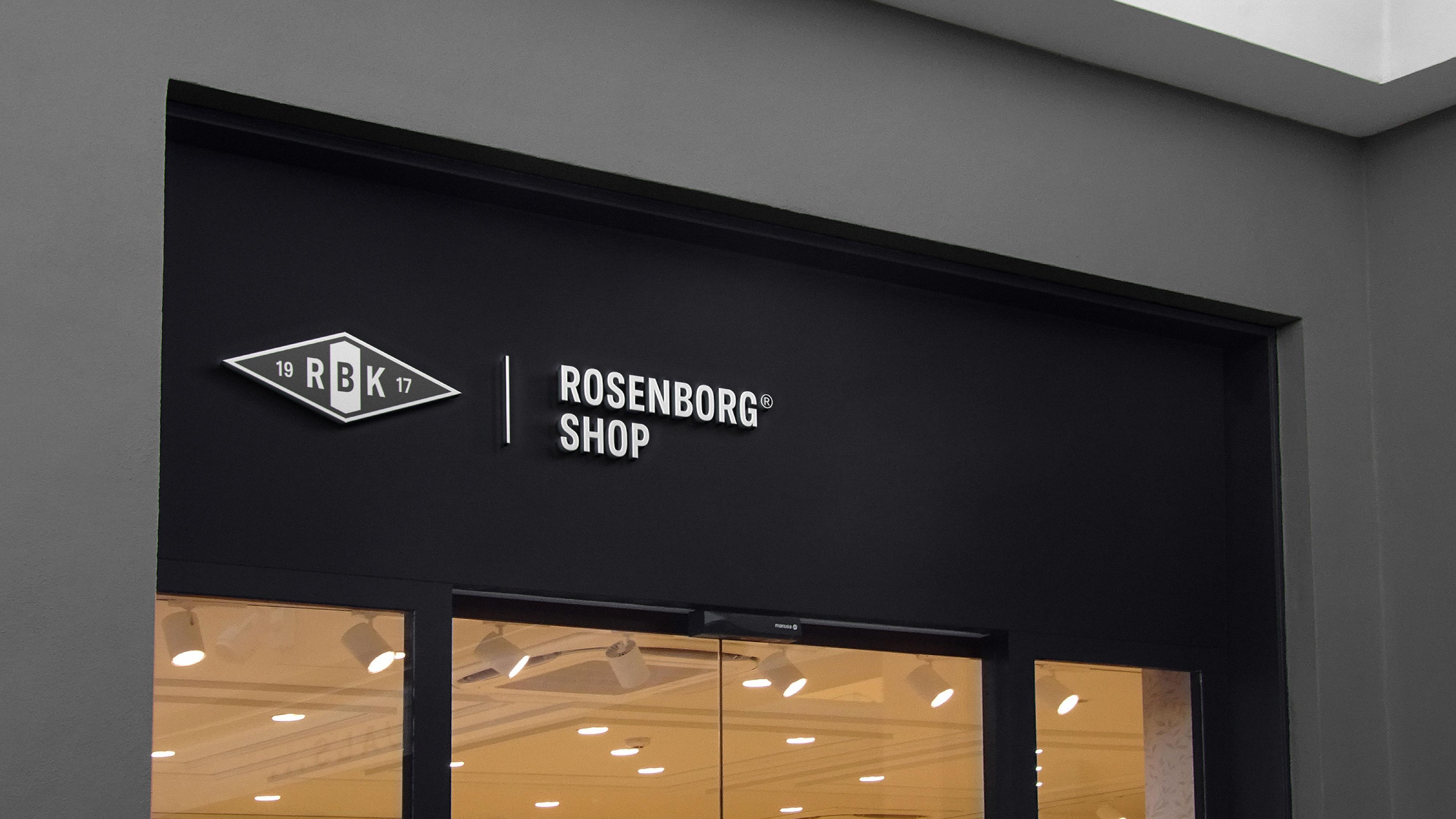
The Rosenborg wordmark is spelt out in capital letters in the same typeface as inside the logo symbol. We have developed a logo lockup with the wordmark and a more comprehensive brand architecture for sub-brands and partnerships.
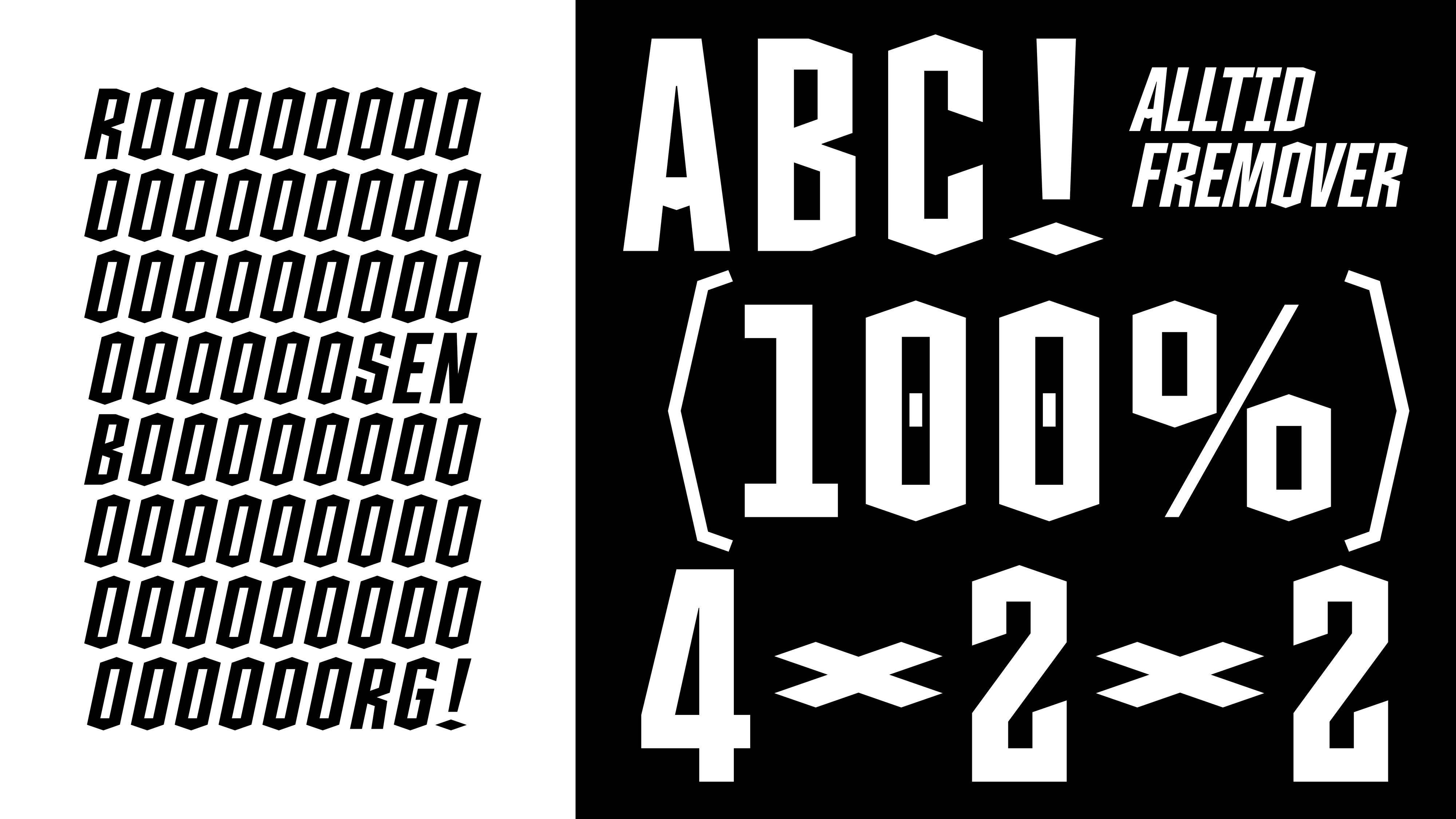
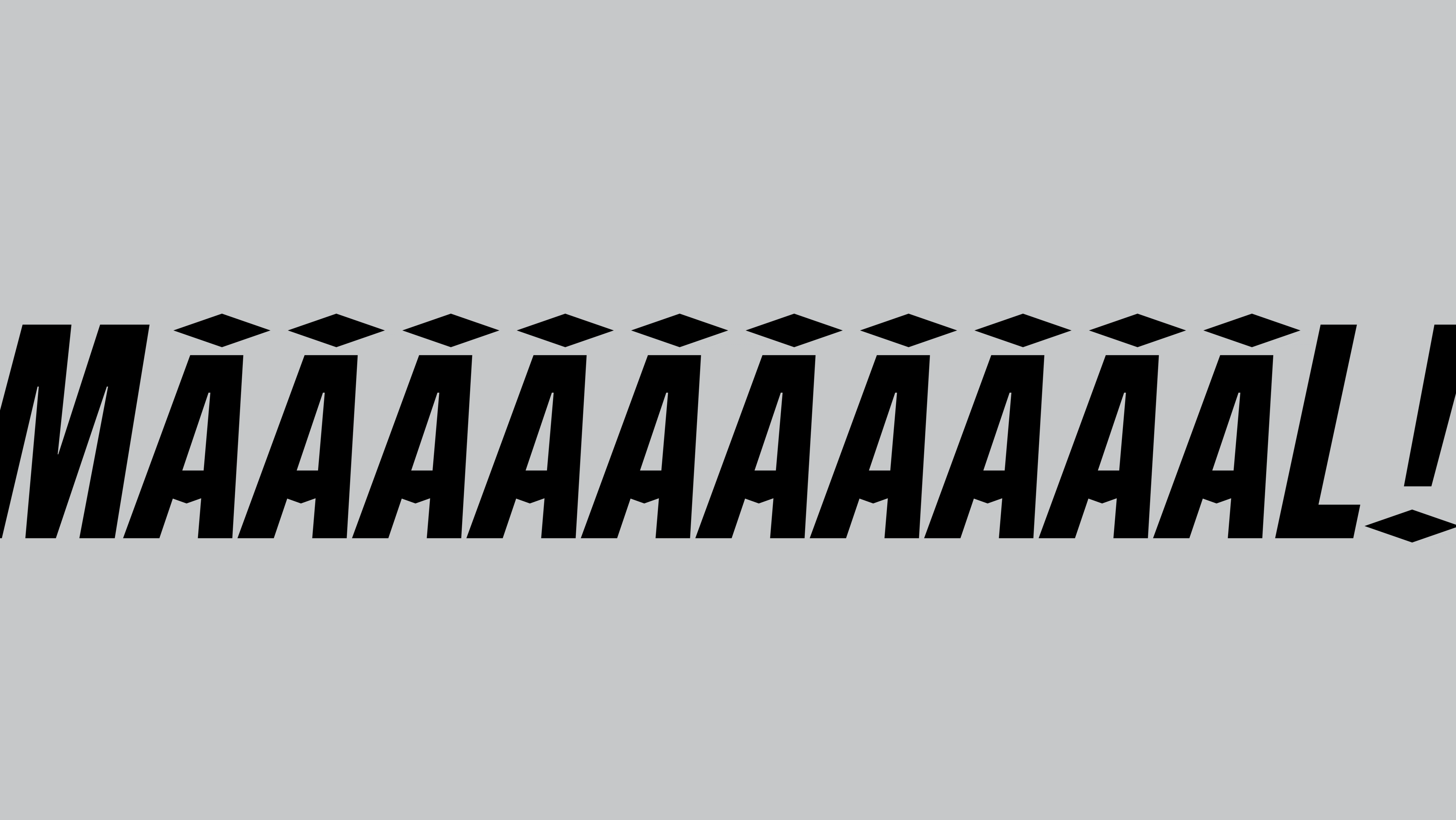
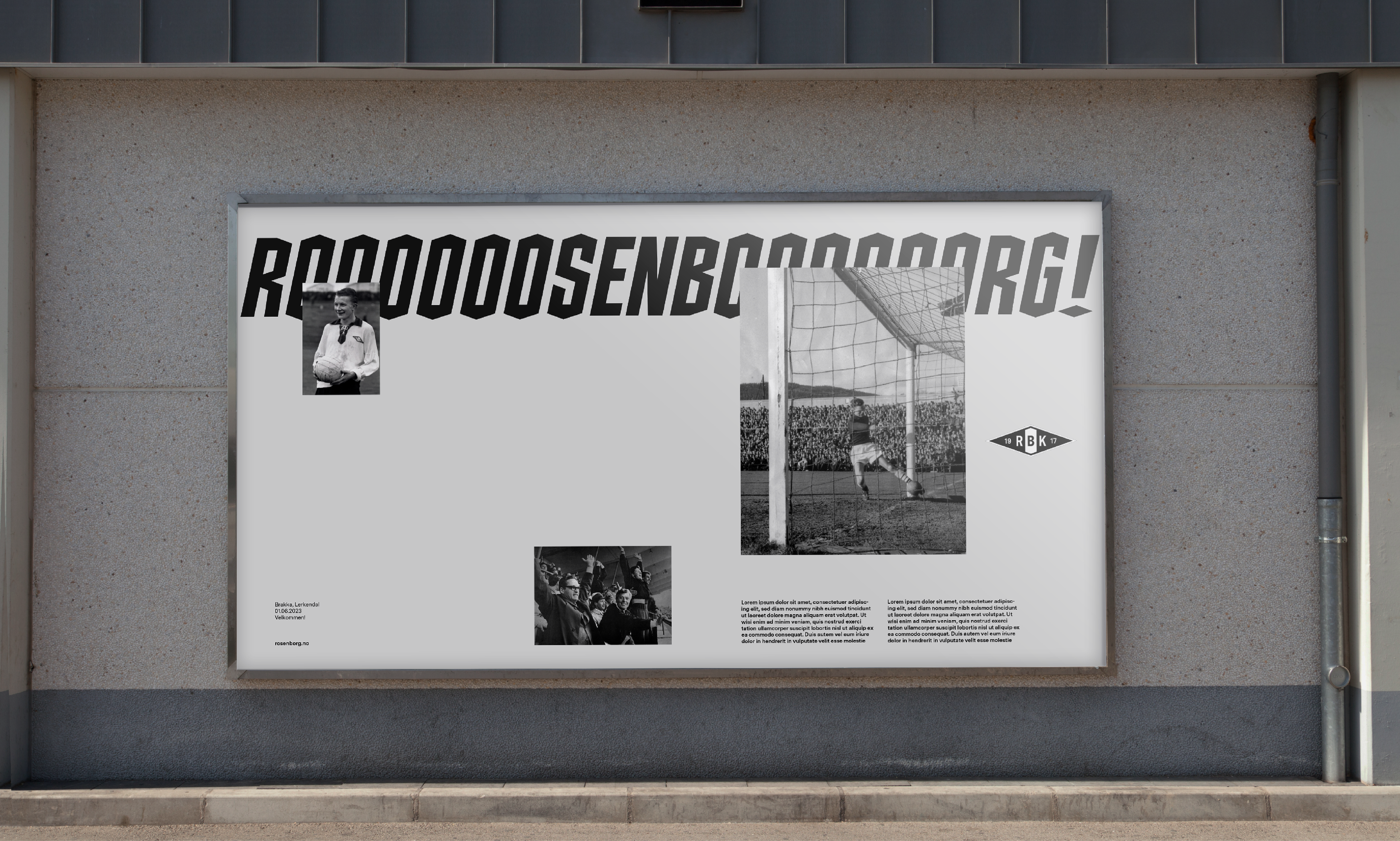
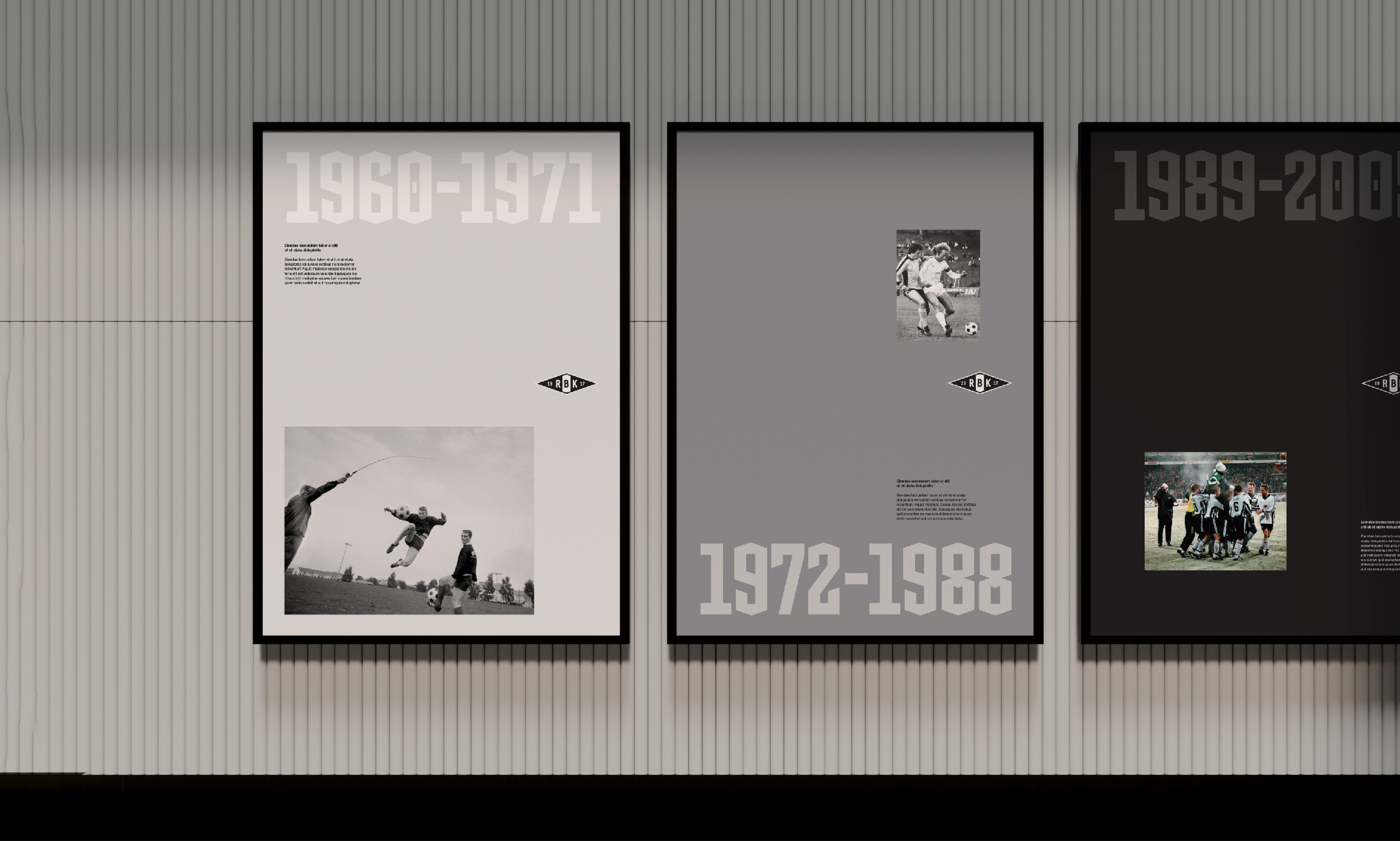
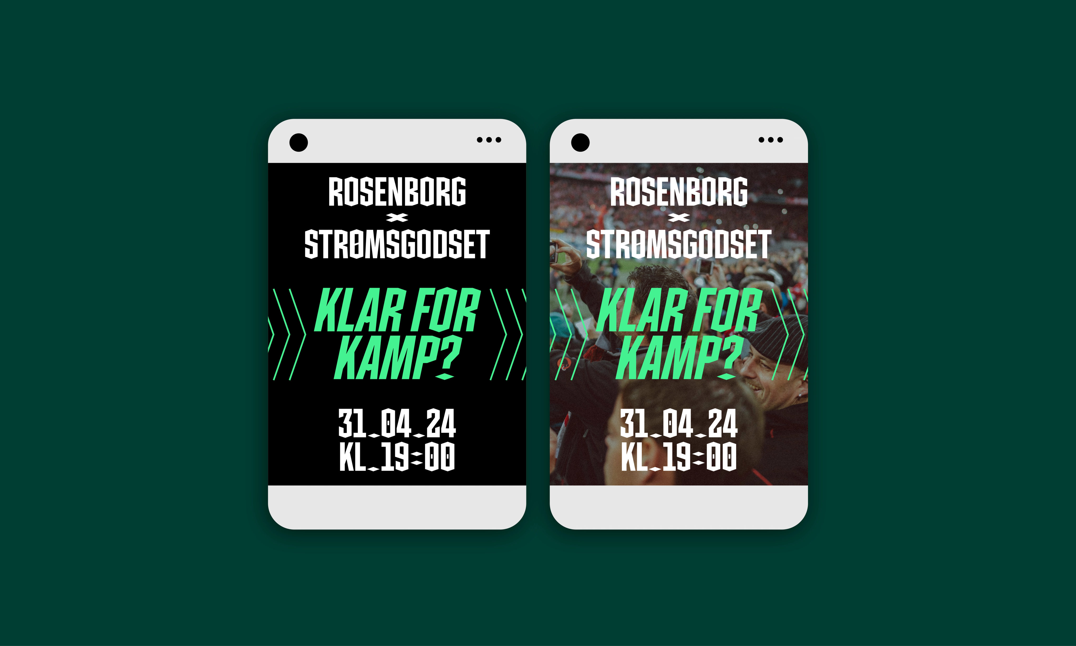
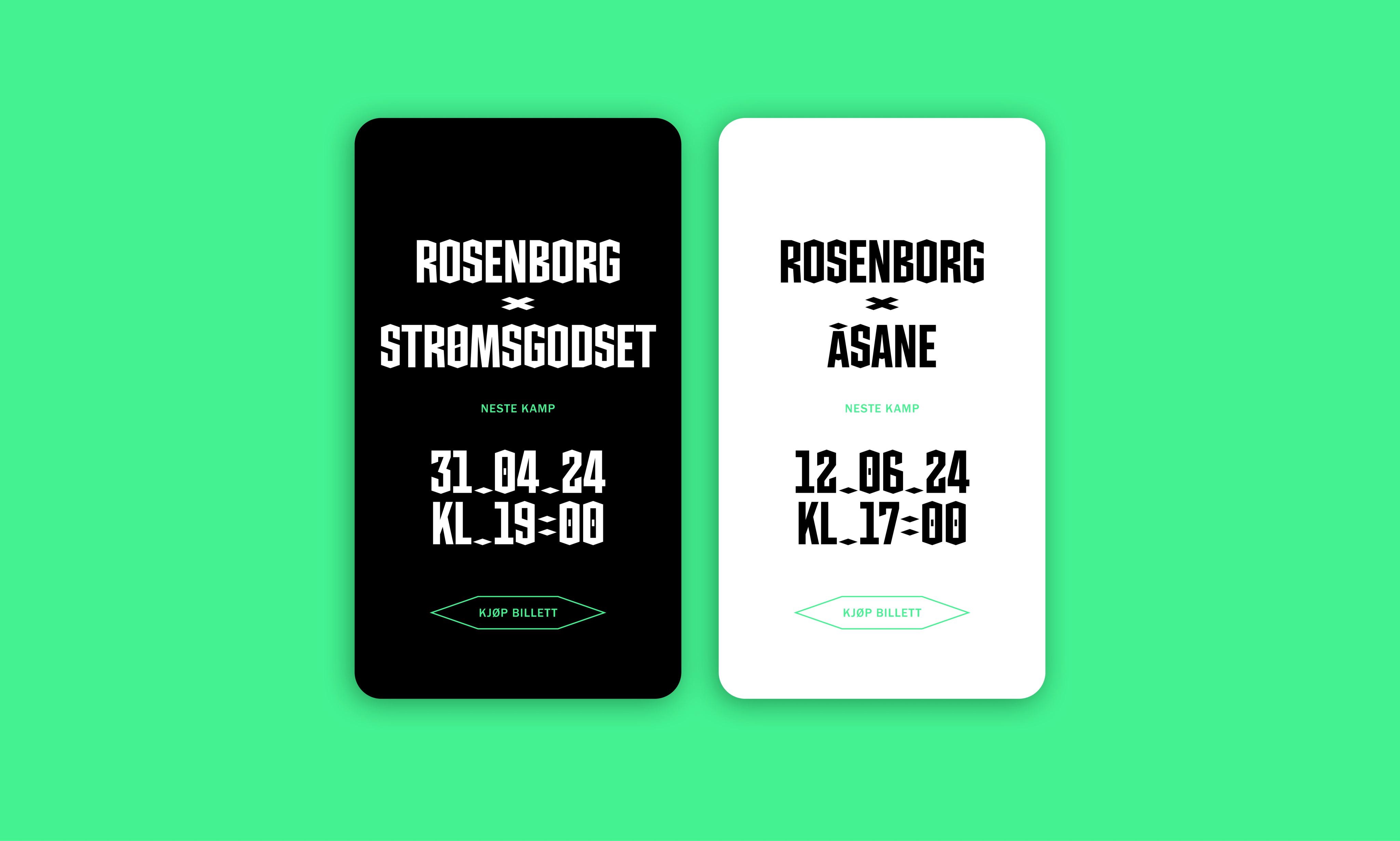
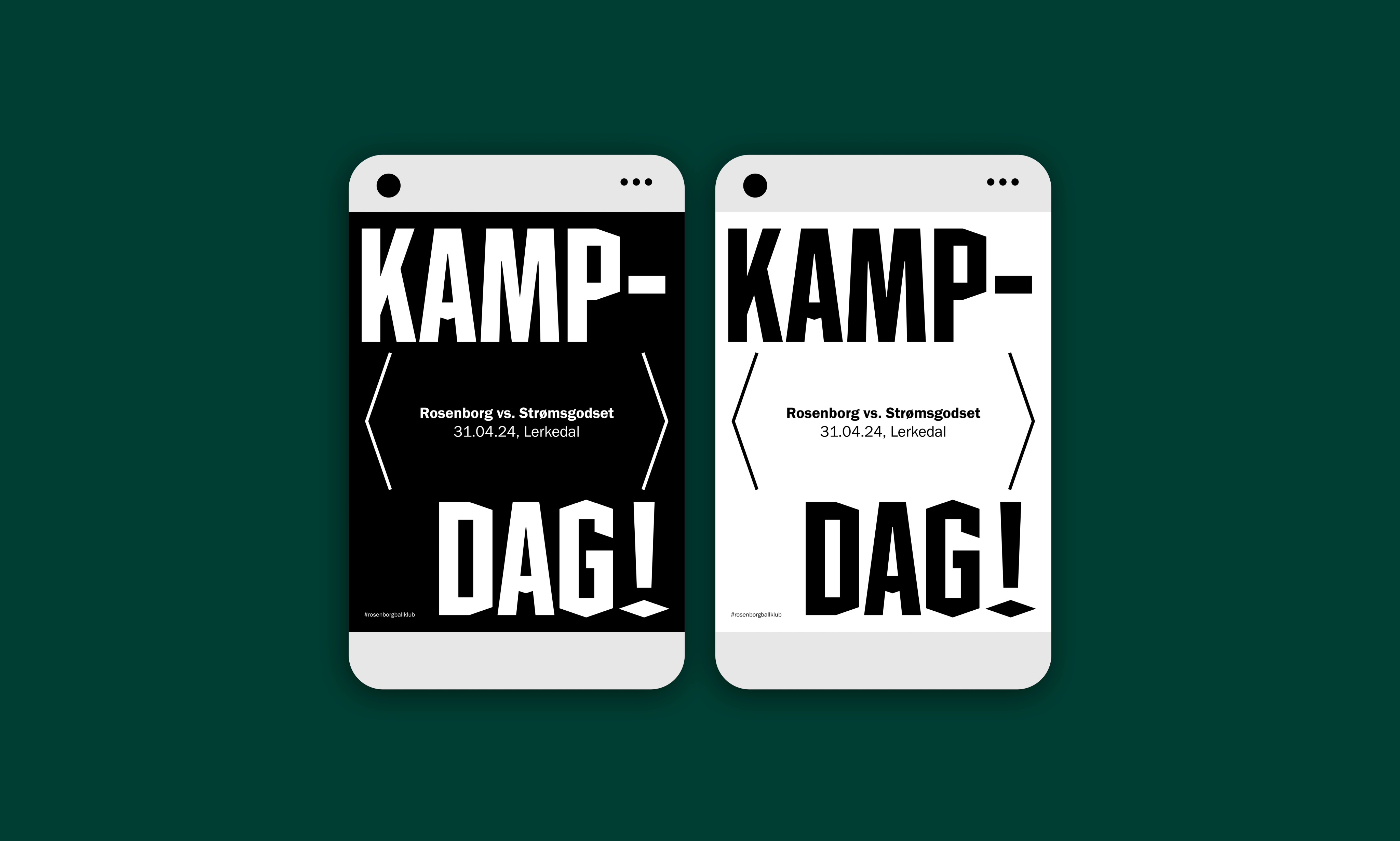
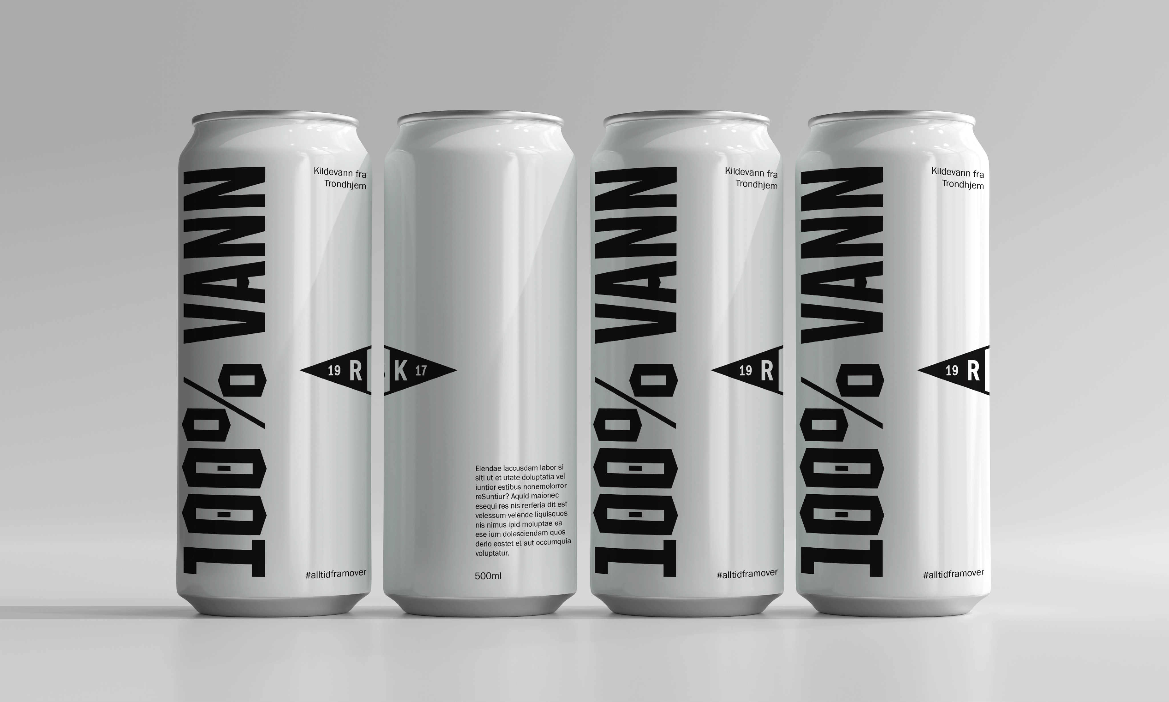
The club now has its own bespoke font, named “Rosenborg 1917”. The typography stems from the club diamond's proportions and angles. It is bold and recognisable and allows us to turn up the volume in line with the strong atmosphere at Lerkendal during a Rosenborg match.
Rosenborg has always stood firm in black and white, and will continue to do so, but we have made some additions to the colour palette. Rosenborg is also the whole scale between black and white, where we find all the levels, nuances and feelings. So we have included the entire grey scale between white and black in the brand's identity.
Green has gradually become a colour that people strongly associate with the club. It is now part of the club's colour palette as a tribute to the legendary manager Nils Arne Eggen (and his iconic Adidas jacket), with a broader scale and accent colours that allow for levels in communication and more opportunities digitally.
Read more about how we work with brand strategy and identity.
Rosenborg Ballklub has extended its partnership with Nonspace as a Gold Partner. According to Andreas Evensen, Head of Business Development and Brand, revenue from the Rosenborg Shop grew by 75% over two years despite weak sporting results, as a result of the work to strengthen the brand.
“Nonspace has been an important partner in Rosenborg's work on the club strategy ‘Alltid framover’ and has helped unite the club around a clear direction,” says CEO Tore Bjørseth Berdal.
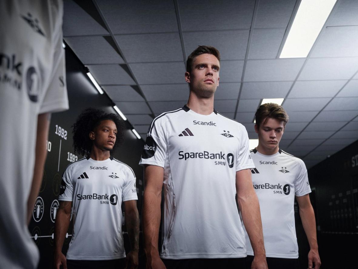
Jersey photography: Ole Ekker
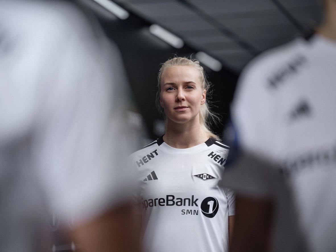
Lifestyle photography: Sander Dybvik
Would you like to know more about this?
Reach out to the team, we're happy to answer questions, receive feedback or discuss the topic.

Relevant cases
A Strategy for All of Norwegian Football
Where Life Plays
Become Trondheim