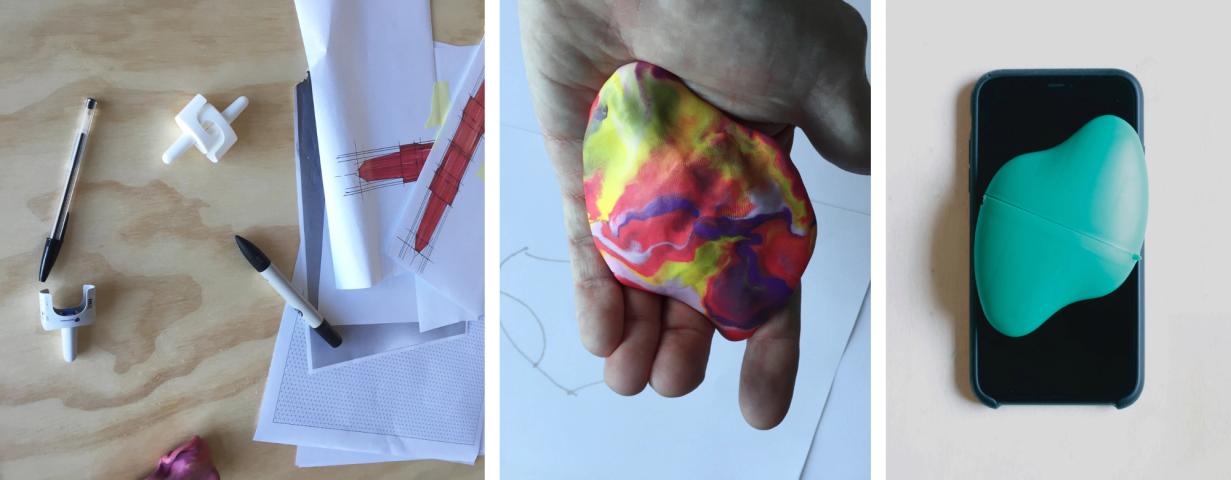
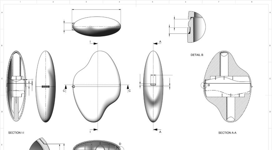
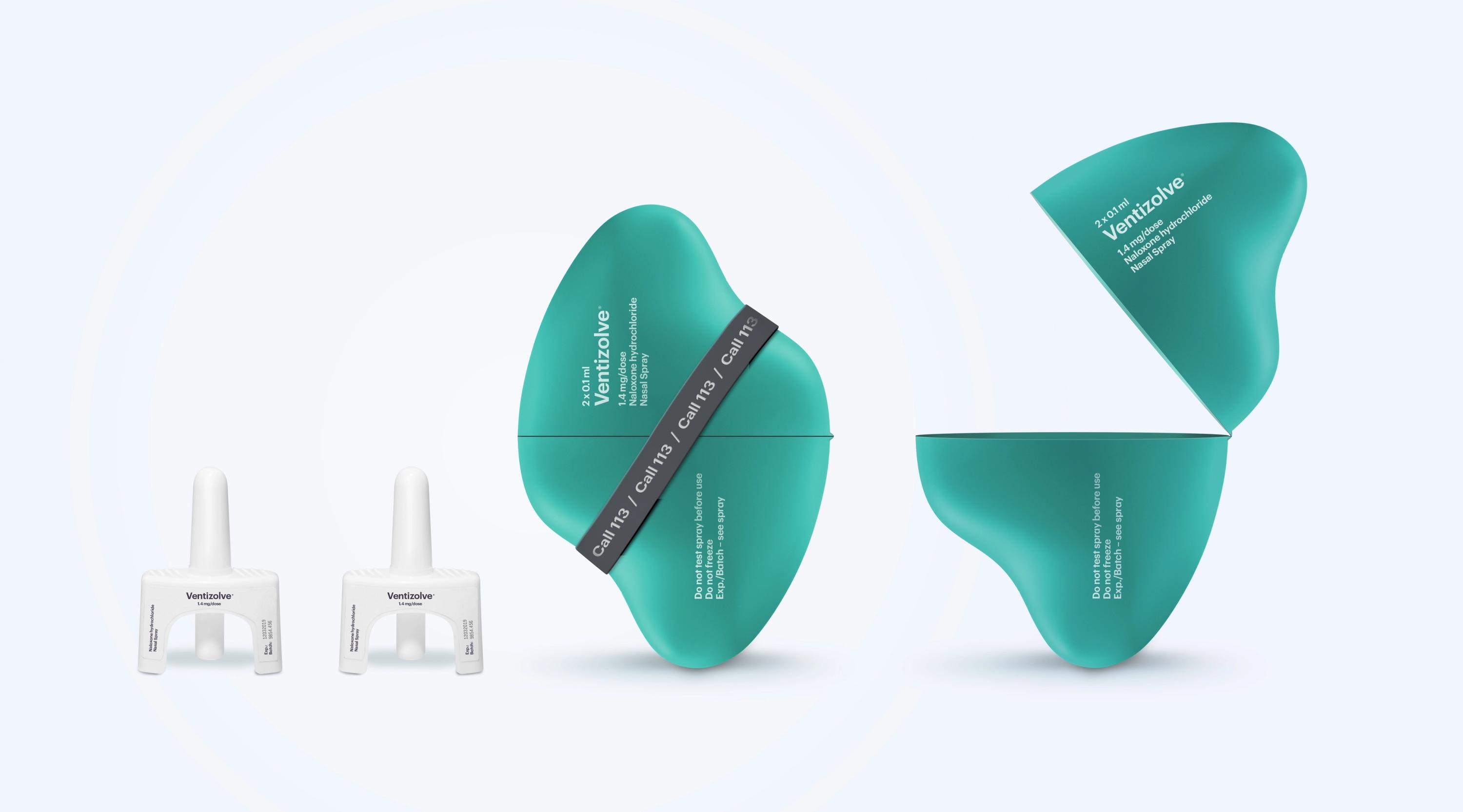
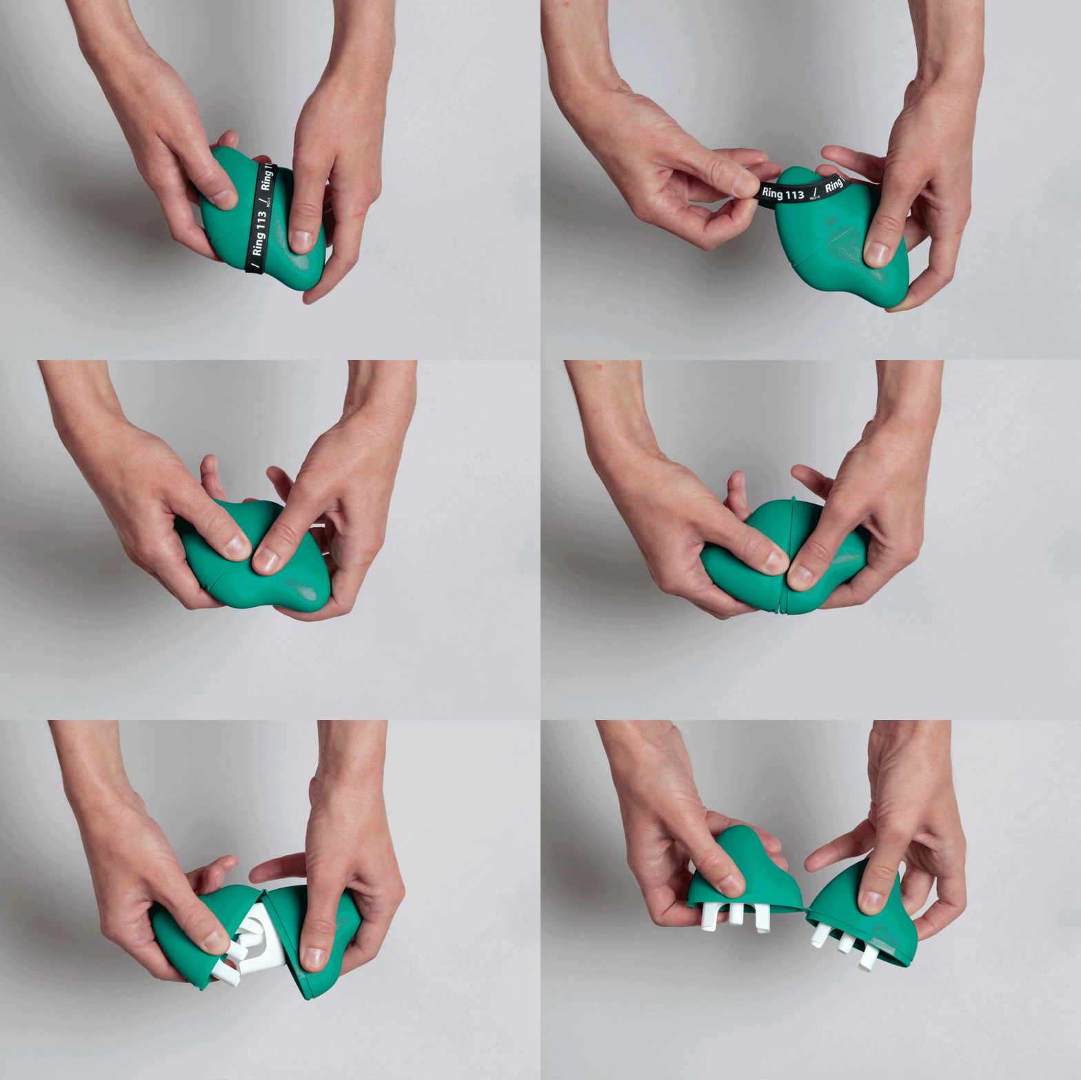
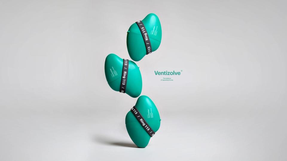
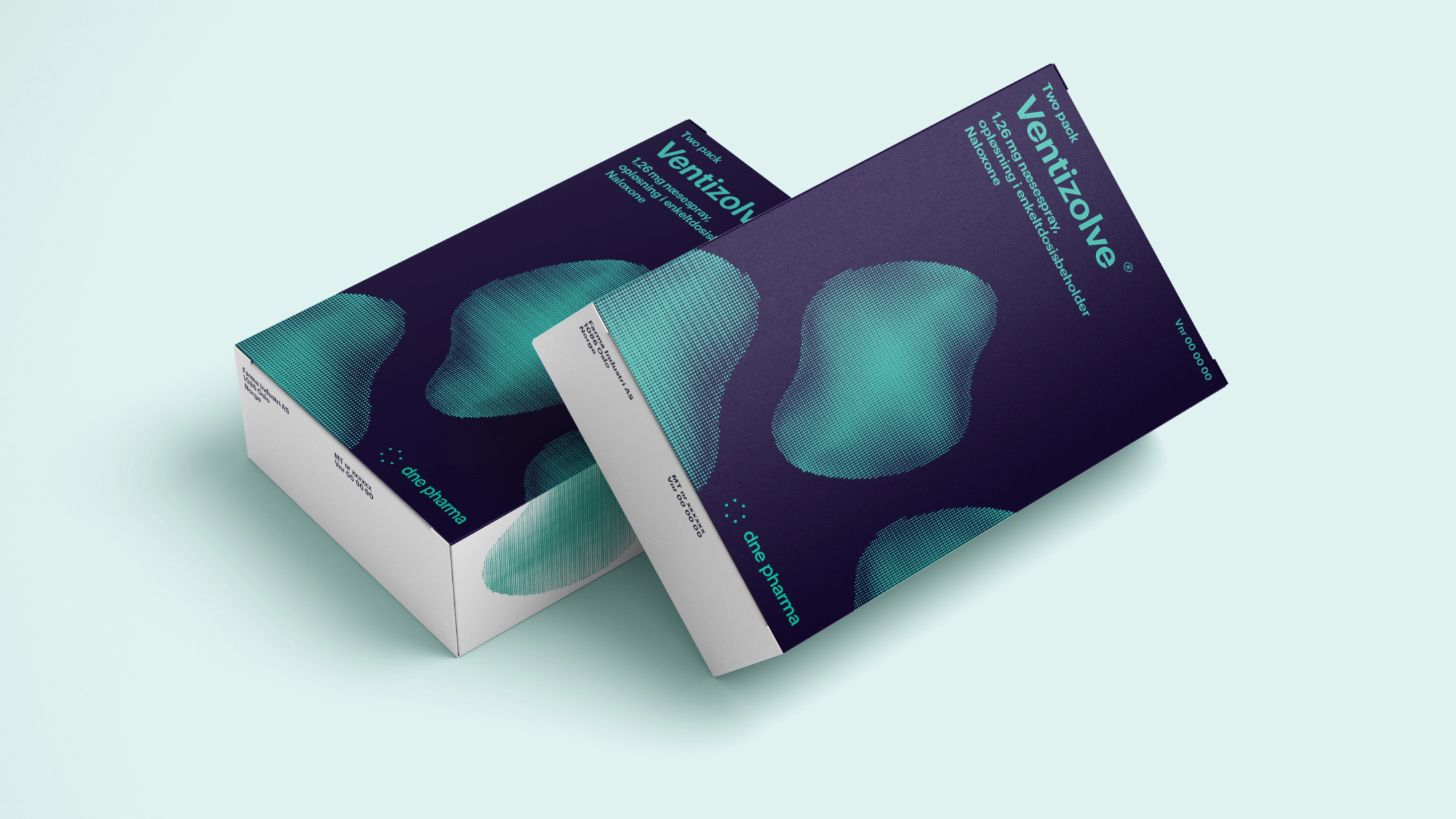
The design follows the ergonomic possibilities, creating a form made to become a recognisable symbol of help in an overdose. With two doses recommended in each pack, the solution keeps them together in the most compact and accessible way. Opening had to be simple, while making sure the applicators could not be released by accident before they were needed.
“Design is a quality that far too often belongs to the richest and healthiest in society. An ironic reality, given what design is really for: improving the human experience. Our ambition from the start was not to compromise on the design values of Ventizolve. Good design is a universal right.”
“There is no greater communication responsibility, and therefore no greater challenge, than the moment a life is to be saved. But this project is about far more than that moment. The reality is that there are many barriers to saving a life, and they start long before the overdose itself.” Tom Morgan
The band around the device has two main functions: it ensures the packaging cannot be opened by accident, and the quick release works like the pin on a fire extinguisher or the “break glass” panel in front of an alarm. When you pull off the safety band, you prepare yourself for what you are about to do: potentially save a life.
The use of colour in the product identity has two functions: to link the product to the manufacturer, giving confidence in quality and continuity, and to stand out in a chaotic or dimly lit environment in an emergency.
The information and audience design, illustration style and film production went through a rigorous process to meet the highest standards of ethics and pharmaceutical regulation. This includes clear, multilingual guides for effective use.