Project
Sjømannskirken has been an iconic institution in Norway since it was founded in 1864, with a commission from the Parliament to serve Norwegians abroad.
The Christian non-profit organisation has 28 churches around the world, from London to LA, Rio de Janeiro to Singapore, creating an important meeting place for Norwegians around the world. With a rich history and high brand awareness, Sjømannskirken needed a revitalised presentation of their brand to represent the modern organisation they have become.
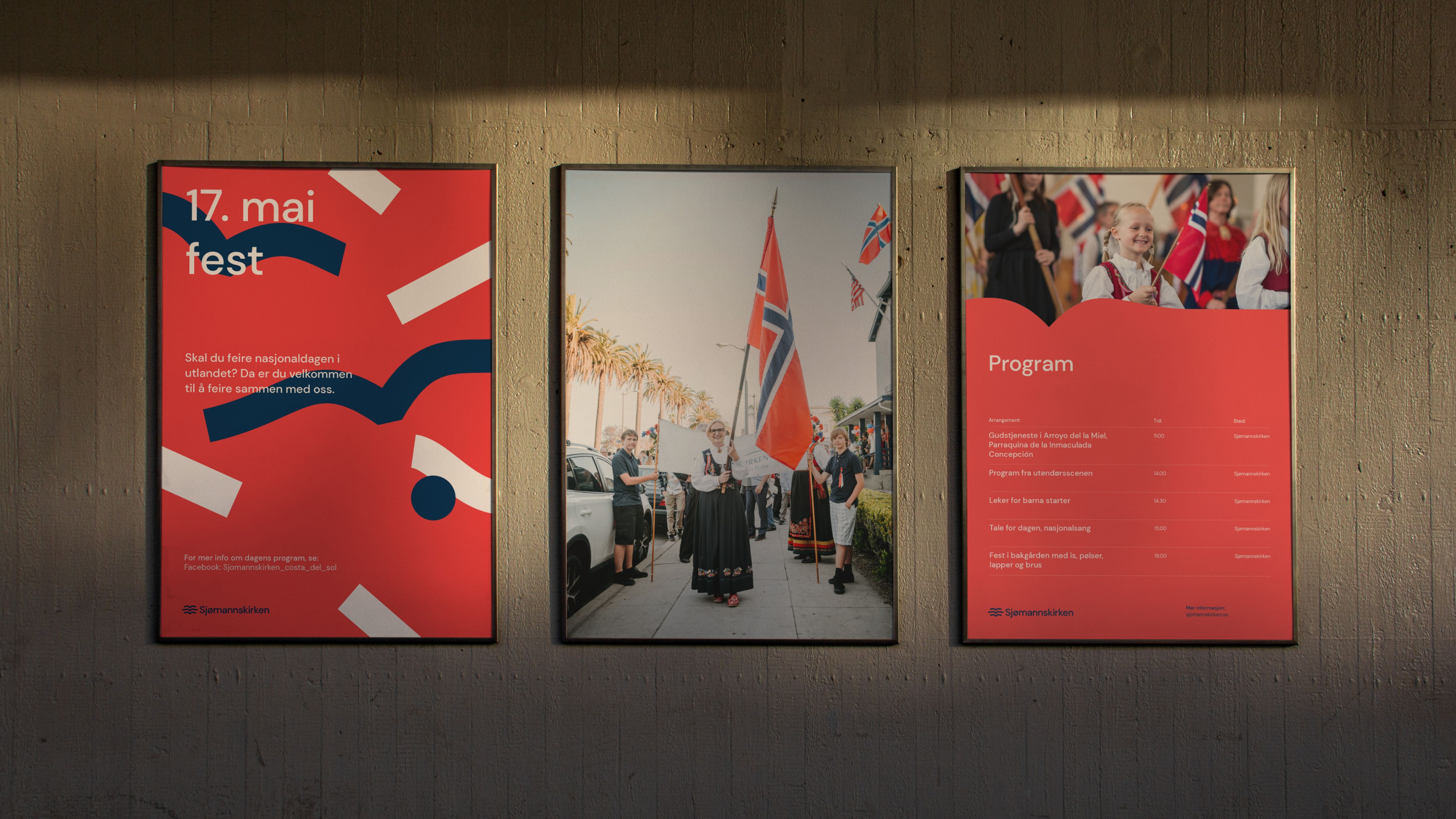
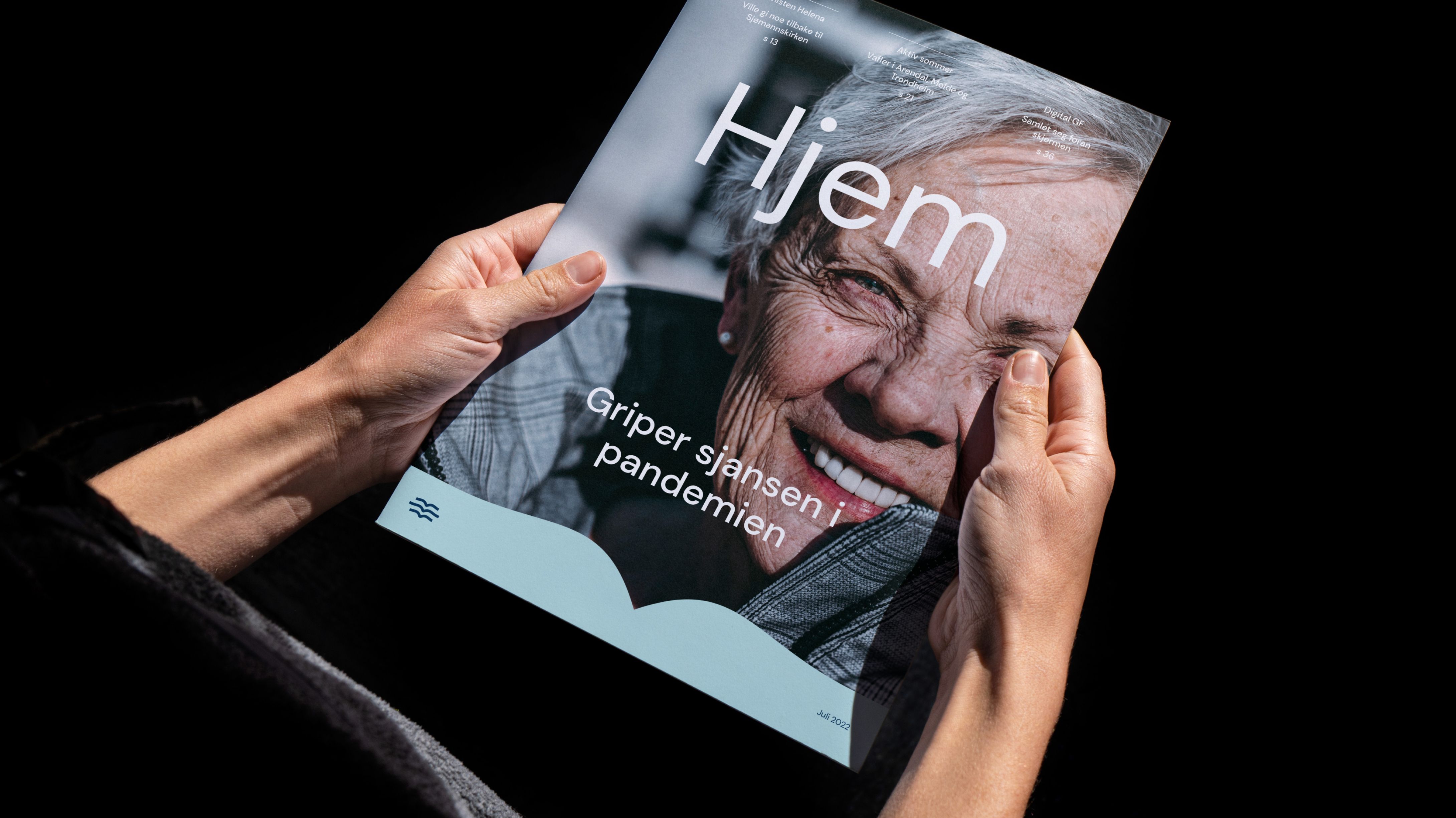
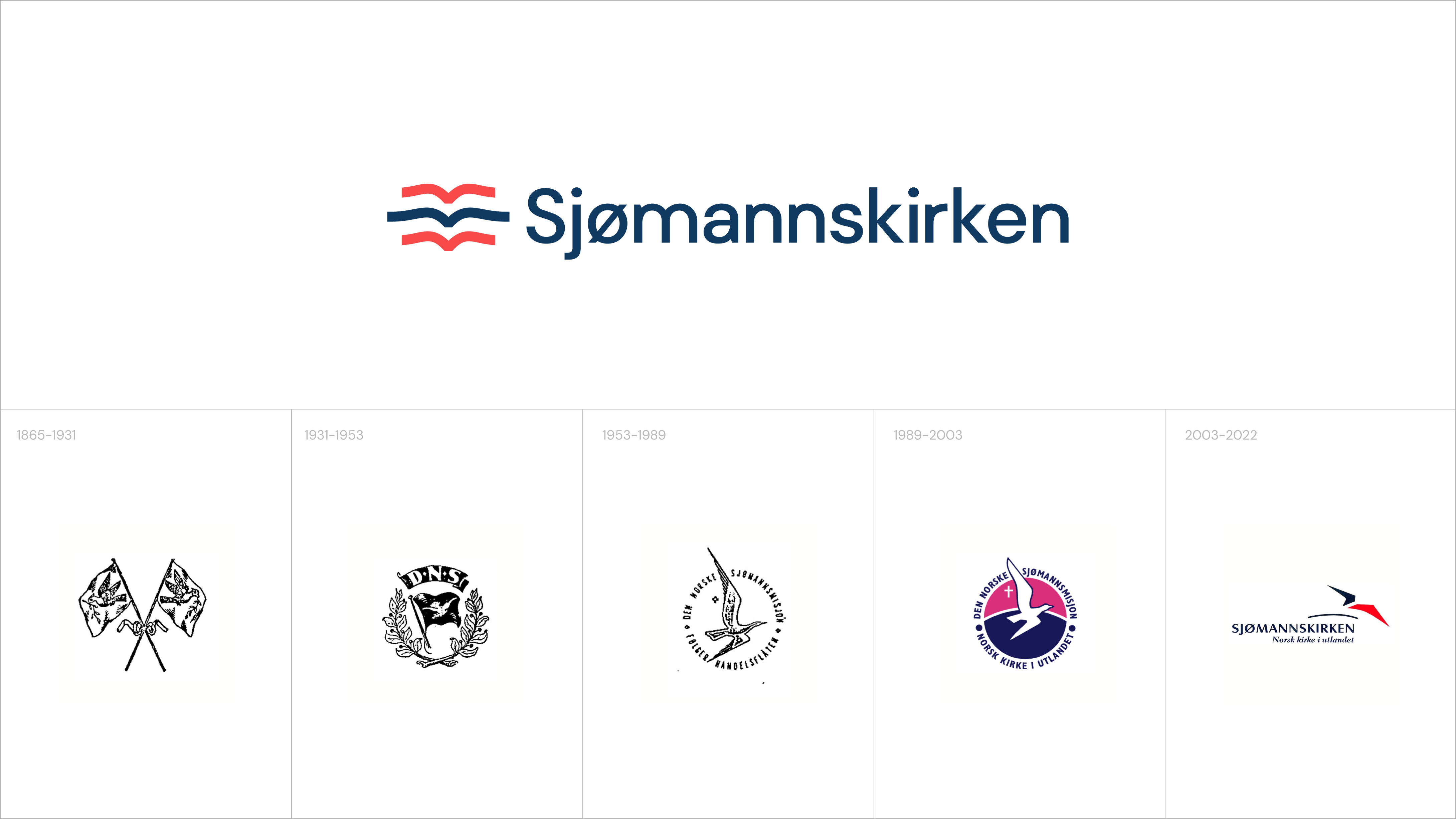
Working on the rebranding of Sjømannskirken we created an accessible and easily recognisable visual profile to be used all around the world, adding a new story of community and togetherness.

Challenge
Many Norwegians have a strong and close relationship with the brand, and a love for the existing visual expression, but the profile needed new energy and a system to work in the digital world. With so much heritage & emotional value it was essential that we built on the history of Sjømannskirken and its national significance.
With such an important and active social responsibility, it was important for us to consider the large numbers of employees and volunteers, who should easily be able to use and work with the new design system, most with little or no practical design experience. Therefore, the emotional equity and usability of the solution were front of mind throughout our process.

Solution
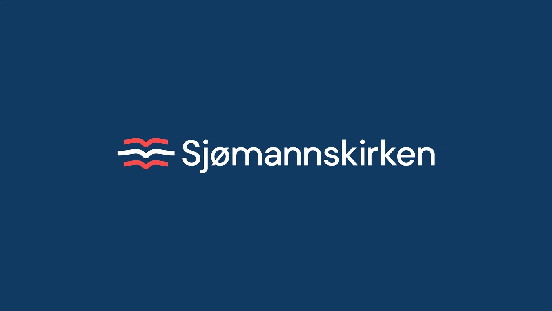
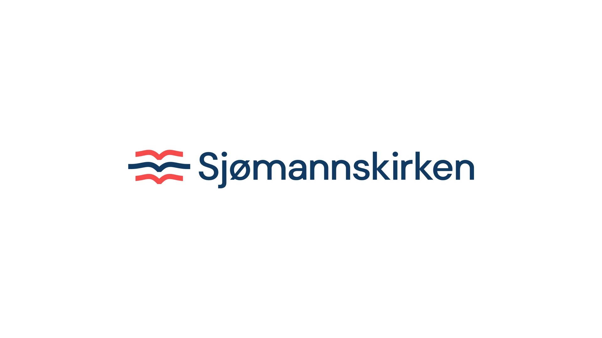
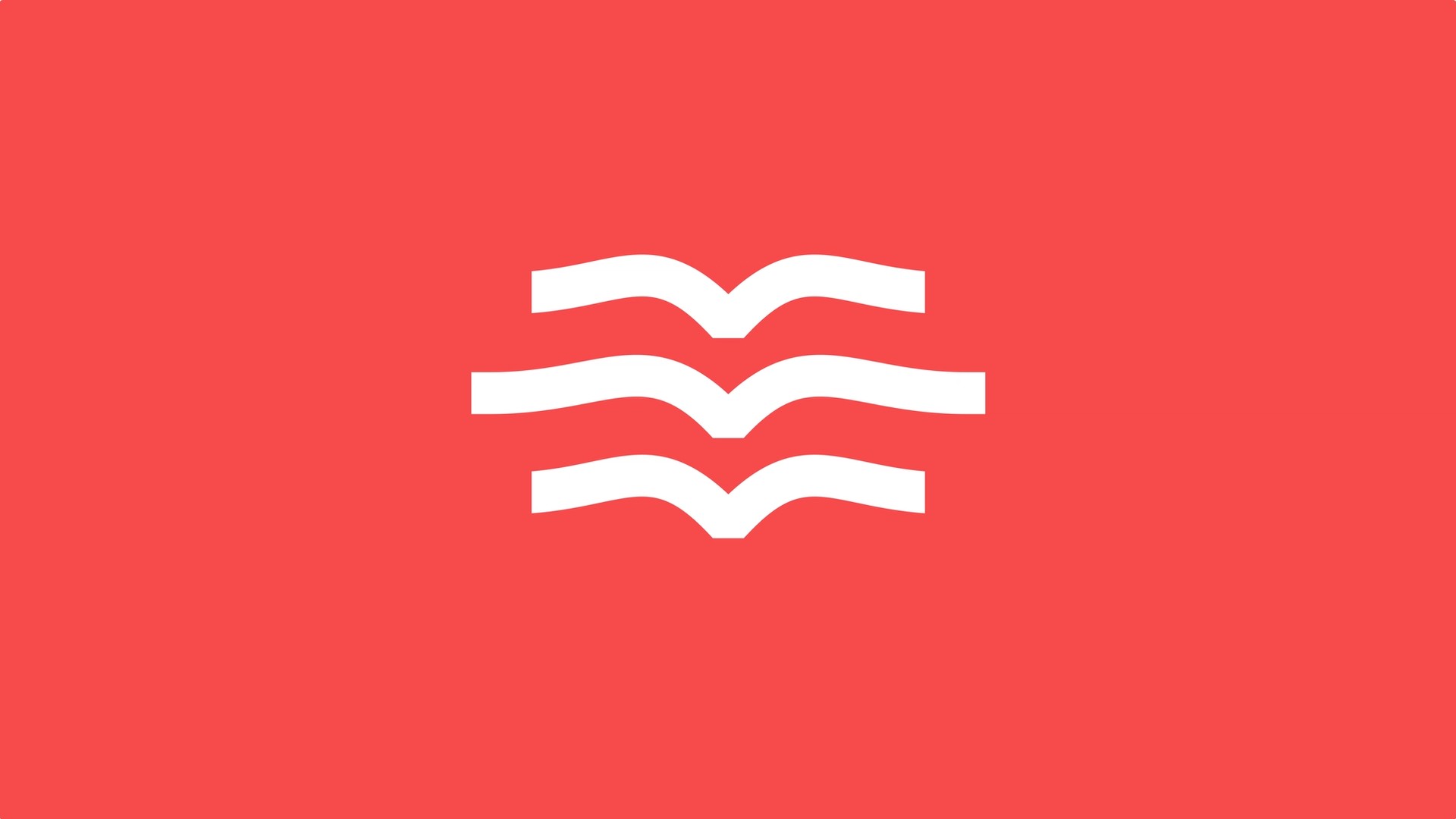
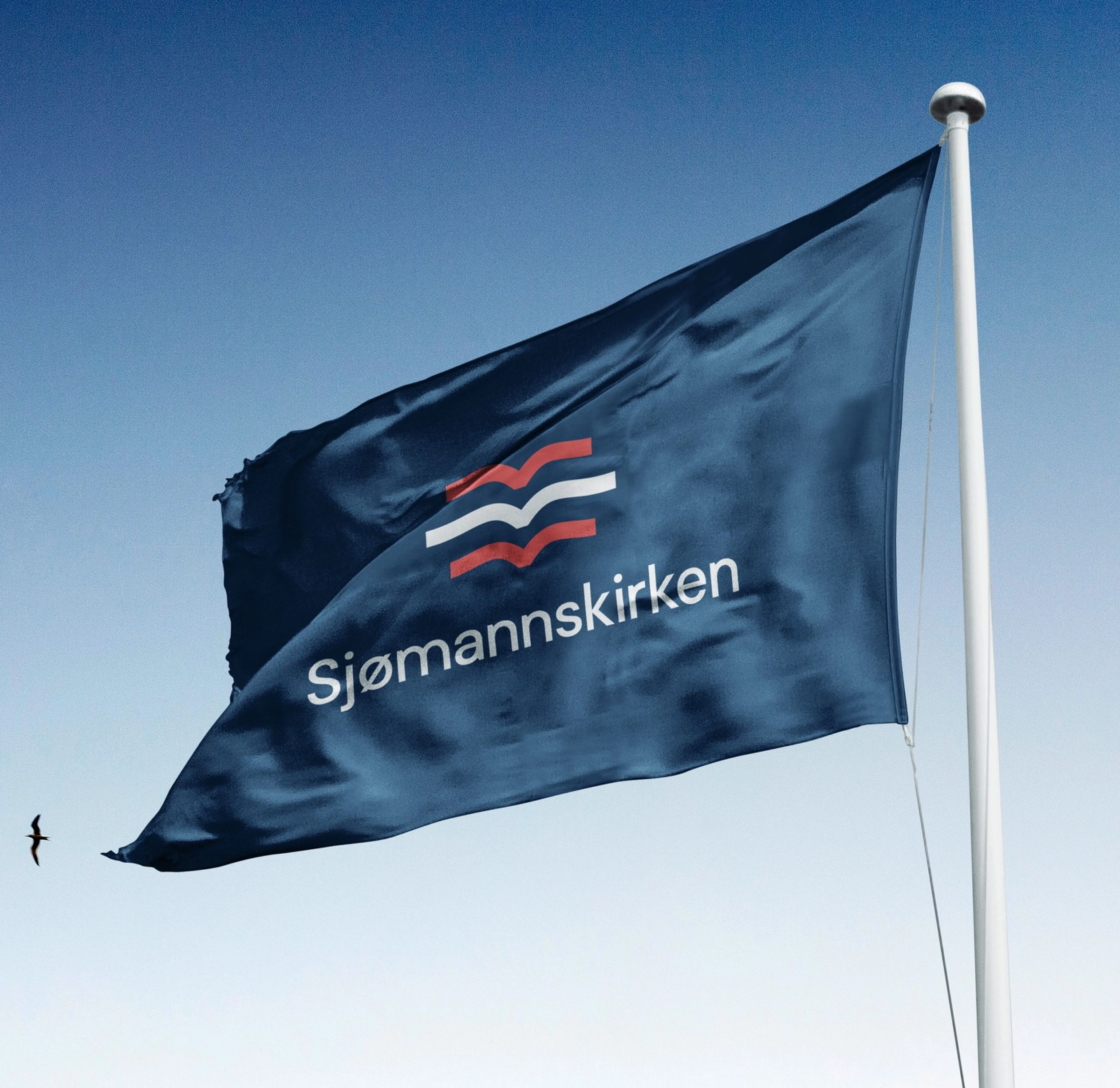
For hundreds of years, the Sjømannskirken logo has been a new version of itself, connected to the symbol of a lone seagull, originally representing a safe harbour for sailors. Our recommendation was to not change it totally, but adding to it, so the one seagull became a flock. Three seagulls together, telling a story of community, being together, and never feeling alone.
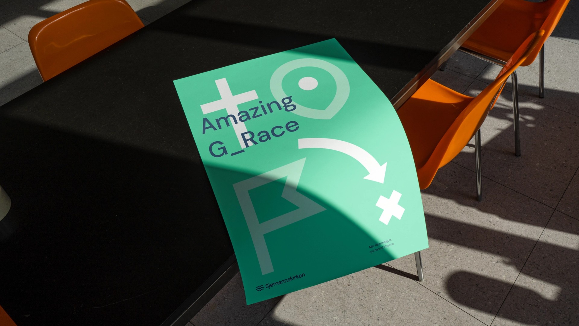
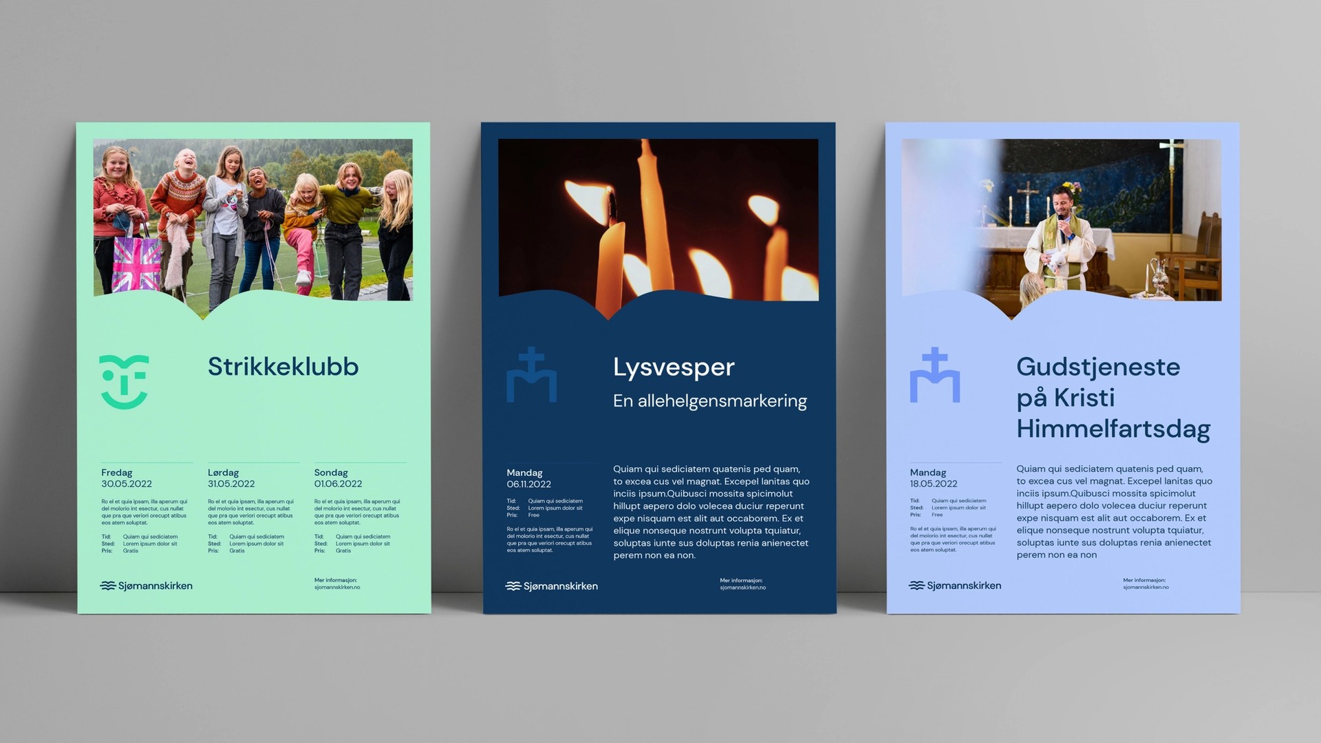
We also developed a visual icon style to differentiate the many aspects of Sjømannskirken, fronting their large number of activities, creating an easy way for the organisation to communicate towards their different target groups.


Based on the national Norwegian colours, we created a red, white, and blue colour pallet, maintaining the roots of the organisation around the world. The dark navy is there through the whole brand, representing the colour of the ocean and the sea, connecting all the continents of the world.
We also introduced a more vibrant and energetic secondary colour palette to work with all the diverse events and locations that Sjømannskirken operates.

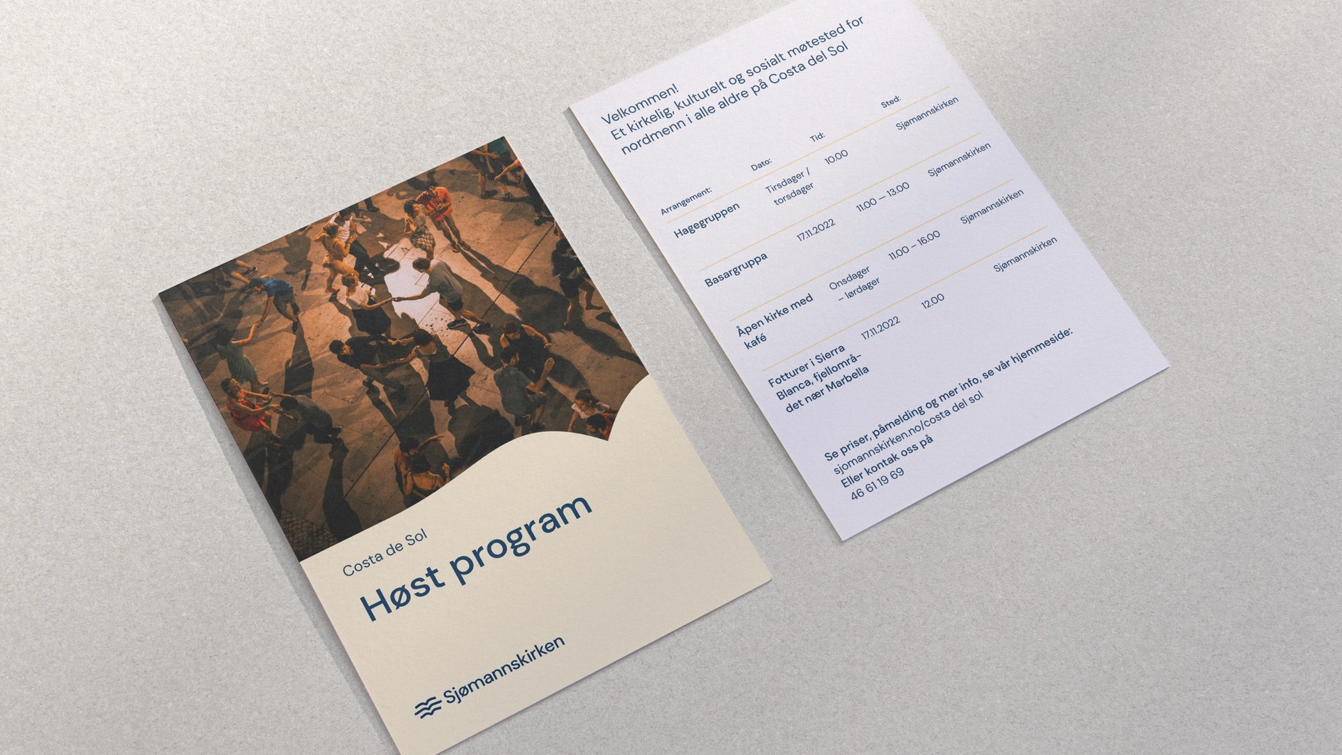
To make the new profile accessible and easy to use, we chose an open source typography, concomitant use of brand graphics, simple layout solutions, and a comprehensive, but easy to use and engaging digital brand manual.
