Perfect isn’t always sound
Published:
22 October 2026
Written by

Robert Dalen
Head of Operations | Partner and Owner
On 21 October 2026, Apple Music launched a new visual identity: its logo filmed beneath a liquid surface set in motion by sound. We did the same for Bergen International Festival in 2018. The move says more about the era we are entering than about Apple.
Apple calls the project “Made by Sound”. Together with producer Fred again.., sound studio NEST Acoustics and the agency TBWA\Media Arts Lab, they played individual notes through a transducer into a shallow bath of liquid. The movement on the surface was filmed in camera and became the raw material for the logo, the wordmark and the motion language. According to Wallpaper*, the work took months of experimentation.
Apple could have made all of this digitally, in a fraction of the time. They chose a tank of liquid, a sound source and a camera. It is the second time in a short period: the Apple TV identity from 2025 was also made with practical effects.
A bowl of water in Bergen
The identity we developed for Bergen International Festival (Festspillene i Bergen) in 2013 has one idea at its core: the logo is the pattern, and the pattern is the logo. The F is built from blocks on a strict grid, and the same blocks grow into patterns that move, stretch and break apart, just as music is built from sound and silence. That removed the distance between logo and supporting elements, and turned the whole surface into the sender. In the first year, the festival doubled its number of first-time visitors, and in 2014 the identity won the Grand Prix for Design at Cannes Lions, alongside a number of other international awards.
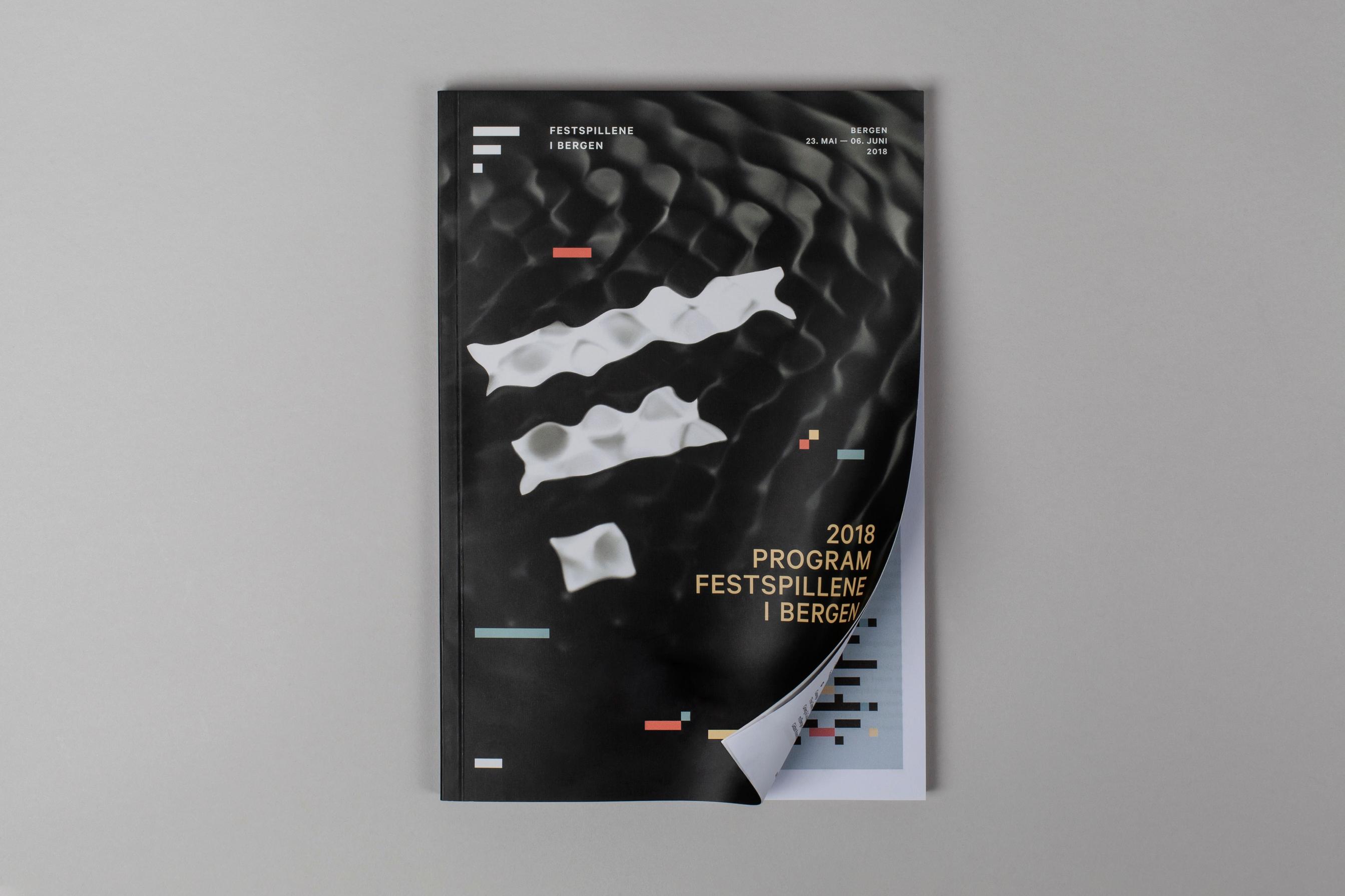
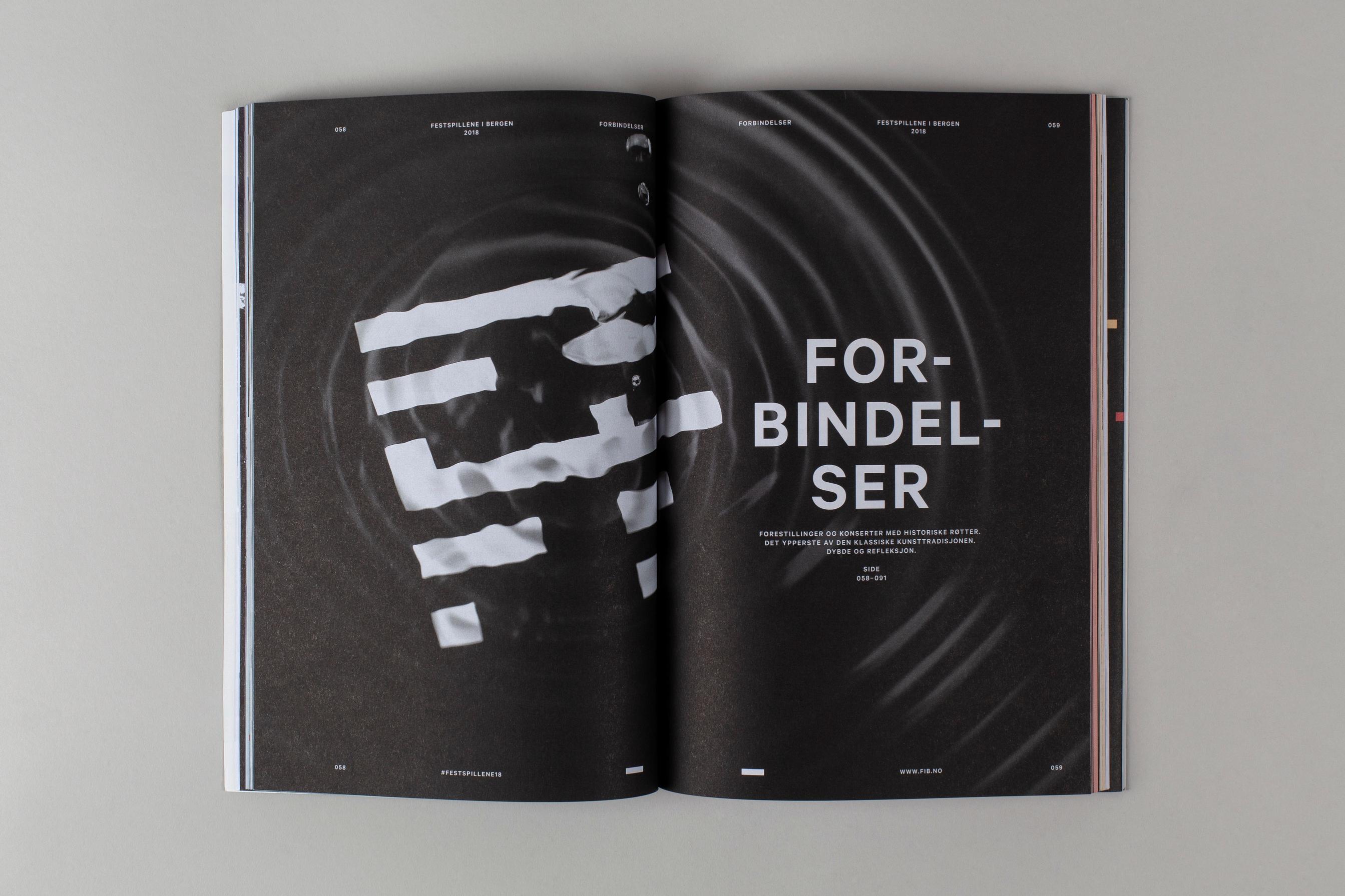
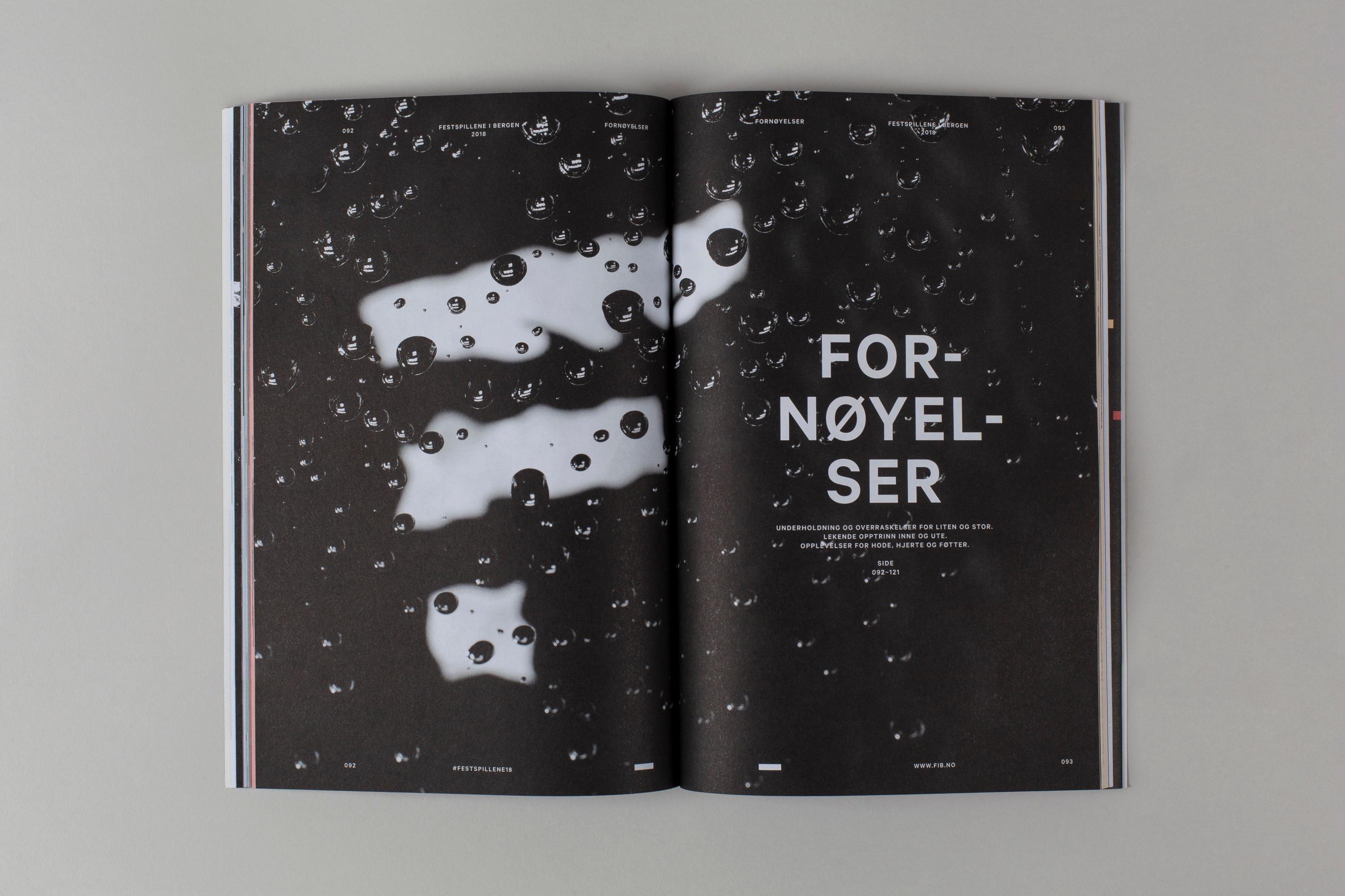
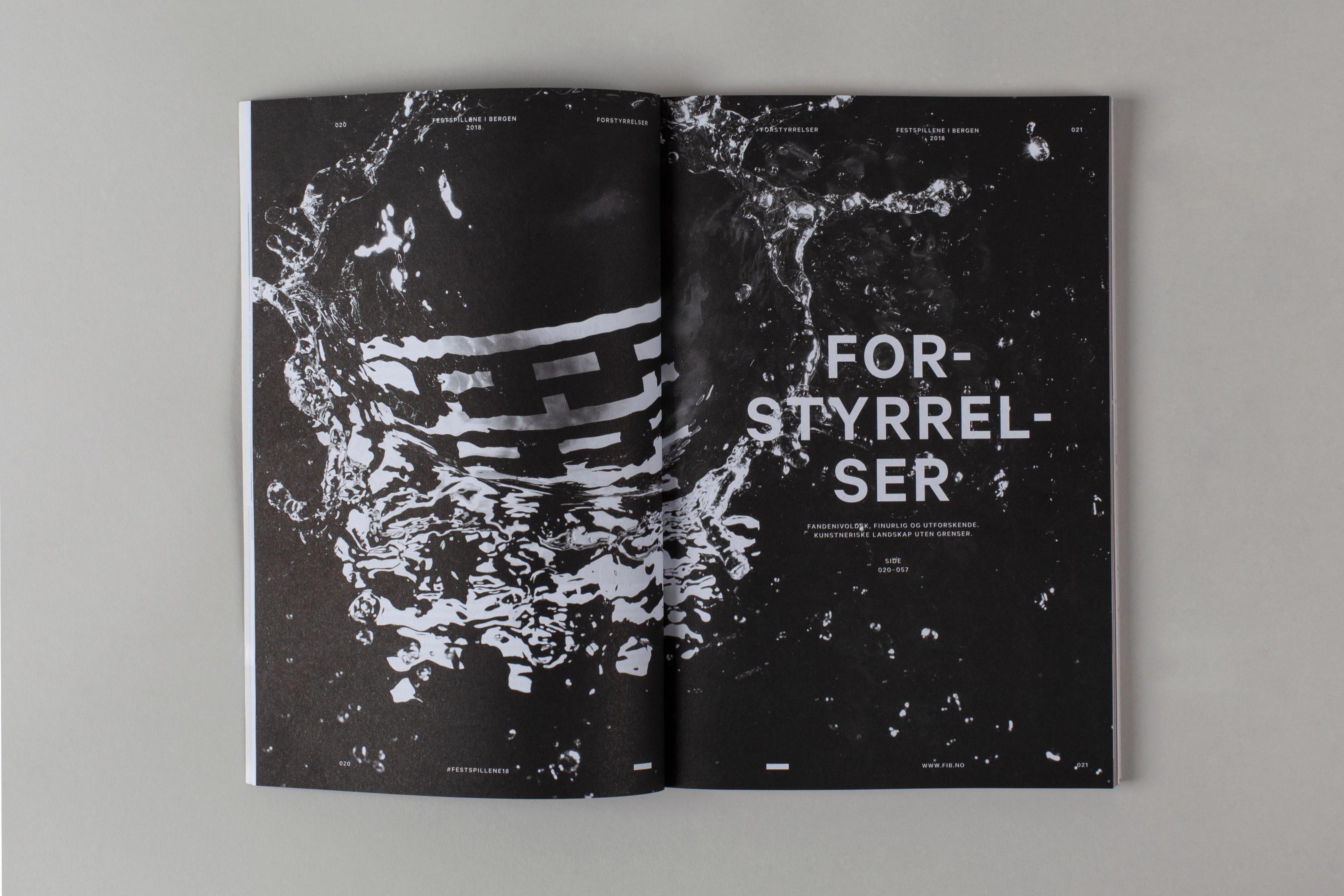
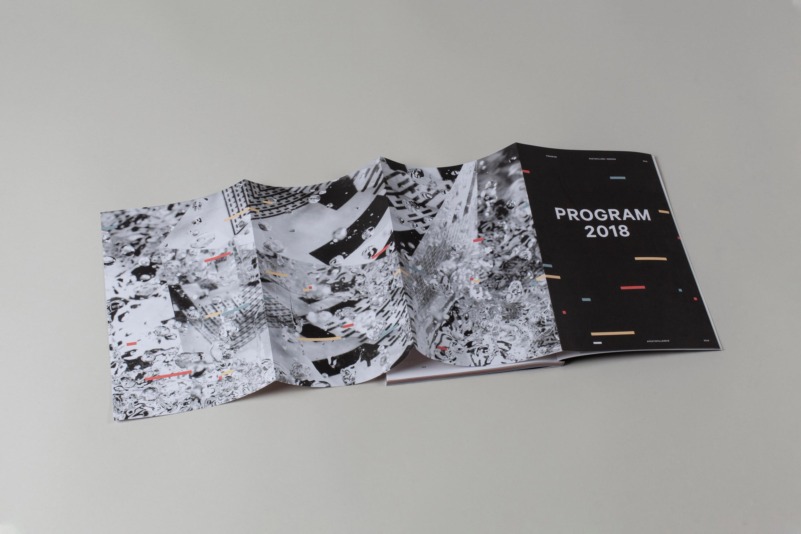
The system was built to be renewed, and every year the festival graphics get a new expression. In 2018, Nonspace filmed the Bergen International Festival identity beneath water set in motion by sound, eight years before Apple Music launched an identity using the same approach. We placed the pattern beneath a bowl of water, sent sound through it and captured the surface with a high-speed camera. The water broke up the straight lines, droplets struck the surface, and no two images were alike. The images carried that year’s programme, from the cover to the chapter pages.
The digital sign met physics, and the result could only have been made that way.
Why it matters now
Generative tools have made it easy to create images that look polished. When anyone can generate a beautiful water surface in seconds, beauty is no longer what sets work apart. What sets it apart is that something actually happened: someone built a rig, played a note and captured the result.
The process becomes part of the product. Apple knows this, which is why it released the film about how the identity was made alongside the identity itself. The story of how something came to be is the one people pass on.
We do not see analogue and digital as opposites. The festival identity was built to live beyond the screen, and that was one of the concept’s greatest strengths from its launch in 2013. It made it possible for the logo to hover as a drone formation above the festival stage on opening day, light up the windows of Bergen City Hall and become part of the city’s pedestrian crossings. The 2018 shoot was a continuation of that idea. Digital gives scale and flexibility. Physical gives proof.
This is also how we use AI. Nonspace uses AI to free up time in our processes, while the creative craft stays with the team. The time we save on research, planning and production, we spend on the ideas and on the detours that make them good.
What it means for brands
The analogue detour takes more time. It requires someone to test, fail and try again, and it rarely delivers exactly what you planned. For brands that want to be remembered, that is precisely the value: an expression no one can copy with a prompt, and a story that is true.
In creative development, we therefore ask ourselves three questions:
- Is there a physical version of the idea that is stronger than the digital one?
- Does the process have a story worth telling?
- Is the identity system strong enough to withstand an expression that breaks it apart?
What we take away.
Apple’s identity was made in a room, but it is seen on a screen. The strongest proof is the one people experience for themselves, when a brand meets them in physical space. We will come back to that.
Curious about what the analogue detour could do for your brand? We would be glad to set aside time for an informal conversation.
Would you like to know more about this?
Reach out to the team, we're happy to answer questions, receive feedback or discuss the topic.