A Practical Guide to Managing Your Visual Identity

Ramona Horn
Studio Director Bergen
Date
10 November 2025
Date
10 November 2025

Your brand’s visual identity is used more often by more people. Social media and content-hungry marketing channels mean your visual identity gets applied more frequently, across more touchpoints, by more people - internal teams, external partners, freelancers, agencies.
Yet in branding, one truth remains: consistency builds compounded equity. Every correct application strengthens recognition. Every inconsistent use fragments it.
This isn't about design literacy. It's about having clear reference points when the details matter. Is it the PNG or the SVG? Can we change the colors in this one? Why won't this font work in our email system? These are completely reasonable questions.
There are good and considered reasons for all parts of your visual identity, but unless you work with it daily, the technical details fade quickly. Even experienced brand managers tell us they need to look things up. The difference is knowing what to look for.
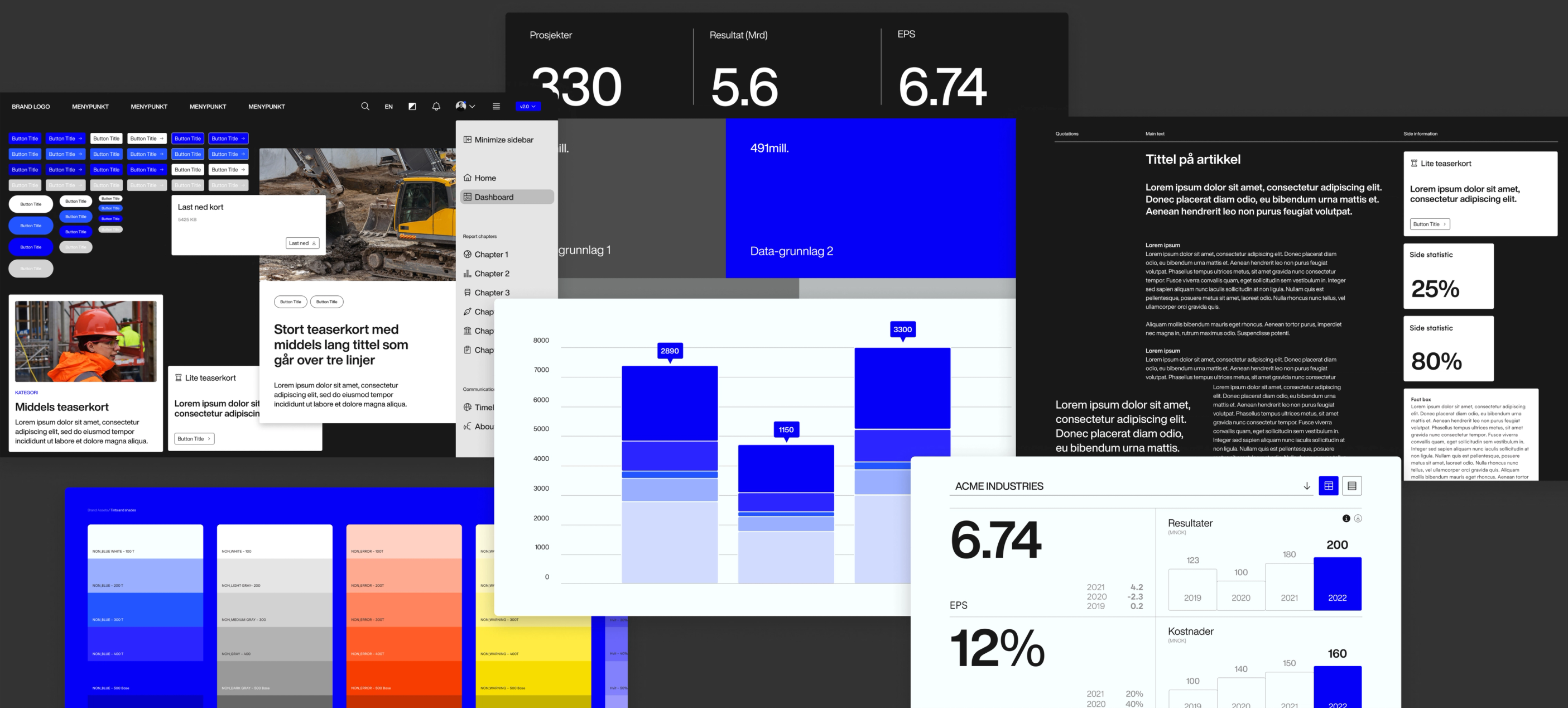
Understanding your visual identity components
When a visual identity is delivered, you're not just getting a logo. You're receiving a system of interconnected elements, each with specific uses and technical requirements. Understanding these components means knowing what to ask for and what to do with it once you have it.
Logo, symbol, logotype - what's the difference?
Your logo is the complete visual mark that represents your brand. But within that, there are distinct components. A symbol (sometimes called a logomark) is the graphic element - think Apple's apple or Nike's swoosh. A logotype is the text-based part, your company name set in a specific typeface with particular spacing and proportions.
Many brands use these elements separately depending on context. The symbol might appear on small spaces like social media avatars or product labels. The logotype works for formal documents or when you need maximum clarity. The full logo combines both for primary use. This isn't arbitrary — it's about flexibility across different media and sizes.
Lockups and when they matter
A lockup refers to how elements are arranged together in a fixed relationship. Your logo and tagline. Your symbol and business unit name. These arrangements are designed specifically to maintain visual balance and hierarchy. The spacing, alignment, and proportions have been carefully considered.
When you receive lockup files, you're getting pre-composed versions for specific uses. Don't try to recreate them by placing elements separately - the spacing will be wrong, and at smaller sizes, those tiny differences become obvious.
Graphic elements, patterns, and supporting visuals
Beyond the core logo, most identity systems include supporting graphic elements. These might be patterns derived from the symbol, decorative shapes, or visual devices used in layouts. Their role is to extend the brand's visual language without overusing the logo itself.
These elements give your team creative flexibility while maintaining consistency. A presentation doesn't need the logo on every slide if the graphic language is doing its job. An advertisement can feel unmistakably yours through pattern and color alone.
Image and illustration style
This is where many organizations drift from their visual identity without realizing it. Your brand design likely includes guidance on photography and illustration style - not specific images, but the aesthetic approach. Bright or moody? Candid or composed? Abstract or literal?
These choices shape how your brand feels more than almost anything else. Stock photography, in particular, can undermine months of careful brand work if the style doesn't align. The technical identity might be perfect while the overall impression is completely wrong.
Typography and the font puzzle
Here's where confusion hits hardest. A typeface is the design itself (Helvetica, Garamond, your custom brand font). A font is technically the digital file that contains that typeface in a specific weight and style. Most people use the terms interchangeably, and that's fine for conversation, but it matters when managing files.
Your brand typography typically includes primary and secondary typefaces, each with multiple weights (light, regular, bold) and styles (italic, condensed). Each of these is a separate font file. You need them all installed to maintain consistency, especially for weights used in interfaces or digital products.
The critical thing to understand: fonts are software, and software has licenses. That beautiful typeface might be licensed only for print and web, not for embedding in apps. Or it might be licensed for five users, and you have twenty. This isn't pedantic - it's legal and contractual. Your brand guidelines should clarify what's covered and what requires additional licensing.
File formats decoded
You've probably received folders containing the same logo in five different formats. This isn't redundancy - each format serves specific technical purposes.
Vector files: SVG, AI, EPS
These are resolution-independent, meaning they scale infinitely without losing quality. They're built from mathematical paths rather than pixels. Use these whenever possible, especially for print, large-format applications, or any situation where you might need to resize.
SVG (Scalable Vector Graphics) is ideal for web and digital applications. Modern browsers support it natively, and it remains crisp on high-resolution screens. AI (Adobe Illustrator) and EPS (Encapsulated PostScript) are industry-standard formats for print production and professional design software.
If you're sending your logo to a print vendor, sign maker, or promotional products supplier, they need vector files. Sending a PNG will result in disappointing quality at larger sizes.
Raster files: PNG, JPG
These are pixel-based images with fixed dimensions. They have their place, but they don't scale up well. A logo that's 500 pixels wide will look fine at that size but fuzzy if you enlarge it.
PNG supports transparency, making it essential for logos that appear over photographs or colored backgrounds. JPG doesn't support transparency and uses compression that can create artifacts around sharp edges - it's generally not ideal for logos, though it works for photographs in brand materials.
When you export raster files, resolution matters. For screen use, 72-150 DPI is standard. For print, you want 300 DPI at the actual size you'll use it. A logo that's 300 DPI at 2 inches wide isn't suitable for a 2-meter banner.
Which format when?
- For your website: SVG or high-resolution PNG with transparency
- For a Word document: PNG or EMF (vector format Windows supports)
- For a printer: AI, EPS, or PDF (with fonts outlined)
- For social media: PNG at platform-specific dimensions
- For email signatures: PNG at 2x resolution for retina displays
- For large format (banners, vehicle wraps): Vector (AI, EPS, SVG)
Typography in practice
Installing fonts seems straightforward until it isn't. Fonts behave differently across operating systems and applications. What works beautifully in your design software might not appear correctly in PowerPoint or web browsers.
Desktop fonts vs web fonts
The fonts installed on your computer (OTF, TTF files) work in desktop applications - design software, Office programs, presentation tools. But websites need web fonts, which are technically different files optimized for browser rendering and licensed specifically for web use.
This is why your brand font might display perfectly in your pitch deck but revert to Arial on your website unless web fonts are properly implemented. It's not broken - it's just two different technical environments requiring two different file types.
Font licensing and why it matters
Unlike images, which you can license once and use freely within those terms, fonts often have restrictions based on usage, number of users, or page views (for web fonts). Your organization might legally use the brand font in internal documents but need additional licensing for your website if it exceeds traffic thresholds.
Before sharing brand fonts widely across your organization, verify what your license allows. Some foundries permit internal use across unlimited employees. Others charge per user. This isn't creative restriction - it's respecting the work of type designers.
When fonts don't work
If a font isn't displaying correctly, the most common issues are: it's not installed on that specific computer; the application doesn't support that font format; or the file is corrupted. For documents you're sharing externally, either outline the fonts (convert text to shapes) or use PDF format, which embeds fonts properly.
Managing your visual identity
All of this complexity - formats, files, versions, licenses - is why organized visual identity management matters. A folder system works until multiple people need access, or someone can't find the updated version, or the freelancer gets sent three-year-old logo files.
Effective visual identity management isn't about rules and restrictions. It's about making it easy for everyone to find the right asset and use it correctly. When your team has to improvise, it's usually because getting the proper file is harder than it should be.
Every organization's ambition is hassle-free management - not stricter control, but removing the barriers that make correct usage the path of least resistance.
Digital asset management systems like Brandspace® Manager exist to solve this specific problem - one source of truth, always current, accessible to everyone who needs it. Not because people can't manage folders, but because organizations change, teams grow, and keeping everything synchronized across locations and departments is genuinely difficult at scale.
The tools matter less than the principle: your visual identity should be easy to use correctly and difficult to use incorrectly. If team members are constantly asking where to find things or which version to use, the system isn't working, regardless of how beautiful the brand design is.
Quick reference
Core visual identity components:
- Symbol/Logomark: The graphic element alone
- Logotype: The text-based name treatment
- Logo: Complete mark (typically symbol + logotype)
- Lockup: Fixed arrangement of multiple elements
- Graphic elements: Supporting visual devices and patterns
When to use which file:
- Vector (SVG, AI, EPS): Print, large format, any scaling required
- PNG: Web, presentations, anything needing transparency
- JPG: Photography, email (where file size matters), generally avoid for logos
Typography essentials:
- Typeface: The design (Helvetica, Arial)
- Font: The specific file (Helvetica Bold Italic)
- Desktop fonts (OTF/TTF): For installed applications
- Web fonts: For websites, separately licensed
- License: Check permitted uses and user limits
Red flags that indicate problems:
- Logo looks fuzzy when enlarged (using raster instead of vector)
- Brand fonts revert to system defaults (not installed or licensed)
- Colors look different across materials (using RGB for print, CMYK for screen)
- Someone is manually spacing logo elements (should use lockup files)
- Team members improvising because they can't find assets
What to Ask Your Brand Agency
The best partnerships are built on clarity. Once your visual identity is delivered, take the time to ask the practical questions that prevent confusion later:
- Which file formats have you provided - and when should we use each?
- What are the licensing terms for our fonts? Do we need additional licenses for certain uses (like web or app)?
- How should these assets be organized for easy access across our team?
- What’s the right process for requesting new formats, updates, or localized versions?
- Who do we contact if something doesn’t look or work as expected?
A good agency will welcome these questions. They’re not signs of inexperience - they’re signs of stewardship.
You don’t need to become a designer or a technical expert. You just need to understand your brand system well enough to keep it intact as it grows. When your team knows where to find things, what to use, and why it matters, every output - from an email signature to a national campaign - adds to the same, clear story.
That’s what makes a brand feel strong, recognizable, and trustworthy over time: not the logo itself, but the care behind how it’s used. When that care becomes part of everyday practice, your visual identity moves from being something managed through guidelines to something naturally applied and consistently understood across the organization.