Prosjekt
Omdøpingen av Bergensregionens turistkontor til Visit Bergen krevde en troverdig og internasjonal markedsføringsplattform. En personlighet sterkt forankret i det lokale som kan engasjere både det asiatiske, amerikanske, afrikanske og europeiske markedet, men også for Bergensere og nordmenn generelt.
En kontrastfull region med troll og hip hop, regn og iskrem, fiskere og kodere, bratte fjell og dansegulv, styrerom, soverom, vikinger og shoppere. En perle som stadig profileres i internasjonale medier som The New York Times, BBC, The Guardian, Kinfolk og Condé Nast.
(Arbeid utviklet under ANTI Bergen & ANTI Trondheim)

Utfordring
En organisasjon som representerer over 400 reise- og hotellbedriftsmedlemmer med aktiviteter som spenner fra Bergen Convention Bureau, som lager events for delegater fra hele verden, og Turistinformasjonssenteret i Bergen til å fremme regionen hjemme og over hele verden, gjennom medierelasjoner, reise- og hotellfora og internasjonal markedsføring.
Antall besøkende per år er for tiden fire ganger større enn regionens befolkning. 1,2 millioner besøkende, bare med båt, hvert år. Visit Bergens strategi ønsker å tiltrekke seg internasjonale turister, og samtidig feire de som allerede er her, forbedre deres opplevelser og berike lokalsamfunnet.
Uansett formål, enten det er et adrenalinkick fra ekstremsport, en gastronomisk extravaganza, eventyrlige opplevelser for barna, en helg med hvile og avkobling eller en kulturell opplevelse; det finnes ett Bergen og én personlighet. Et konsekvent kjerneuttrykk som kan brukes både lokalt og rundt om i verden, og som viser det brede spekteret av små og store medlemmer og partnere, i tillegg til ulike sektorer og markeder gjennom dynamisk innhold og kanaler.


Løsning
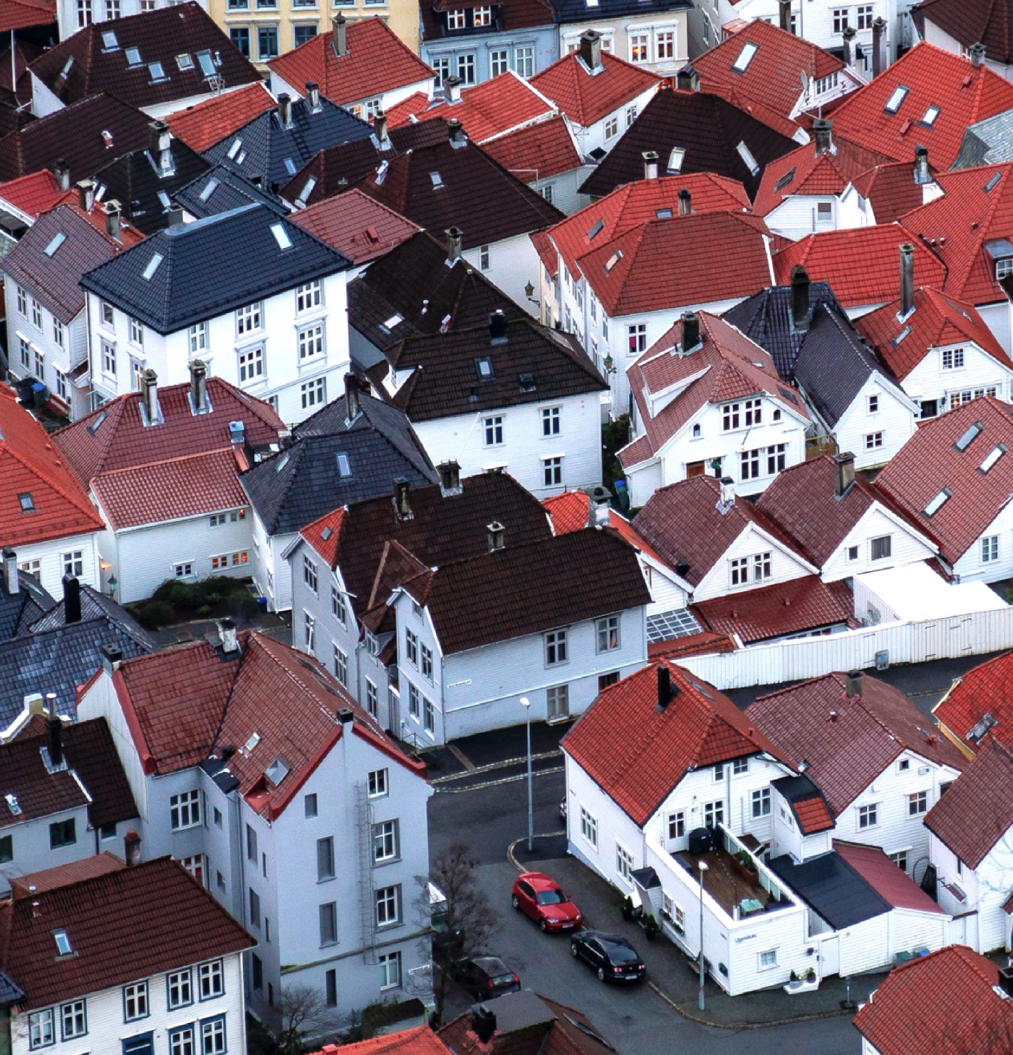
Bergen er en by med en lang og sterk historie. En ikonisk by og region, men også med en arv av klisjeer og gamle symboler. Det nye profilen utfordrer det velkjente med det overraskende og ukjente, og gir Bergen en helt ny energi som løfter og feirer bredden av opplevelsene regionen har å tilby.
Fokuset var å bevege seg fra posisjonen som 'Gateway to the Fjords' for å forankre merkevaren i livskvaliteten som regionen har å tilby; ikke bare en port, men en destinasjon.
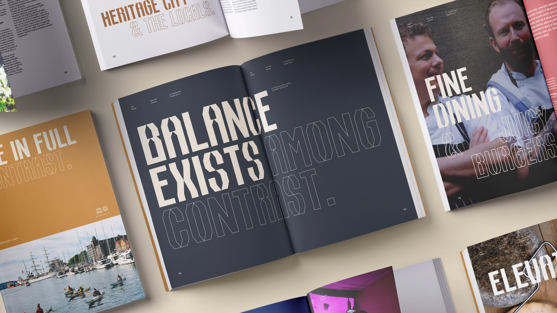
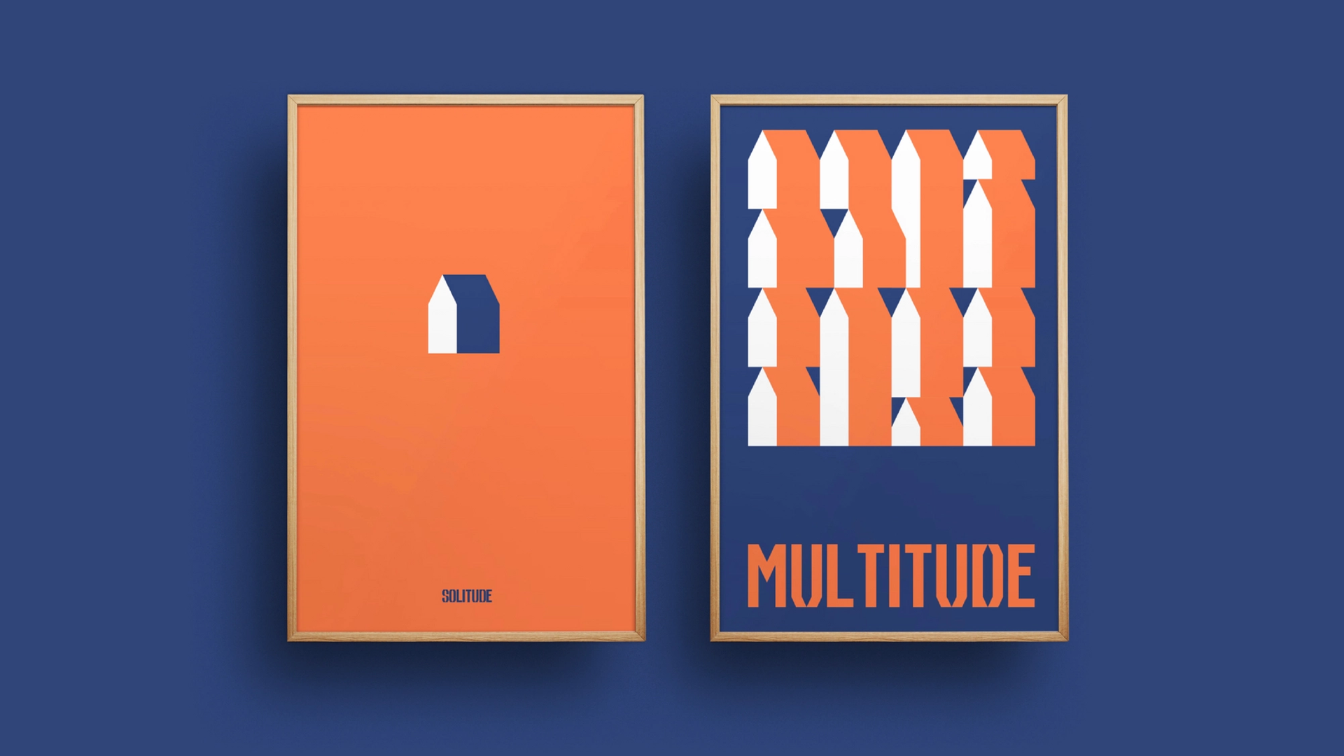
En destinasjon med "Liv i full kontrast". En feiring av mangfoldet av kulturelle og naturlige ekstremer, fra urbane gateliv til fjelltopper, fra klassisk til moderne, raskt og langsomt. En personlighet som setter pris på konstraster i størrelse, volum og følelser.
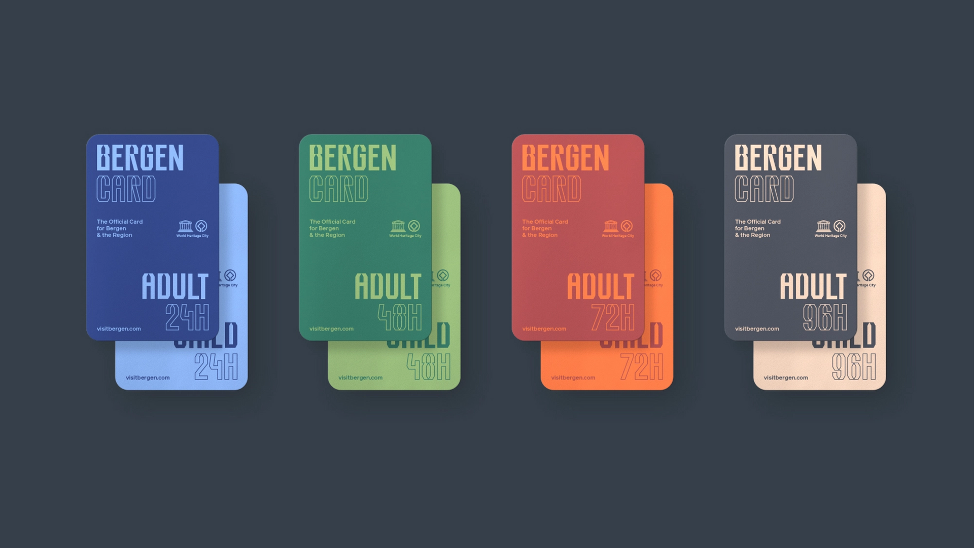
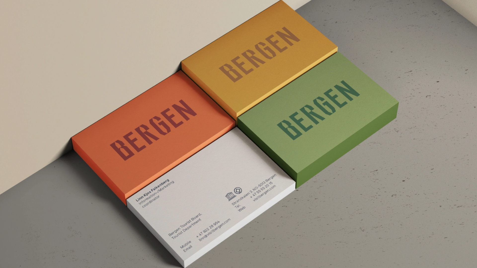
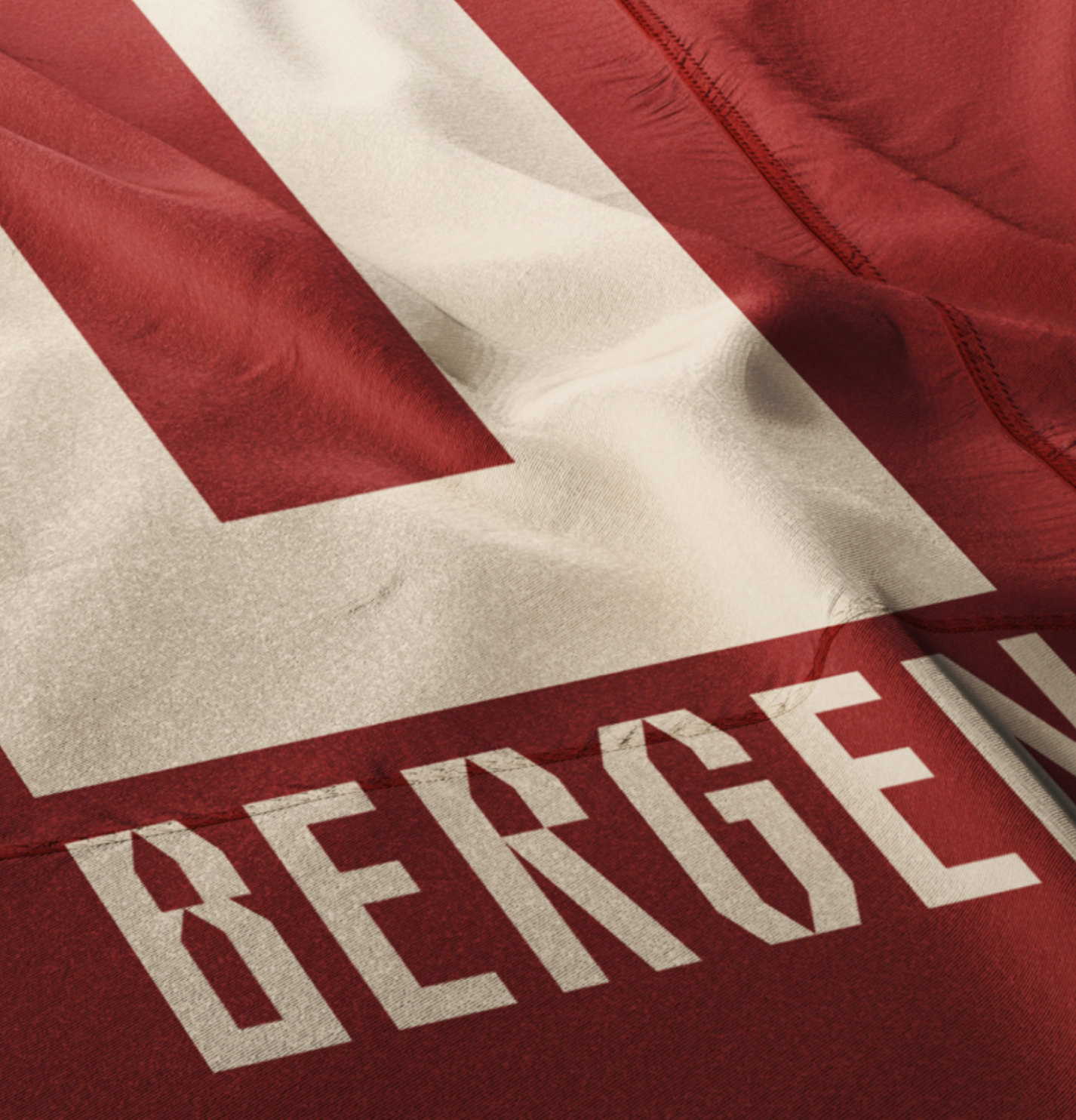
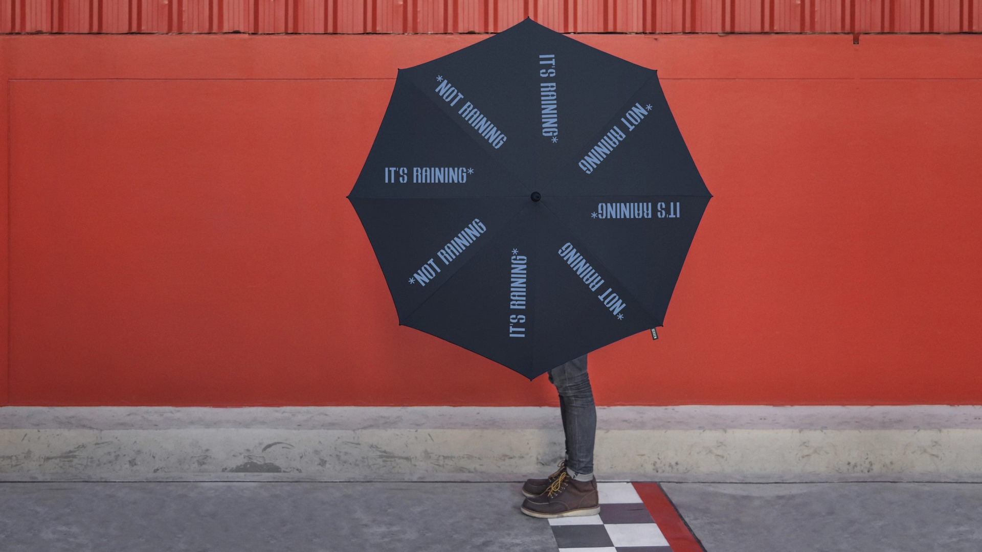
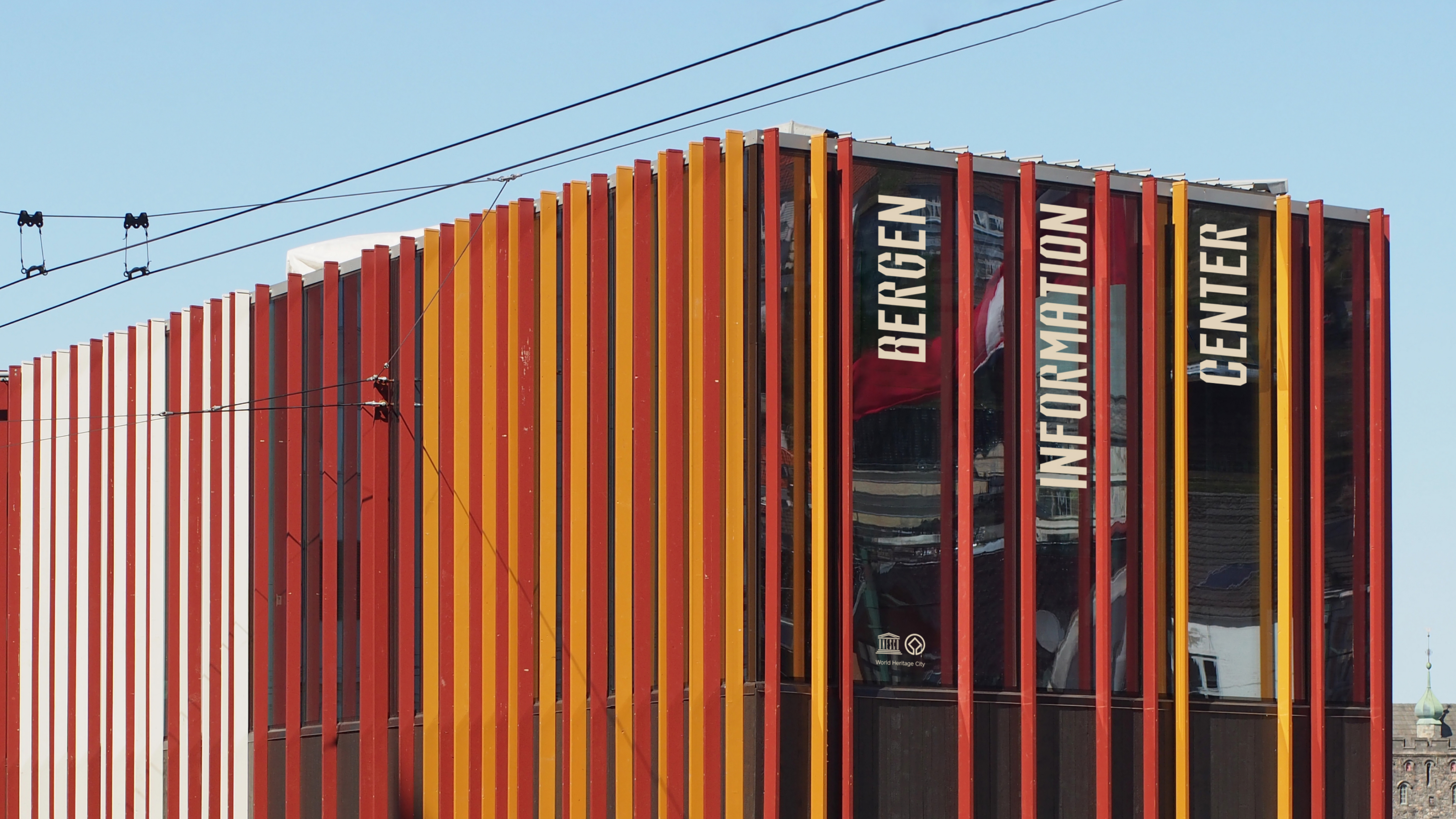
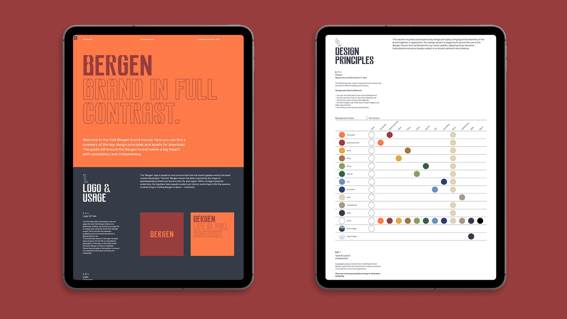
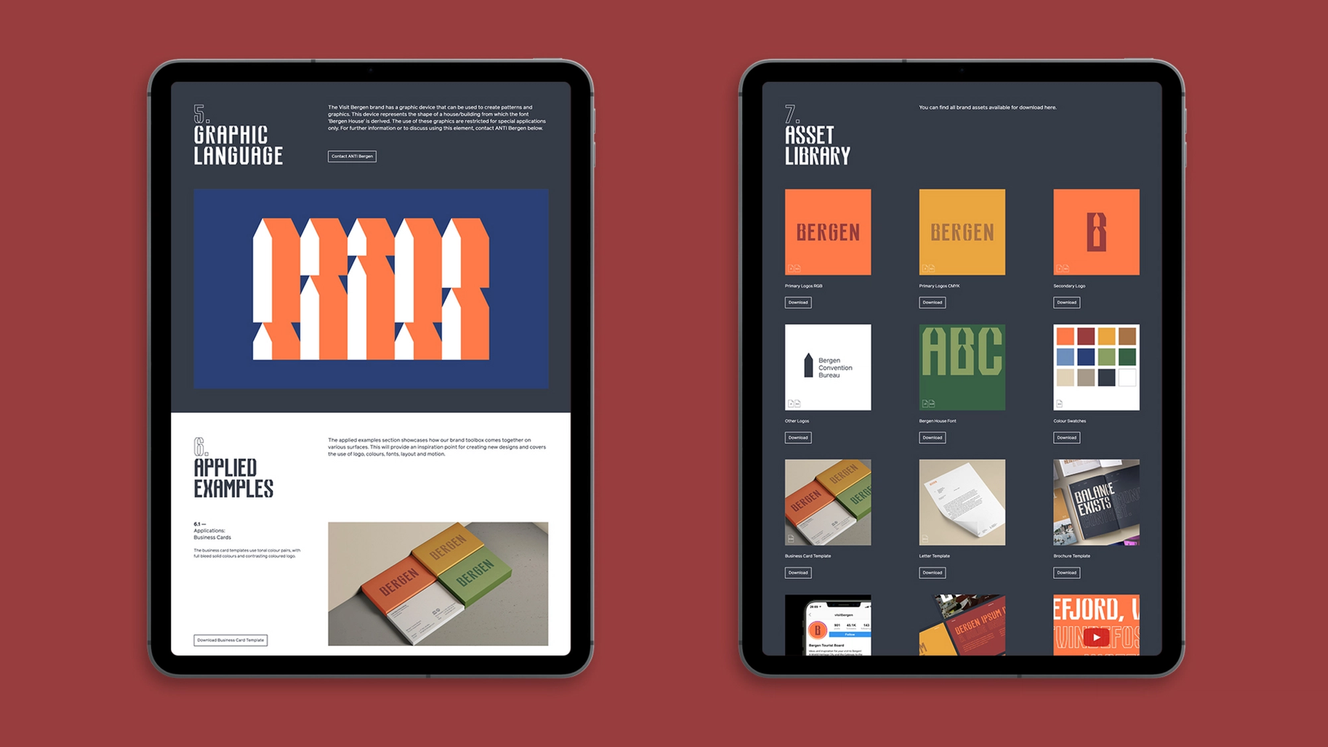
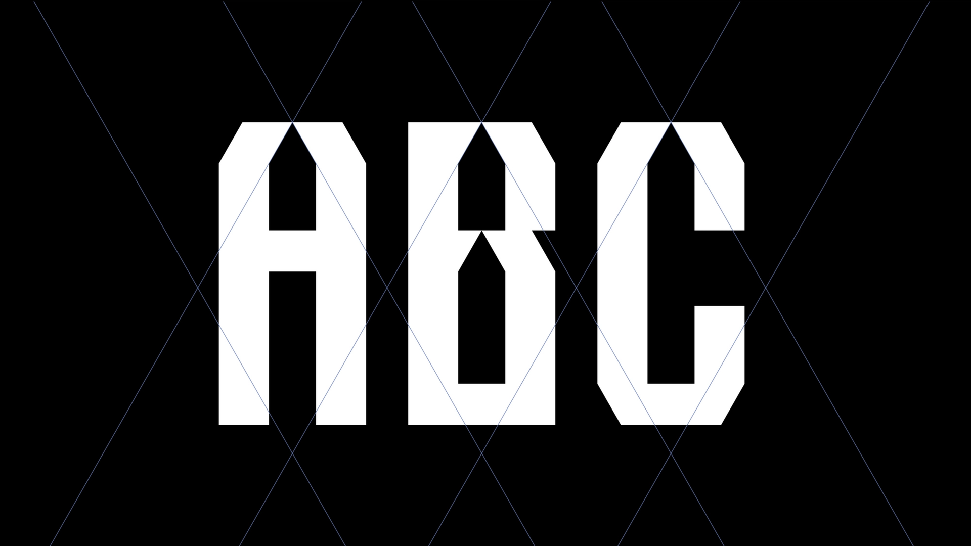
Praktisk sett fungerer identiteten som en kvalitetsmerking for medlemsmerker, som en organisasjonsidentitet som profilerer tjenestene til Visit Bergen, helt opp til en kampanjeplattform. Det er ingen logo i tradisjonell forstand, heller en tilpasset typografi som er klar til å fortelle historiene om regionen. En stemme som roper fra fjelltoppene, hvisker i vinden og synger i mengden!


Tone of voice er en viktig komponent i merket. Modig og uttrykksfull, leken, men direkte. En personlighet fylt med selvtillit, men samtidig raus og sjarmerende. En region som er åpen, energisk og stolt av sine kontraster. Bruken av tekst sammen med bilder og film er den enkle, men virkningsfulle måten merkevaren fanger oppmerksomheten og bærer sin historie på - en enkel, men energisk måte å speile den upretensiøse, norske væremåten på.
Den skreddersydde typografien inneholder symboler, en grafisk aksent som peker tilbake på regionen. Denne formen kan stå alene som et grafisk element, brukt som mønster, i forskjellige frekvenser forankret i regionen, fra det urbane til det naturlige, fra det rolige til det energiske.
Den nye profilen for Bergensregionen ble introdusert på ulike vis, som en organisasjonsmerkevare, som kampanje, som rap-tekster og musikkvideo, som merchandise, som liveopplevelser, og mye mer som kommer.