

Prosjekt
En ikoniske institusjon siden 1864, og en trygg havn å komme til for nordmenn på reise rundt i verden.
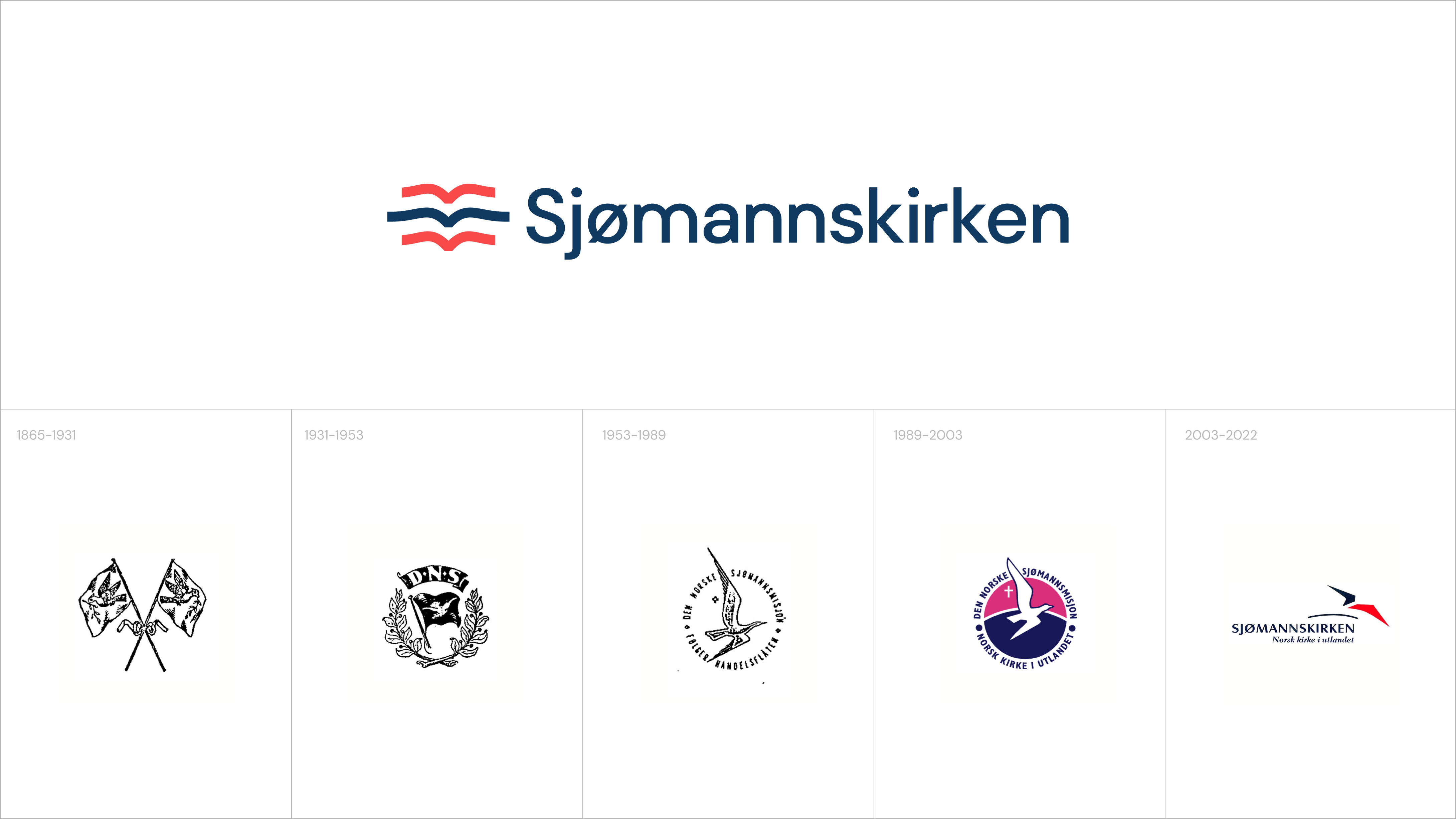
Siden grunnleggelsen i 1864 har Sjømannskirken vært en ikonisk institusjon i Norge, med oppdrag fra Stortinget om å betjene nordmenn i utlandet. Som en ideell kristen organisasjon har de nå 28 kirker spredt over hele verden - fra London til LA, Rio de Janeiro til Singapore - og fungerer som en viktig møteplass for nordmenn på tvers av landegrenser.
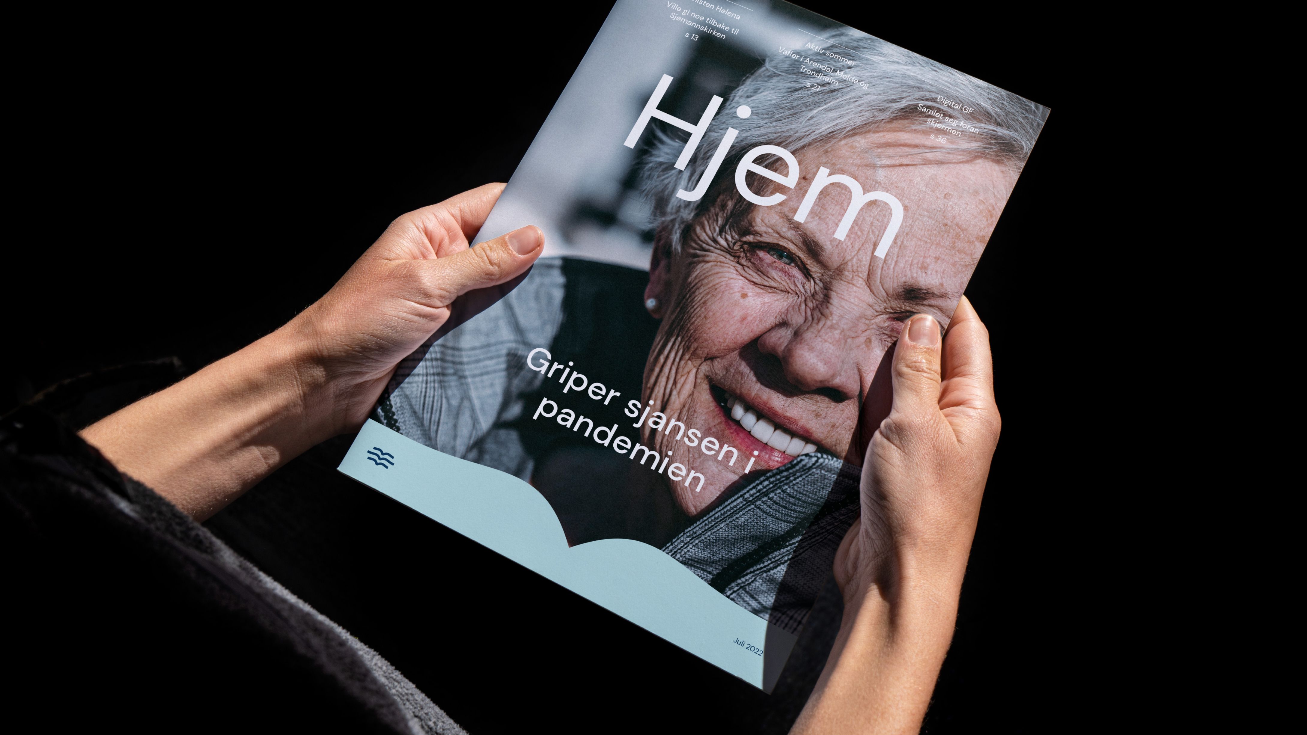
Med en rik historie og høy grad av merkekjennskap, var det viktig for Sjømannskirken å revitalisere sin merkevarepresentasjon for å reflektere organisasjonens moderne identitet. Vi arbeidet med omprofileringen av Sjømannskirken og skapte en tilgjengelig og lett gjenkjennelig visuell profil som skulle brukes globalt, og representere en ny historie om fellesskap og samhold.

Utfordring
Sjømannskirken har en spesiell plass i hjertene til mange nordmenn, og mange hadde en følelsesmessig tilknytning til det eksisterende visuelle uttrykket. Likevel var det nødvendig å gi profilen ny energi og tilpasse den til den digitale verdenen. Vi var opptatt av å ta vare på Sjømannskirkens arv og nasjonale betydning, samtidig som vi moderniserte den.
Det var viktig for oss å utvikle et designsystem som kunne brukes av både ansatte og frivillige, uavhengig av deres designkompetanse og vi la derfor stor vekt på å sikre at den nye visuelle profilen var både brukervennlig og intuitiv, samtidig som den tok hensyn til Sjømannskirkens historiske arv. Dette spilte en viktig rolle i hele prosessen.

Løsning
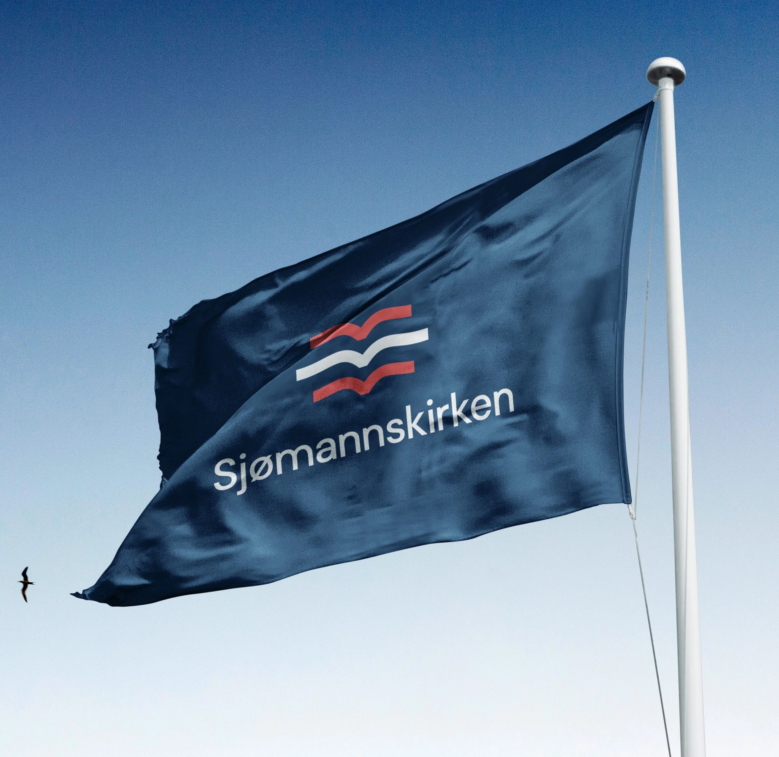
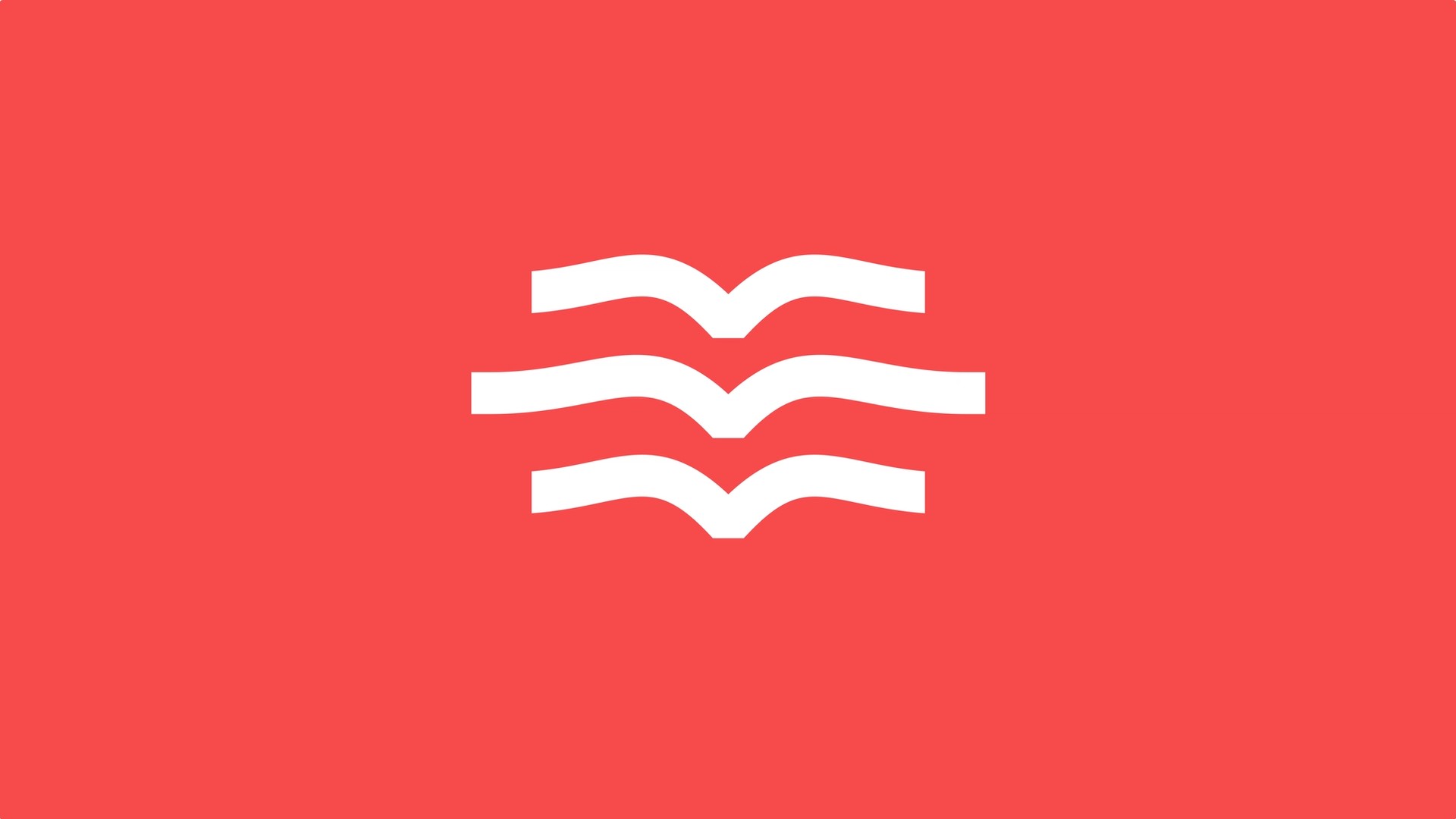
Sjømannskirkens logo har vært en ikonisk del av merkevaren i århundrer, med en ensom måke som symboliserer en trygg havn for sjøfolk. Vi ønsket ikke å forandre logoen helt, men heller å legge til noe nytt - en flokk med måker som forteller en historie om fellesskap og samhold. Tre måker som flyr sammen symboliserer å aldri være alene.
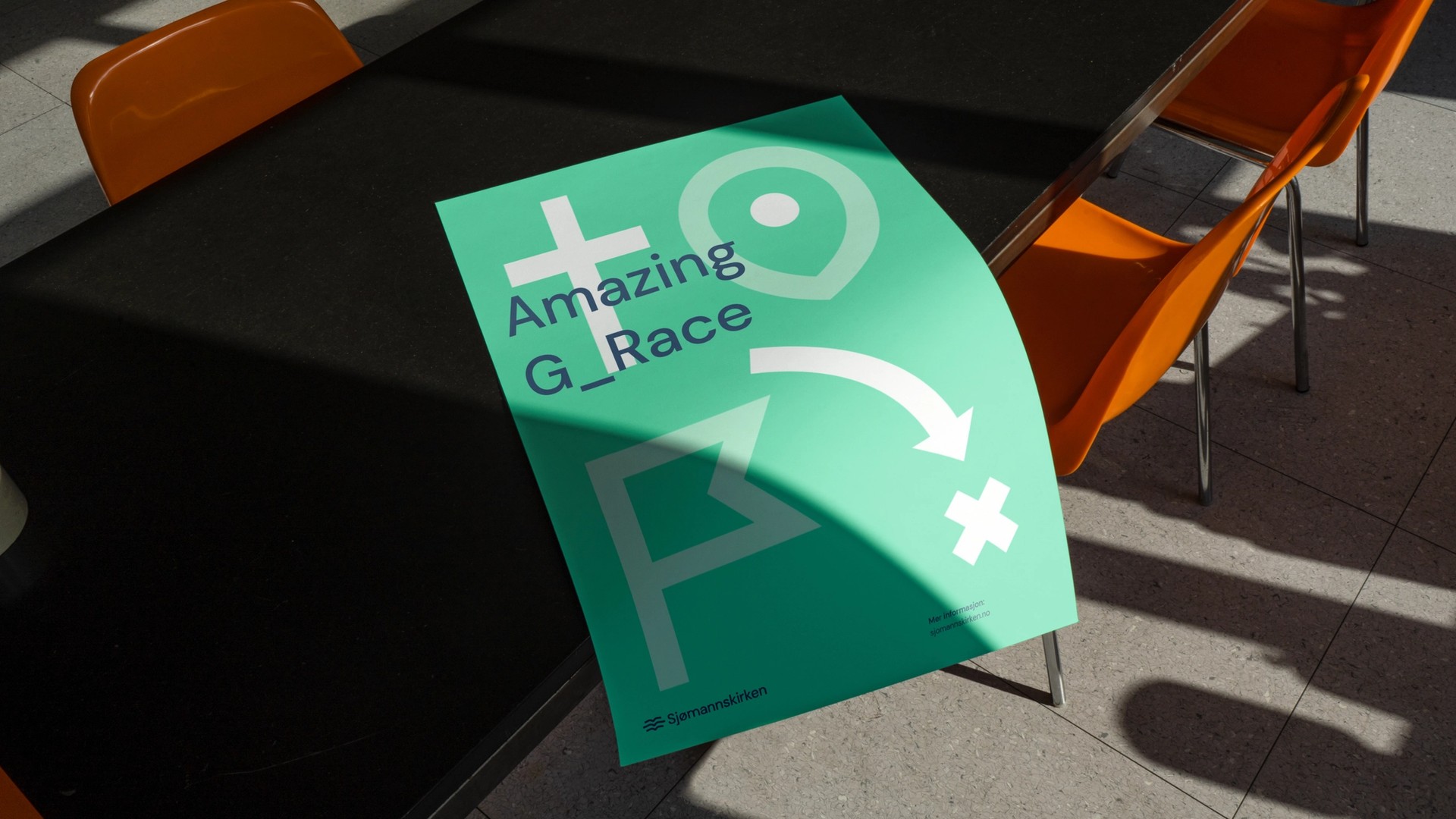
Vi utviklet også en visuell ikonstil som synliggjør Sjømannskirkens ulike nedslagsfelt og gjøremål for å forenkle hvordan organisasjonen kommuniserer med målgruppene sine.


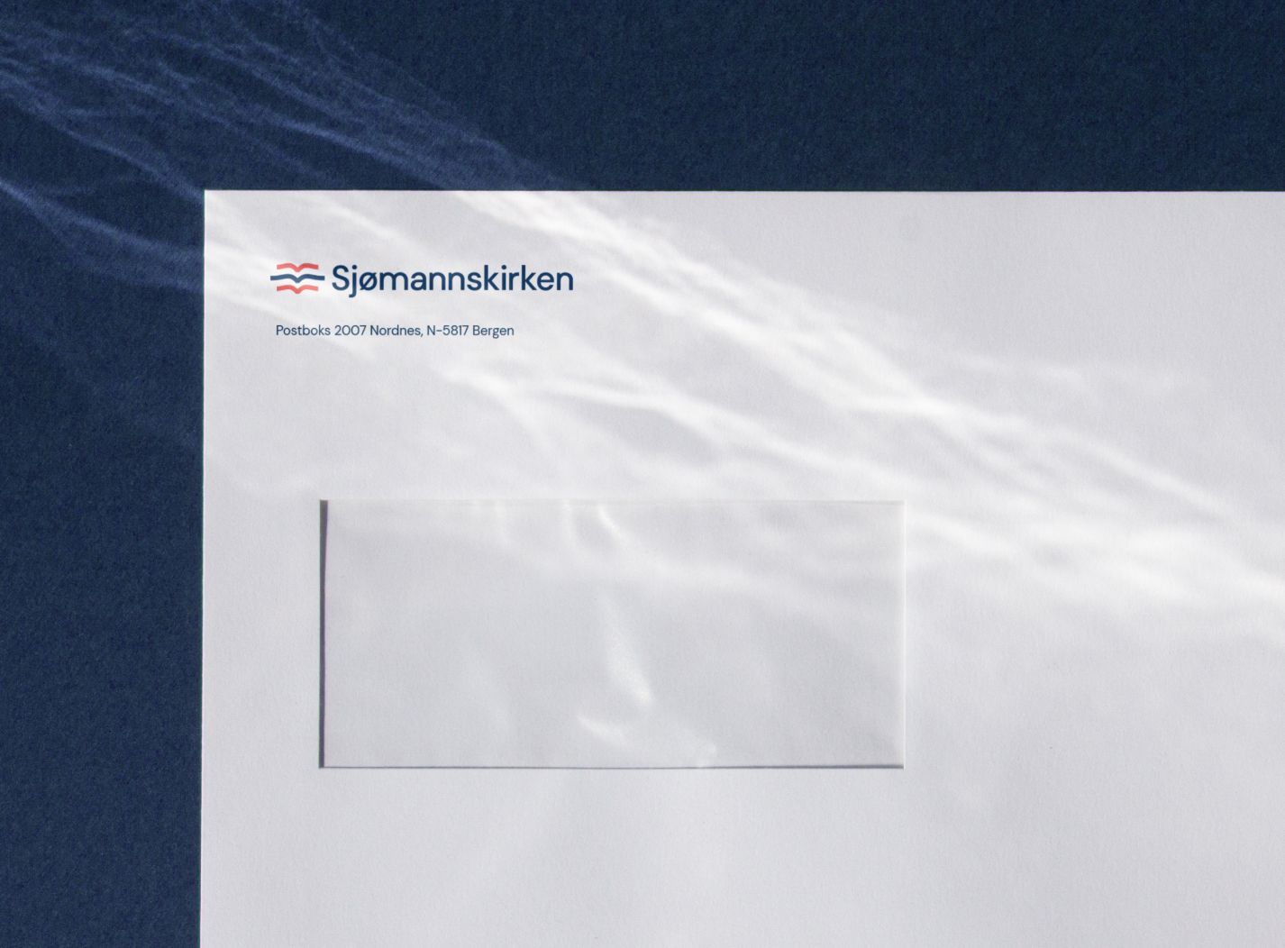
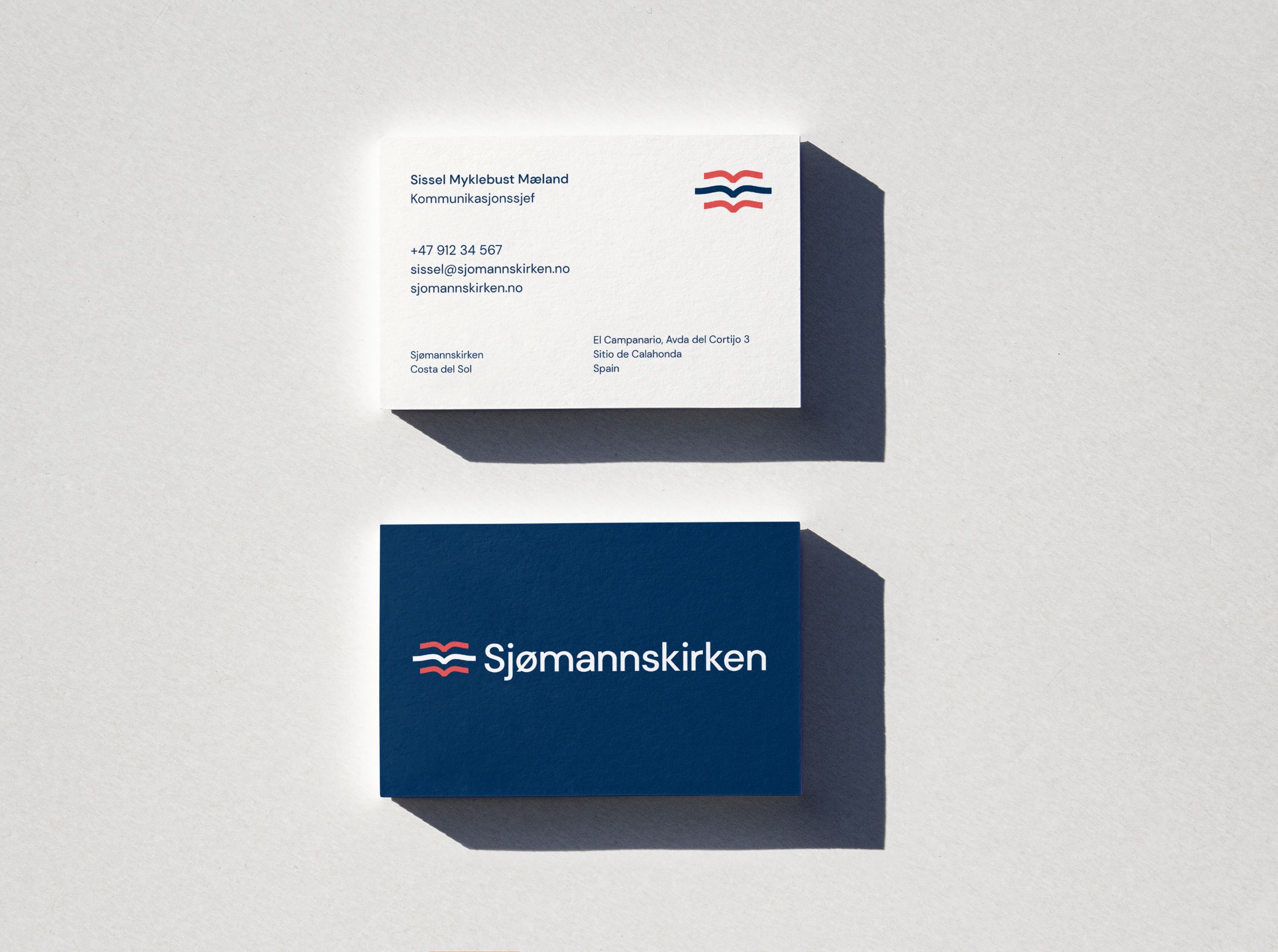

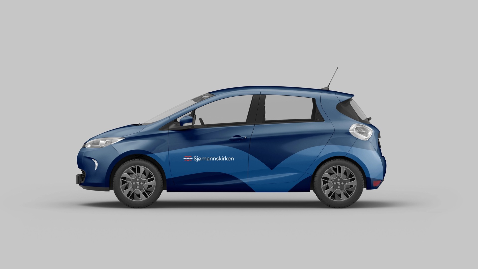
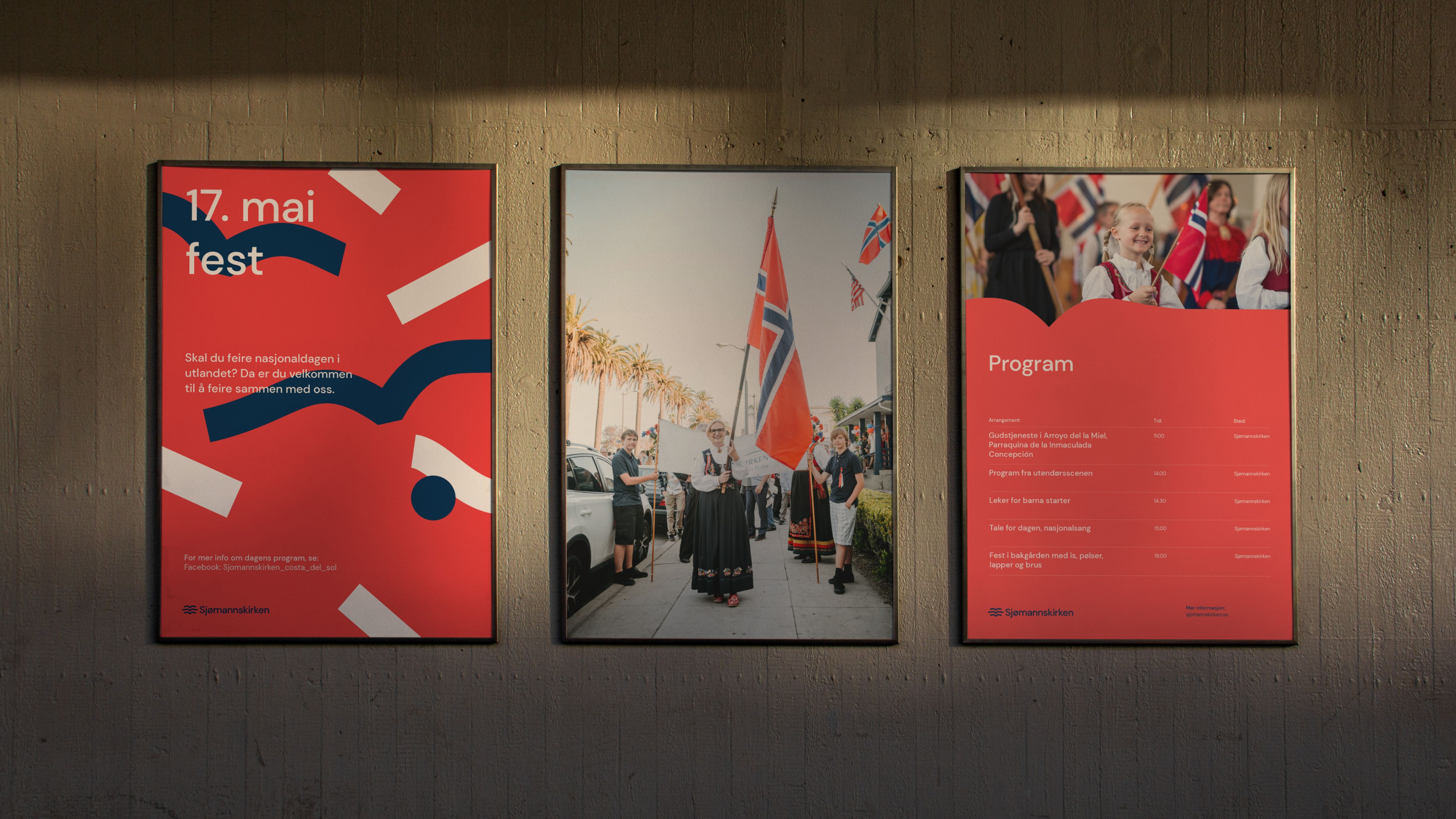
Vi skapte en rød, hvit og blå fargepalett inspirert av de norske nasjonalfargene. Den mørke marineblå fargen går igjen i hele merkevaren og representerer havet og sjøen som binder sammen alle verdenskontinentene.
Vi introduserte også en livlig og energisk sekundær fargepalett som kan brukes i ulike sammenhenger og steder der Sjømannskirken opererer.

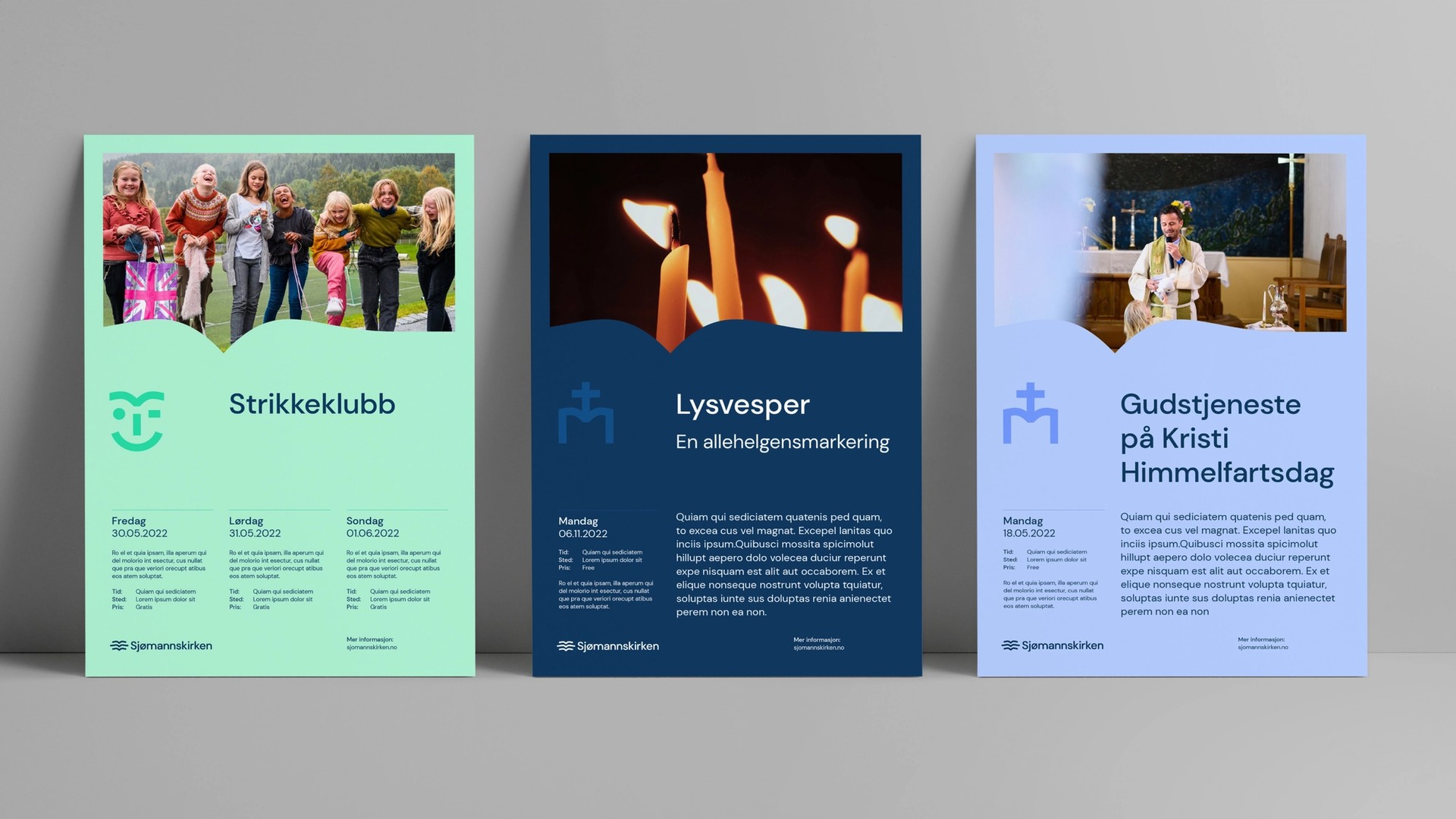
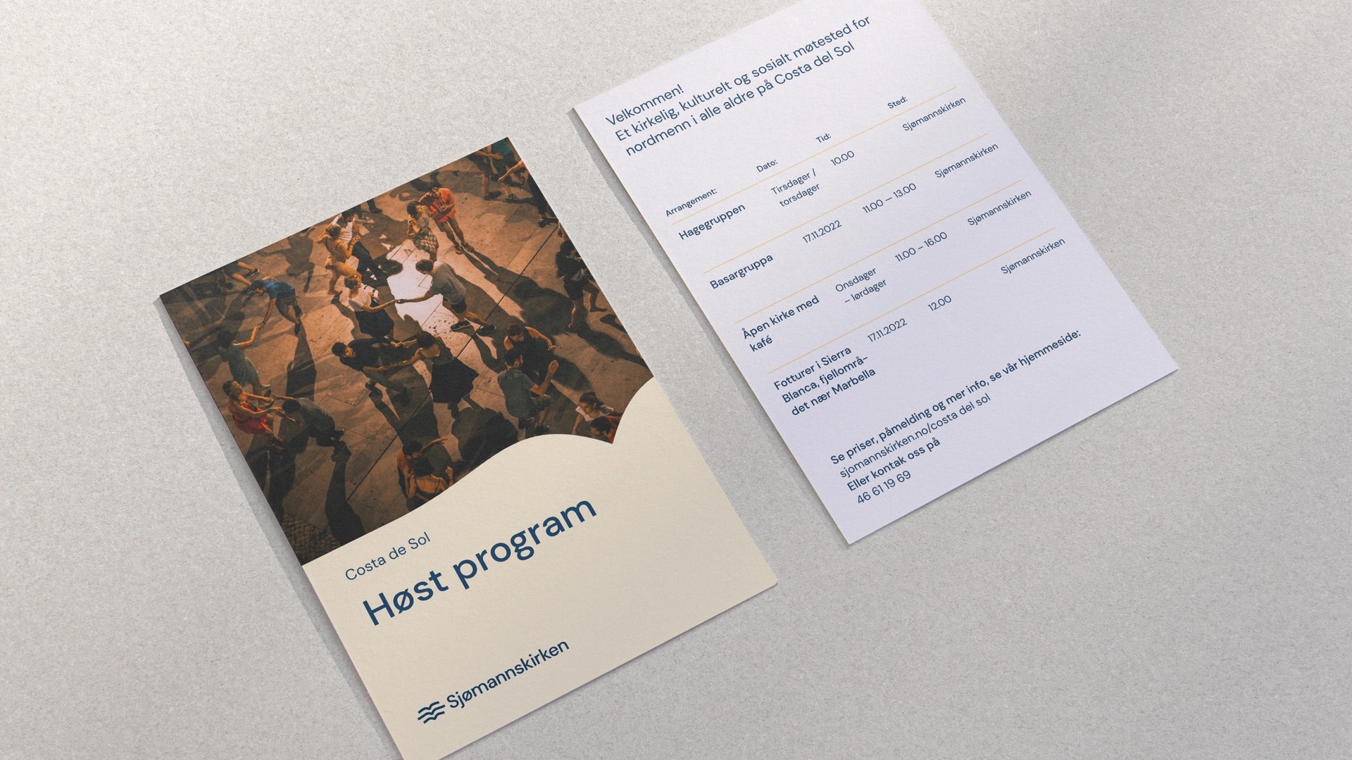
For å gjøre den nye profilen tilgjengelig og enkel å bruke, valgte vi typografi med åpen kildekode, enkel layout og en omfattende, men brukervennlig digital merkevarehåndbok med tydelige retningslinjer og eksempler på bruk.
Gjennom dette arbeidet har vi revitalisert den visuelle profilen for Sjømannskirken, som bygger videre på organisasjonens historie og betydning, samtidig som den tilpasser seg den digitale tidsalderen og er enkel å bruke for alle.
Effekt
“Vi opplever at den nye logoen med tilhørende visuell profil ivaretar vår historie og egenart, samtidig som den er tilpasset tiden vi lever i og gjør at vårt uttrykk oppleves oppdatert og moderne. Gjennom prosessen opplevde vi at Nonspace satte seg godt inn i vår historie, vårt mål og vårt oppdrag, og tok dette med inn i det kreative arbeidet. I utviklingsarbeidet var de lyttende til våre tanker og innspill, samtidig som de hadde faglige begrunnelser og tanker bak det som ble foreslått. Arbeidet ble gjennomført med god framdrift og til avtalt pris.
Vi opplevde overraskende lite motstand internt, og profilen er tatt i bruk i over 35 underenheter. Med den nye profilen framstår Sjømannskirken enhetlig verden rundt.”
- Sissel Myklebust Mæland, Sjømannskirken, Kommunikasjonssjef