Prosjekt
Reitan er et av Norges største privateide holdingselskaper som praktiserer aktivt eierskap gjennom uavhengige selskaper.
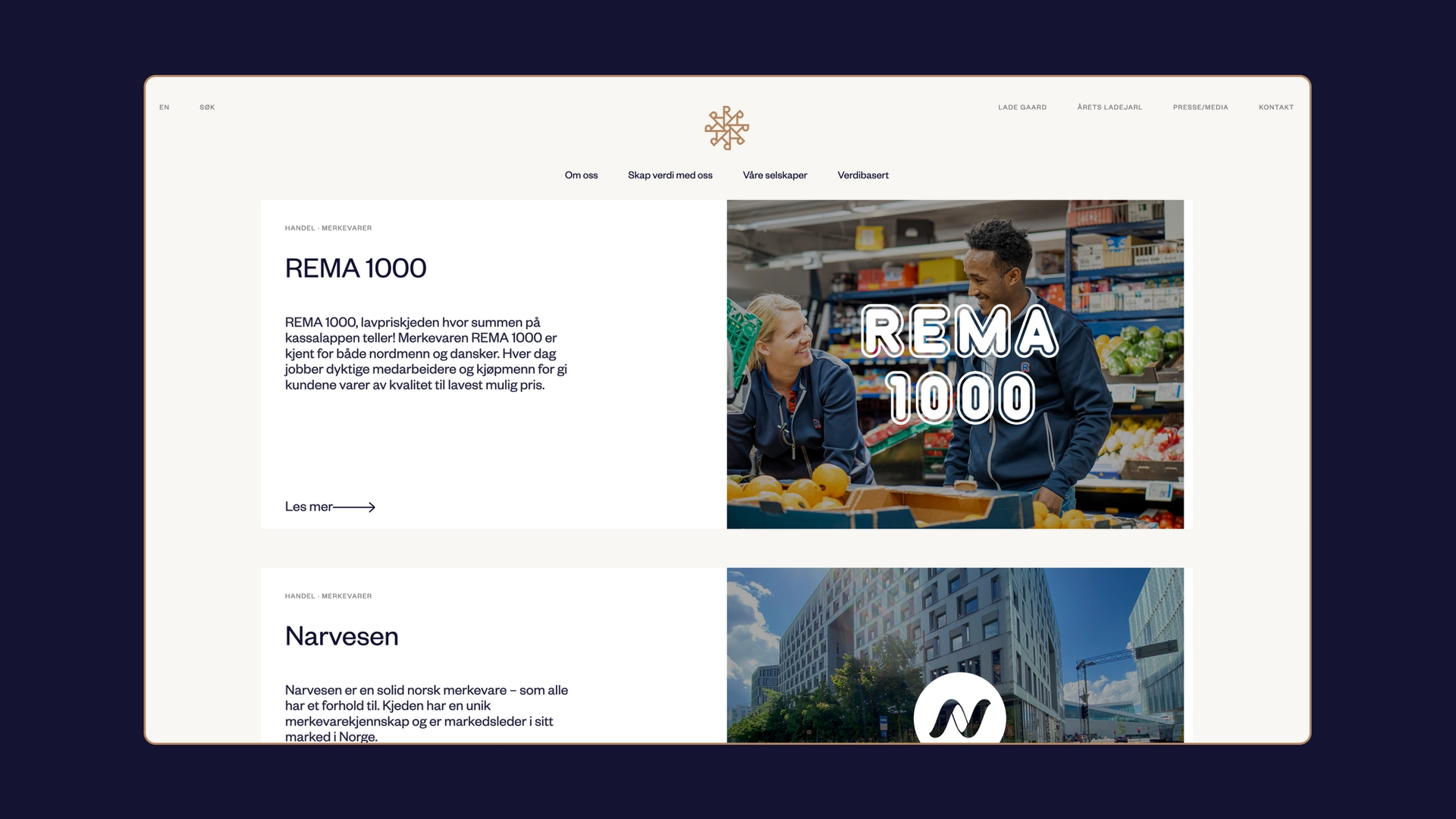
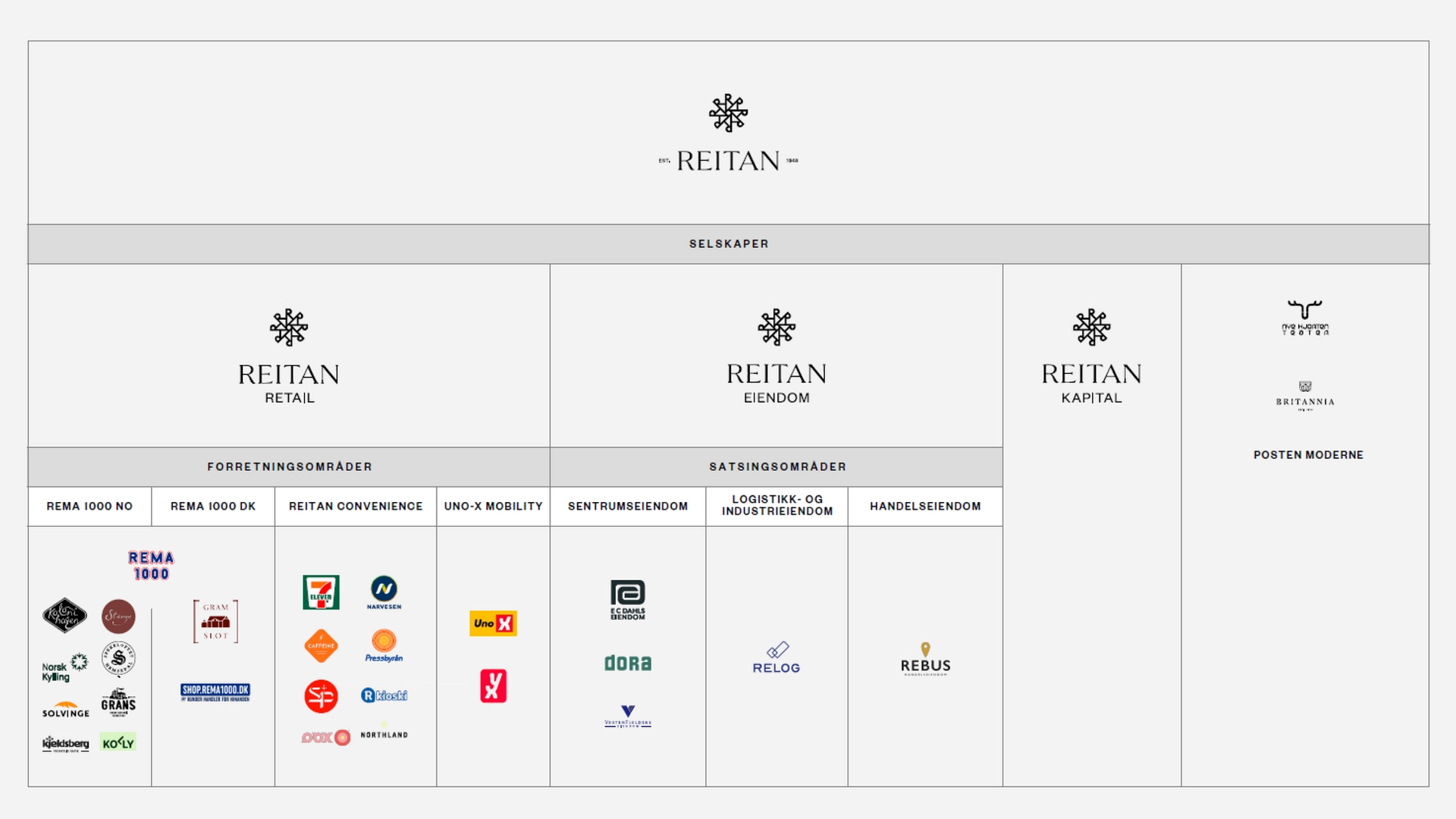
Selskapet har aktivt eierskap i noen av Norges mest kjente og kjære merkevarer, som REMA 1000, YX, Uno-X, Narvesen, 7-Eleven, Solvinge og Kjeldsberg, for å nevne noen. Med en kompleks selskapsstruktur og et aktivt eierskap av merkevarer i syv land i Norden og Baltikum, så Reitan behovet for å reposisjonere seg selv med en ny og forbedret merkevare og merkevarearkitektur.
(Arbeid utviklet under ANTI Trondheim & ANTI Bergen)
Utfordring
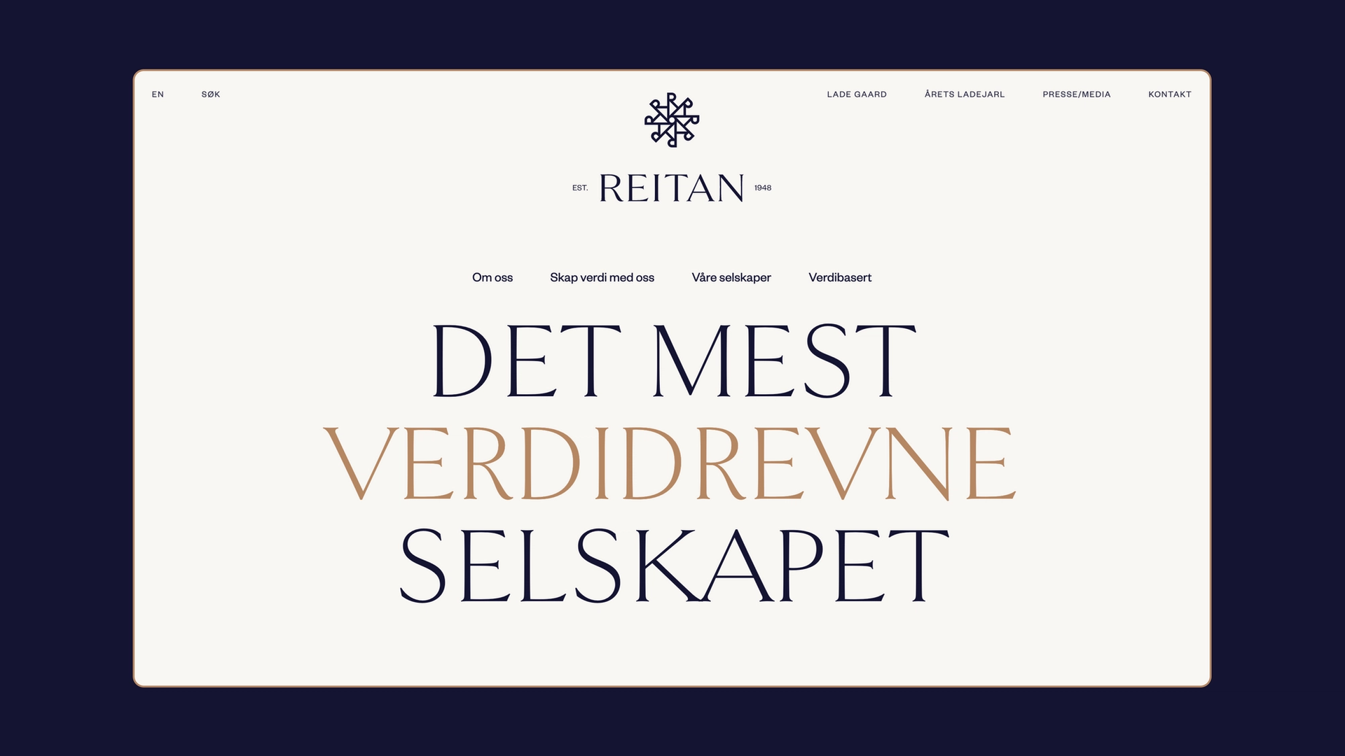
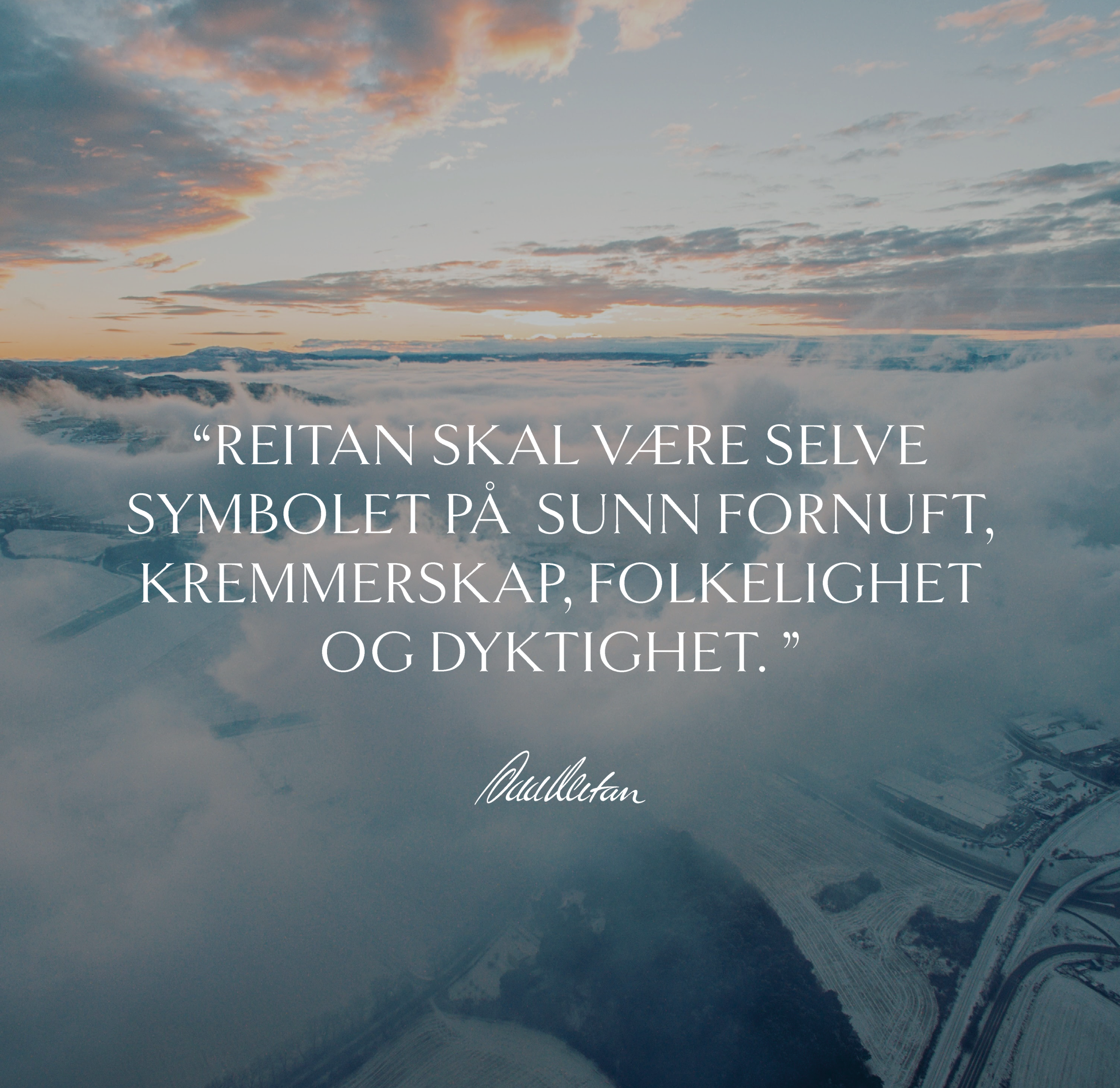
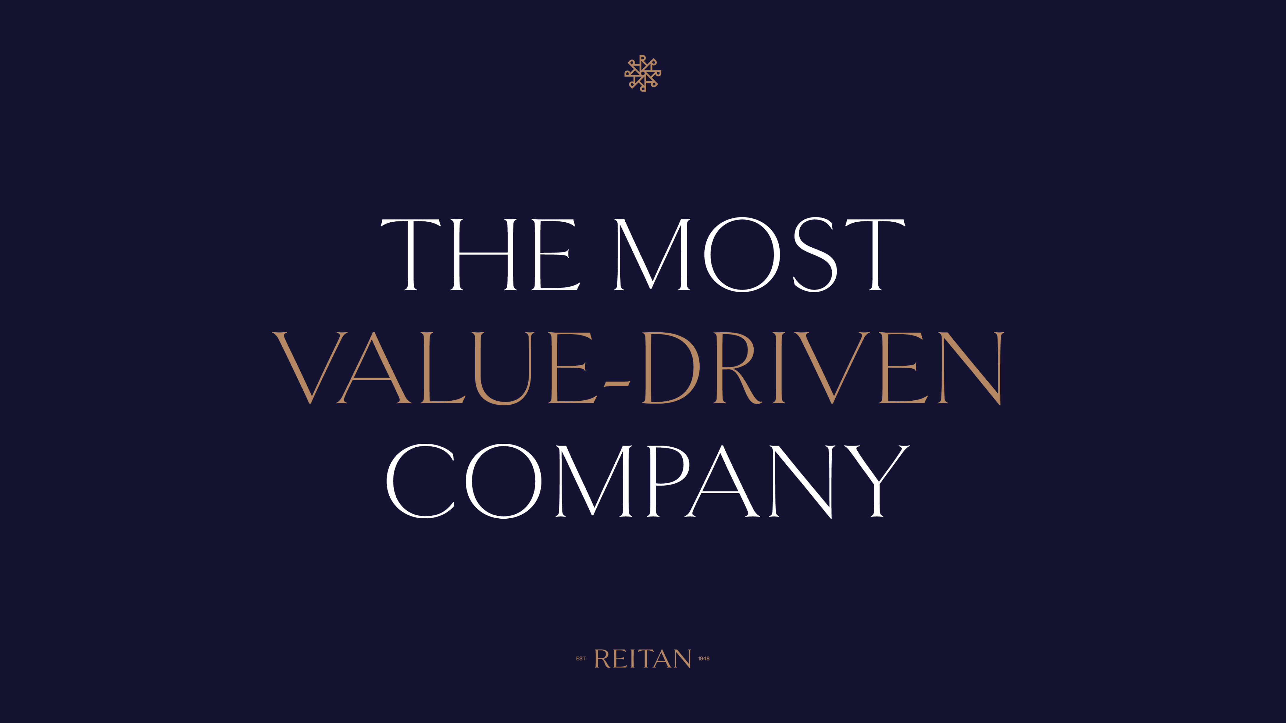
Siden grunnleggelsen i 1948 har Reitan hatt en visjon om å være det mest verdidrevne selskapet i verden. Retan’s suksesshistorie har også resultert i komplekse selskapsstrukturer som gjør det vanskelig å navigere i forretningsområdene og deres merkevareunivers, og å være aktiv i syv land krever at merkevaren fungerer på tvers av ulike kulturer og språk.
Med et fornyet fokus og en ambisjon om å skape en merkevarestrategi som kan vokse over tid, måtte vi definere merkvarehierarkiet og forretningsområdene deres samtidig som vi moderniserte merkevaren uten å miste fokuset på historien deres.
Sammen med kunden så vi behovet for å skape et designsystem som kunne vokse inn i fremtiden. For å gjøre dette, måtte vi skape en ny merkevarestrategi for å sikre økt vekst over tid, og fortsette å posisjonere Reitan som det mest verdidrevne selskapet.
Løsning
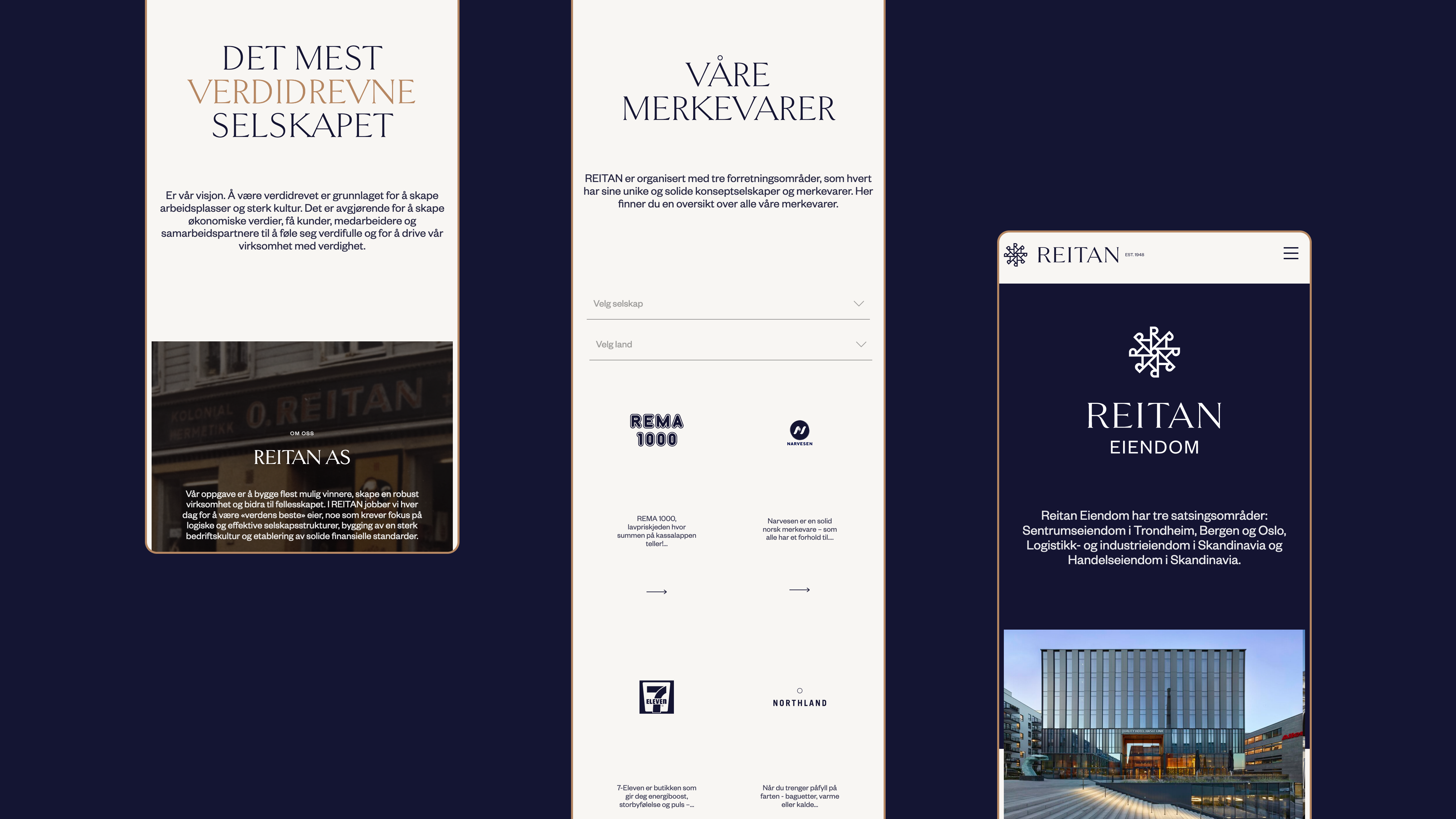
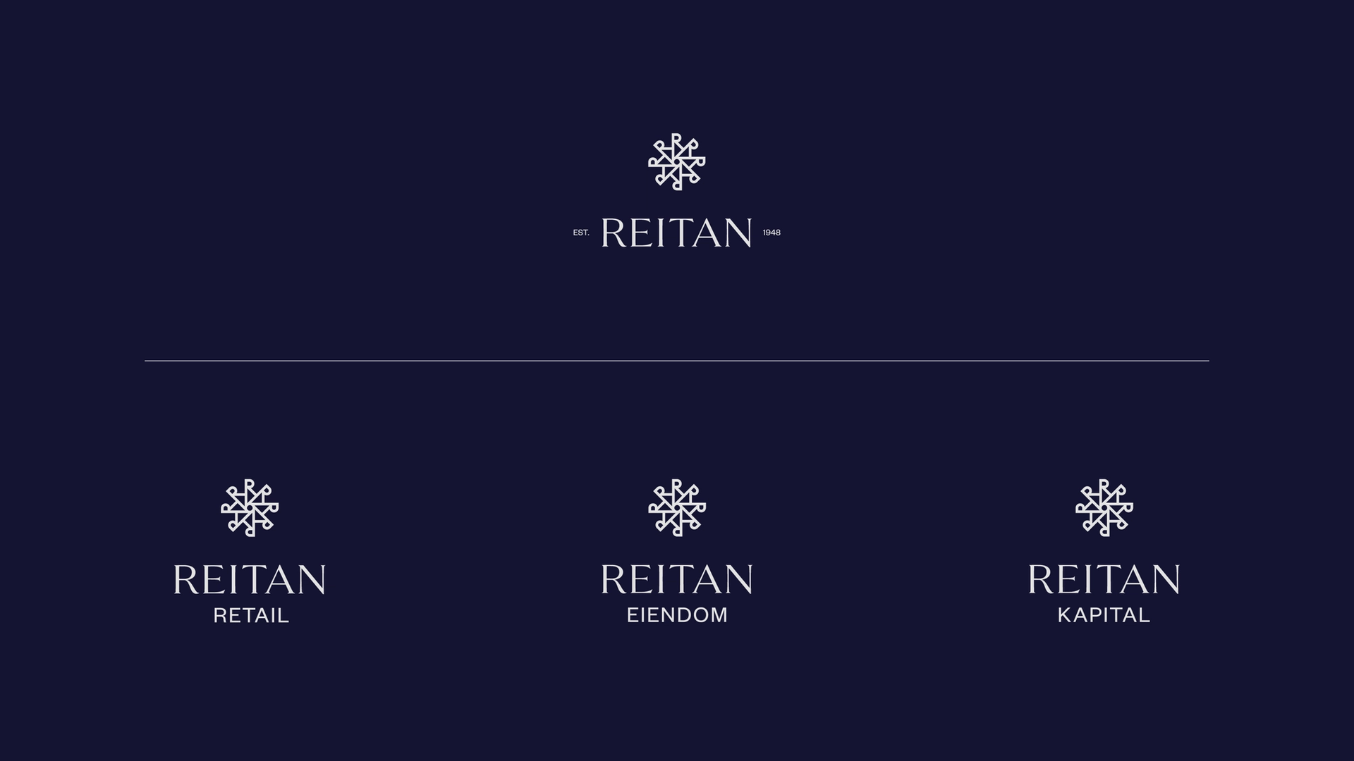
Gjennom en større arbeidsprosess, i tett samarbeid med kunden, utviklet vi en ny merkevarestruktur for Reitan. Denne strukturen tillater skalerbarhet ved innføring av nye konsepter og forretningsområder, alle med fellesnevner i grunnleggende menneskelige behov. Vi la også vekt på intern kommunikasjon ved å gjøre strukturen i hovedaktivitetene mer synlig. Dette inkluderte en overgang fra seks forskjellige forretningsområder til tre områder: Detaljhandel, Eiendom og Finans.
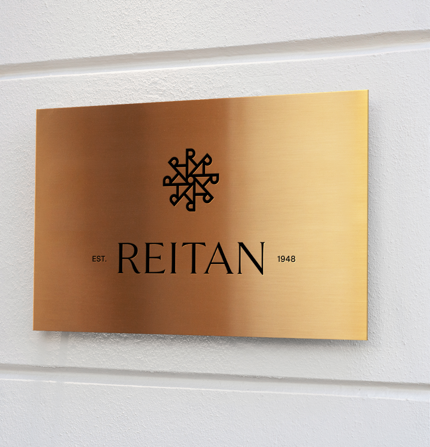
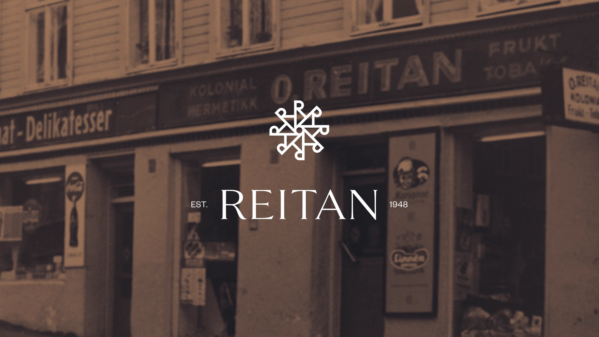
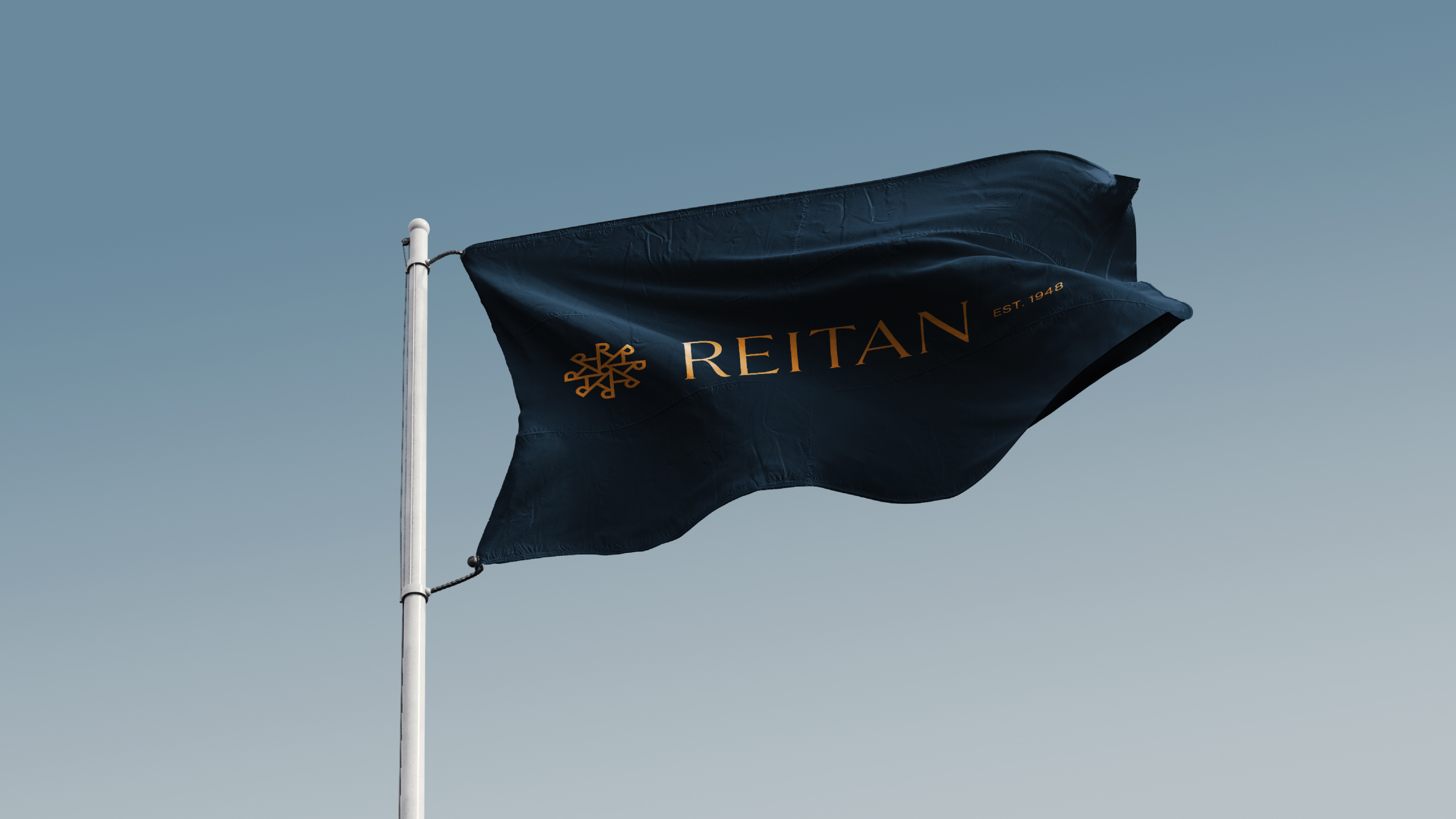
I Norge er de fleste kjente med “Reitangruppen”, mens i de nordiske og baltiske regionene bruker man ”Reitan”. Under prosessen så vi på et navnesystem som kunne forenkle deres merkevarehierarki og gjøre det enklere for alle å forstå merkestrukturen. Selskapet ble med dette omdøpt til REITAN AS.
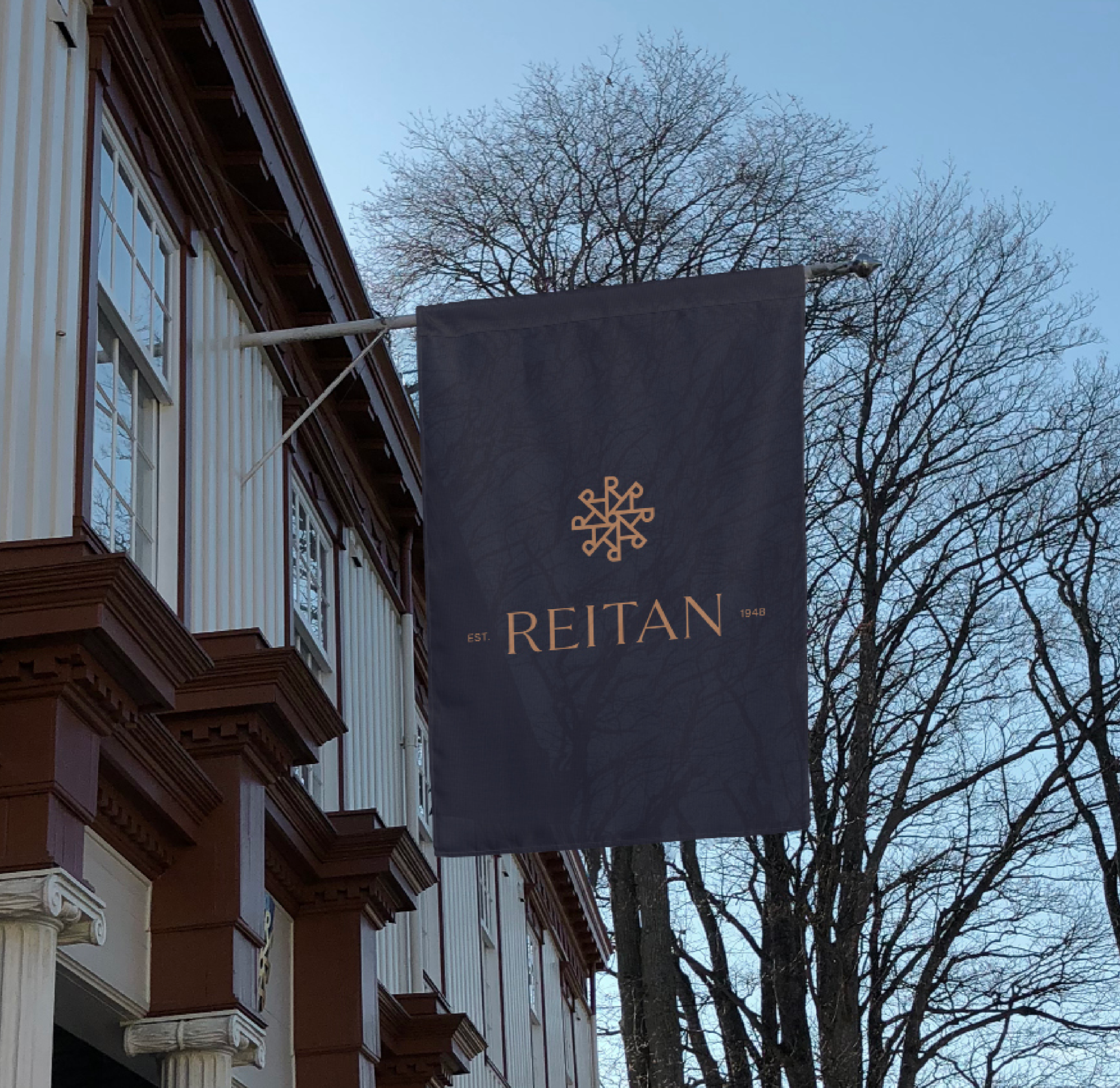
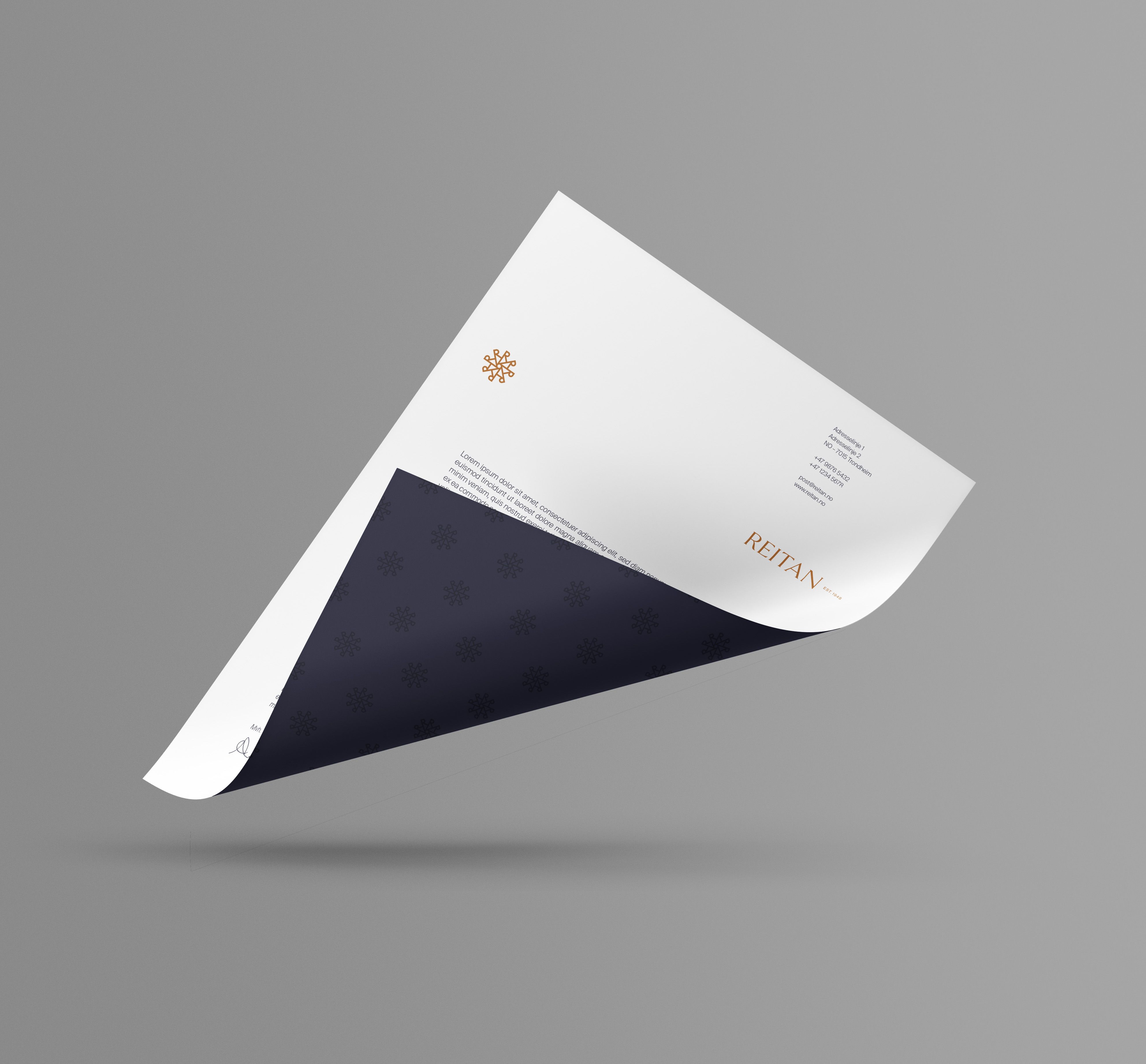
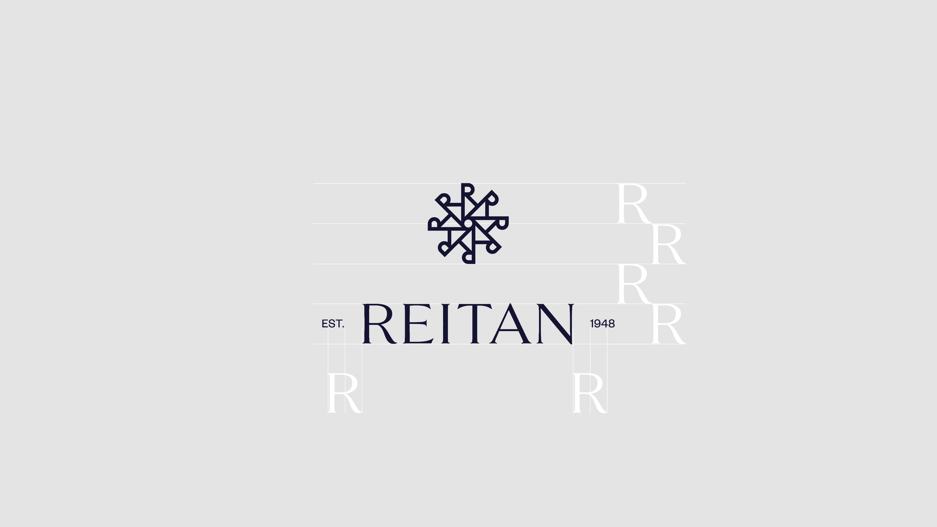
For å skape en bærekraftig merkevarearkitektur og bygge en visuell identitet, fokuserte vi på de mange gode egenskapene og karaktertrekkene som kunne gi Reitan nytt liv, og samtidig bevare arven. I en stadig mer modernisert og internasjonal markedsplass, måtte identiteten formidle stabilitet, fleksibilitet og tillit.
Reitans nye designplattform, system og nettside fokuserer på deres merkevarehistorie, og omdefinerer Reitan som en merkevare med en lang historie og tyngde - fornyet og klar for fremtiden.

Gjennom tett samarbeid med kunden designet vi en ny nettside bygget rundt deres verdier, rike historie og sterke merkevarer.